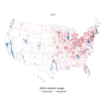
Shifting political winds
The purpose of this post is to recreate the “Shift from 2016” arrow map that the New York Times used to show which counties became more Democratic or Republican-leaning from 2016 to 2020.
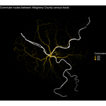
Analyzing major commuter routes in Allegheny County
Intro In this post I will use the Mapbox API to calculate metrics for major commuter routes in Allegheny County. The API will provide the distance and duration of the trip, as well as turn-by-turn directions.
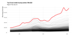
Graphing volatile home values in U.S. metro areas
Zillow publishes a variety of cool data that I haven’t explored much yet. The first dataset that caught my eye was the Zillow Home Value Index (ZHVI). Zillow describes it as the “smoothed, seasonally adjusted measure of the typical home value and market changes across a given region and housing type”.
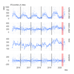
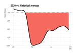
Effect of COVID-19 on Pittsburgh parking transactions
The COVID-19 pandemic’s affect on commerce and mobility habits is well documented. For example, Apple publishes Mobility Trends reports about utilization of various transportation modes.
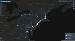
Mapping BosWash commuter patterns with Flowmap.blue
This map shows the commuter patterns in the Northeast Megalopolis/Acela Corridor/BosWash metro area. I pulled the data from the Census Longitudinal Employer-Household Dynamics (LODES) system via the {lehdr} package. The map was created through the Flowmap.
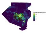
Pittsburgh City Boundary Model Leaflet Map
View this classification model that distinguishes between census tracts that are inside or outside the City of Pittsburgh
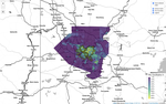
Modeling the Pittsburgh City Boundary
In this post I create a model that differentiates census tracts that are inside and outside the city limits of Pittsburgh
Comparing Healthy Ride Usage Pre And "Post" COVID-19
Lawrence Andrews asked me on Twitter if there had been a change in Health Ride usage after COVID-19. Would be interested to see this @healthyridepgh data to compare pre-covid (2019) and during (2020) — Lawrence Andrews (@lawrenceandrews) August 13, 2020 The {tidyverts} universe of packages from Rob Hyndman provides a lot of tools that let you interrogate time series data.