Comparing Healthy Ride Usage Pre And "Post" COVID-19
Would be interested to see this @healthyridepgh data to compare pre-covid (2019) and during (2020)
— Lawrence Andrews (@lawrenceandrews) August 13, 2020
The {tidyverts} universe of packages from Rob Hyndman provides a lot of tools that let you interrogate time series data. I will use some of these tools to decompose the Healthy Ride time series and see if there was a change.
library(tidyverse)
library(lubridate)
library(janitor)
library(tsibble)
library(feasts)
library(hrbrthemes)

options(scipen = 999, digits = 4)

theme_set(theme_ipsum(base_size = 20,
                      strip_text_size = 18,
                      axis_title_size = 18))
I had already combined the usage data from the WPRDC with list.files and map_df(read_csv), so I can just read in the combined CSV file:
data <- read_csv("data/combined_ride_data.csv")Summarizing the number of rides per day shows that the data is very seasonal. The red line is on March 6, which is the date of the first known positive COVID-19 case in the state.
data %>%
count(date, name = "number_of_rides", sort = TRUE) %>%
filter(!is.na(date)) %>%
ggplot(aes(date, number_of_rides)) +
geom_point(alpha = .5, size = .5) +
geom_vline(xintercept = ymd("2020-03-06"), color = "red")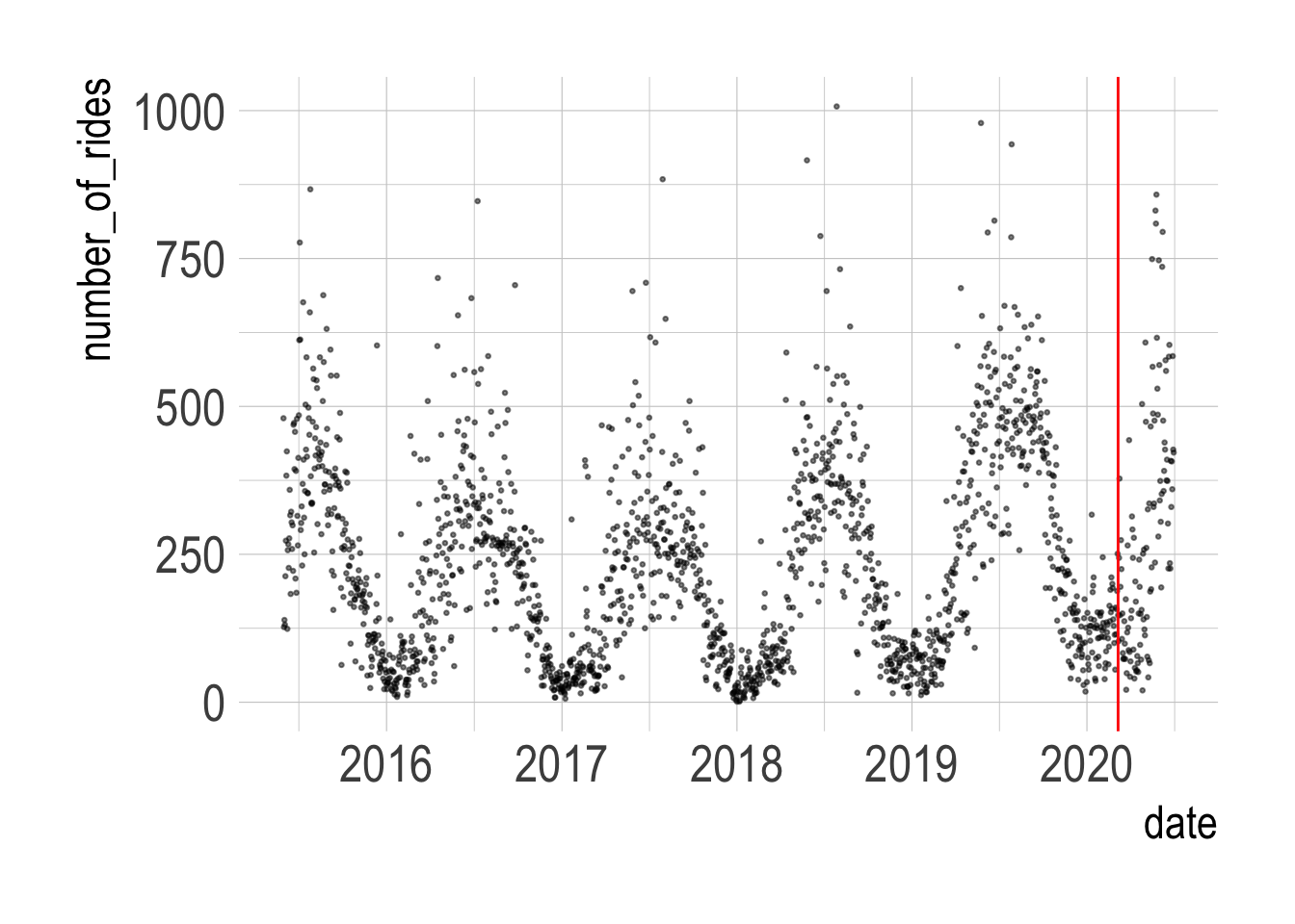 I use the
 {tsibble} package to make a time series tibble and fill in a few gaps in the data. Then I create 3 different models to decompose the time series. I will compare these 3 models to see which strips away the seasonality the best.
dcmp <- data %>%
  mutate(time = date) %>%
  count(time, name = "number_of_rides") %>%
  as_tsibble(index = time) %>%
  tsibble::fill_gaps(number_of_rides = 0) %>%
  model(STL(number_of_rides),
        STL(number_of_rides ~ season(window = Inf)),
        STL(number_of_rides ~ trend(window=7) + season(window='periodic'),
            robust = TRUE))

components(dcmp) %>%
  glimpse()
## Rows: 5,574
## Columns: 8
## Key: .model [3]
## STL Decomposition: number_of_rides = trend + season_year + season_week + remainder
## $ .model <chr> "STL(number_of_rides)", "STL(number_of_rides)", "STL(…
## $ time <date> 2015-05-31, 2015-06-01, 2015-06-02, 2015-06-03, 2015…
## $ number_of_rides <dbl> 480, 127, 139, 131, 213, 273, 383, 424, 124, 257, 267…
## $ trend <dbl> 136.7, 138.4, 140.0, 140.1, 140.1, 141.8, 143.5, 144.…
## $ season_year <dbl> 97.60, 104.44, 136.59, 89.18, 143.96, 104.35, 11.13, …
## $ season_week <dbl> 148.509, -78.004, -82.011, -7.388, -57.130, -19.725, …
## $ remainder <dbl> 97.153, -37.821, -55.613, -90.871, -13.951, 46.581, 1…
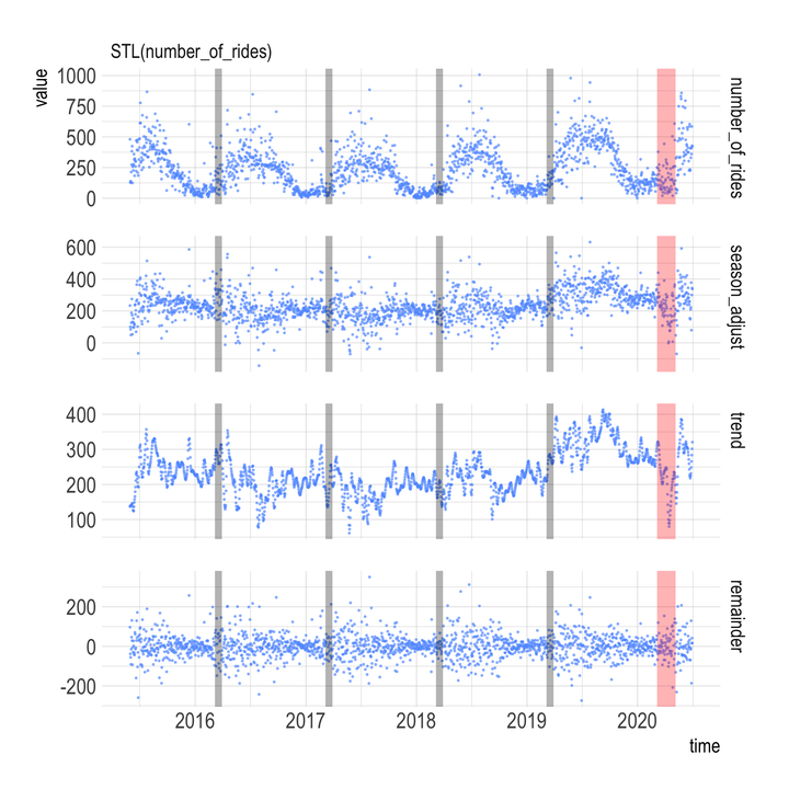
## $ season_adjust <dbl> 233.89, 100.57, 84.42, 49.21, 126.17, 188.37, 274.81,…This code pivots the data long and plots the true number of rides per day and the estimate of the underlying trend per model. The “season_adjust” panel shows the number of rides adjusted for seasonal effects, the “trend” panel shows the underlying trend, and the “remainder” panel shows how much the seasonal adjustment missed by.
components(dcmp) %>%
  pivot_longer(cols = number_of_rides:season_adjust) %>%
  mutate(name = factor(name, levels = c("number_of_rides", "season_adjust",
                                        "trend", "seasonal",
                                        "season_year", "season_week",
                                        "random", "remainder"))) %>%
  filter(!is.na(value)) %>%
  filter(name == "trend" | name == "season_adjust" | name == "number_of_rides" | name == "remainder") %>%
  ggplot(aes(time, value, color = .model)) +
  geom_point(alpha = .6, size = .6) +
  annotate(geom = "rect",
           xmin = ymd("2020-03-06"), xmax = ymd("2020-12-31"),
           ymin = -Inf, ymax = Inf,
           fill = "red", alpha = .1) +
  facet_grid(name ~ .model, scales = "free_y", labeller = label_wrap_gen()) +
  guides(color = FALSE)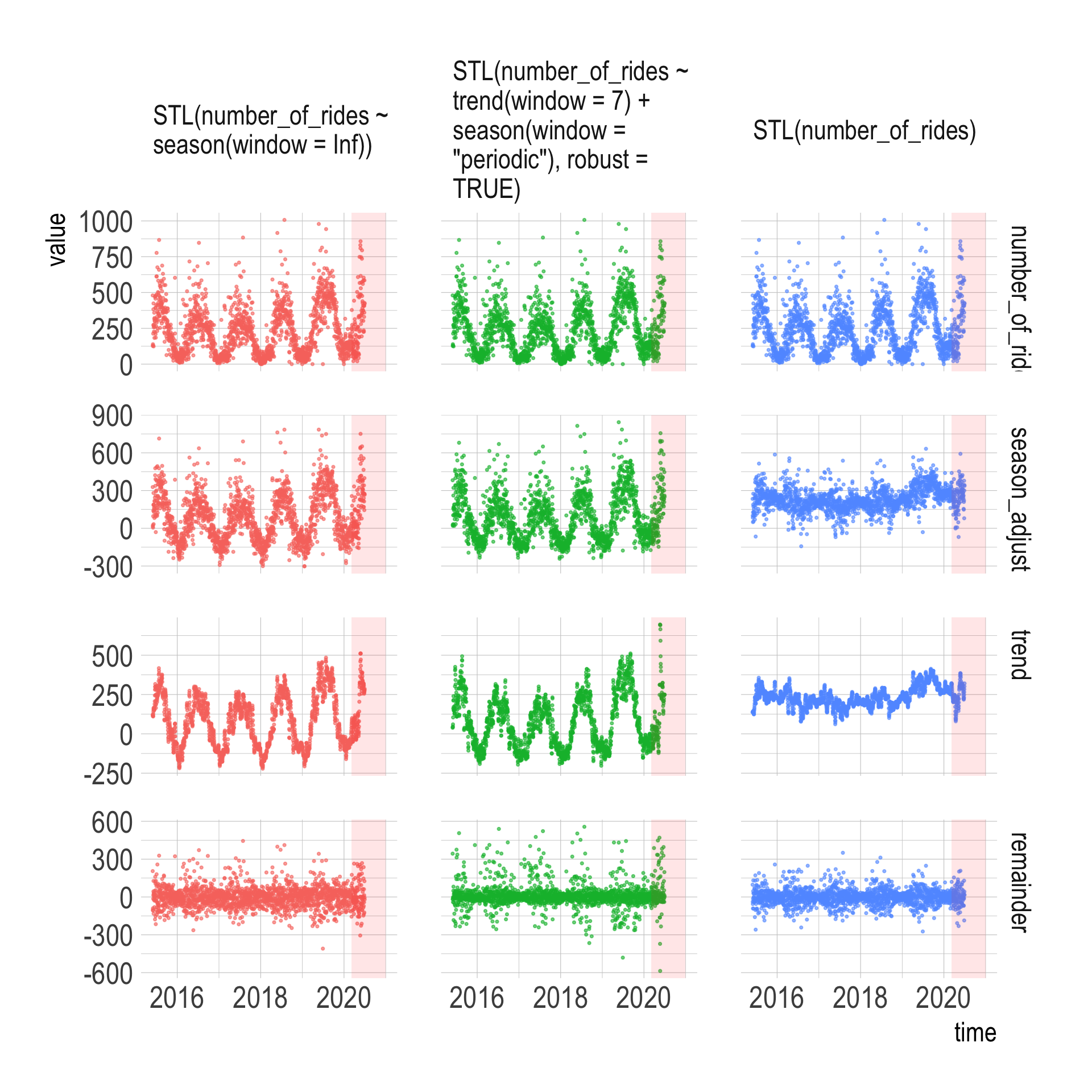
I am not a time series expert, but it appears that the most basic STL model STL(number_of_rides) does the best job because that model’s “trend” panel shows the least seasonality.
components(dcmp) %>%
  pivot_longer(cols = number_of_rides:season_adjust) %>%
  mutate(name = factor(name, levels = c("number_of_rides", "season_adjust",
                                        "trend", "seasonal",
                                        "season_year", "season_week",
                                        "random", "remainder"))) %>%
  filter(!is.na(value)) %>%
  filter(name == "trend" | name == "season_adjust" | name == "number_of_rides" | name == "remainder") %>%
  filter(.model == "STL(number_of_rides)") %>%
  ggplot(aes(time, value, color = .model)) +
  geom_point(alpha = .6, size = .6, color = "#619CFF") +
  annotate(geom = "rect",
           xmin = ymd("2016-03-06"), xmax = ymd("2016-03-30"),
           ymin = -Inf, ymax = Inf,
           fill = "black", alpha = .3) +
  annotate(geom = "rect",
           xmin = ymd("2017-03-06"), xmax = ymd("2017-03-30"),
           ymin = -Inf, ymax = Inf,
           fill = "black", alpha = .3) +
  annotate(geom = "rect",
           xmin = ymd("2018-03-06"), xmax = ymd("2018-03-30"),
           ymin = -Inf, ymax = Inf,
           fill = "black", alpha = .3) +
  annotate(geom = "rect",
           xmin = ymd("2019-03-06"), xmax = ymd("2019-03-30"),
           ymin = -Inf, ymax = Inf,
           fill = "black", alpha = .3) +
  annotate(geom = "rect",
           xmin = ymd("2020-03-06"), xmax = ymd("2020-03-06") + 60,
           ymin = -Inf, ymax = Inf,
           fill = "red", alpha = .3) +
  facet_grid(name ~ .model, scales = "free_y", labeller = label_wrap_gen()) +
  guides(color = FALSE)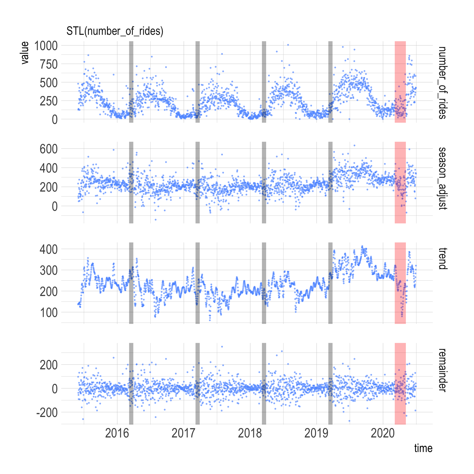
Focusing on that model, it appears that the trend dropped in mid-March, but rebounded to normal levels quickly. I highlighted the data from previous Marches to see if there was a recurring dip in March.