Premier League 538 SPI Ratings
538’s Soccer Power Index (SPI) rates the quality of soccer teams from a variety of leagues around the world. In this post I’ll use gganimate to animate team SPI over the past 3 seasons.
The SPI data is available on 538’s GitHub repo.
Set up the environment:
library(tidyverse)
library(purrr)
library(gganimate)
library(ggrepel)
library(broom)
library(lubridate)

theme_set(theme_minimal(base_size = 18))
Load the data and make the data long, instead of having different columns for home and away results:
data <- read_csv("https://projects.fivethirtyeight.com/soccer-api/club/spi_matches.csv")

df_home <- data %>%
  select(team1, date, league, spi1) %>%
  rename(team = team1,
         spi = spi1) %>%
  mutate(venue = "home")

df_away <- data %>%
  select(team2, date, league, spi2) %>%
  rename(team = team2,
         spi = spi2) %>%
  mutate(venue = "away")

df_all <- bind_rows(df_home, df_away) %>%
  filter(date < "2019-04-07") %>%
  arrange(league, team, date) %>%
  group_by(league, team) %>%
  mutate(team_game_number = dense_rank(date)) %>%
  ungroup()
Filter to EPL teams and add a season column:
df_epl <- df_all %>%
  filter(date < Sys.Date(),
         league == "Barclays Premier League")

season1 <- tibble(date = seq(ymd('2016-08-13'), ymd('2017-05-21'), by='days'),
                  season = 1)

season2 <- tibble(date = seq(ymd('2017-08-11'), ymd('2018-05-13'), by='days'),
                  season = 2)

season3 <- tibble(date = seq(ymd('2018-08-10'), ymd('2019-04-06'), by='days'),
                  season = 3)

seasons <- bind_rows(season1, season2, season3)

df_epl_smooth <- df_epl %>%
  left_join(seasons)
Calculate the smoothed SPI per team per season using loess:
df_epl_smooth <- df_epl_smooth %>%
  nest(-c(team, season)) %>%
  mutate(m = map(data, loess,
                          formula = spi ~ team_game_number, span = .5),
         spi_smooth = purrr::map(m, `[[`, "fitted"))

df_epl_smooth <- df_epl_smooth %>%
  select(-m) %>%
  unnest()

df_epl_last <- df_epl %>%
  group_by(team) %>%
  summarize(date = last(date),
            spi = last(spi))
Create the animation:
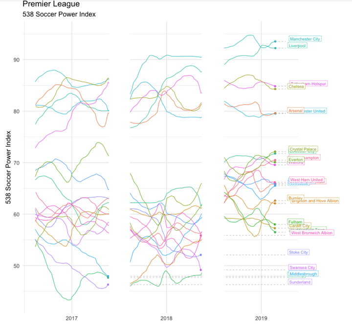
spi_smooth_gif <- df_epl_smooth %>%
  ggplot(aes(date, spi_smooth, color = team, group = team)) +
  geom_line() +
  geom_point(size = 2) +
  geom_segment(aes(xend = ymd("2019-04-05"), yend = spi_smooth), linetype = 2, colour = 'grey') +
  geom_label(aes(x = ymd("2019-04-05"), label = team),
             hjust = -.1,
             vjust = 0) +
  geom_rect(xmin = ymd("2017-05-25"), xmax = ymd("2017-08-12"),
            ymin = -Inf, ymax = Inf,
            fill = "white", color = "white") +
  geom_rect(xmin = ymd("2018-05-18"), xmax = ymd("2018-08-10"),
                ymin = -Inf, ymax = Inf, fill = "white", color = "white") +
  guides(color = FALSE) +
  labs(title = "Premier League",
       subtitle = "538 Soccer Power Index",
       x = NULL,
       y = "538 Soccer Power Index",
       caption = "@conor_tompkins") +
  transition_reveal(date) +
  coord_cartesian(clip = 'off') +
  theme(plot.margin = margin(5.5, 110, 5.5, 5.5))

animate(spi_smooth_gif, height = 900, width = 900, duration = 15, nframes = 300)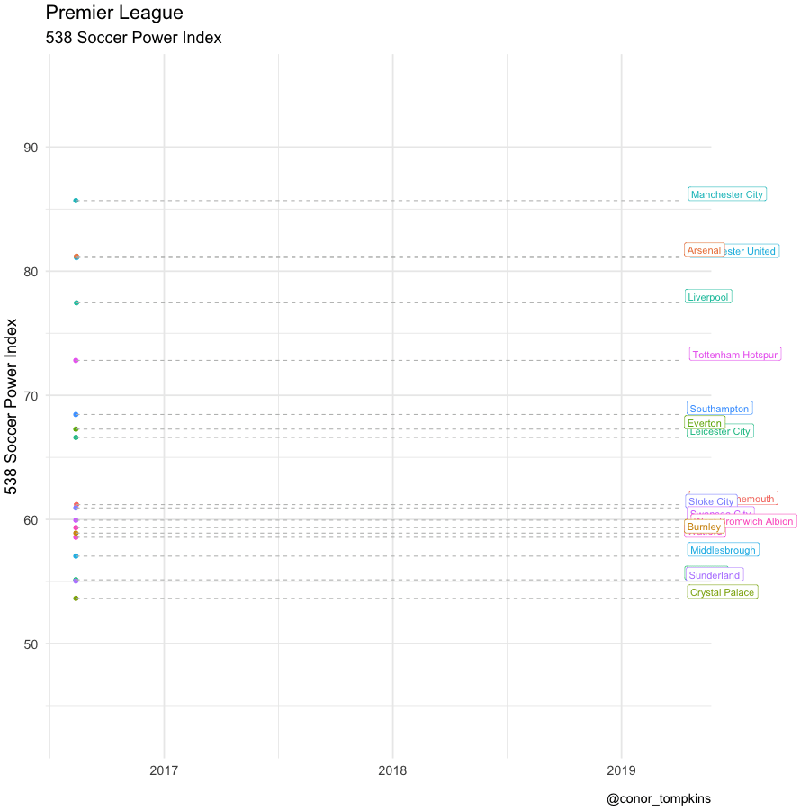
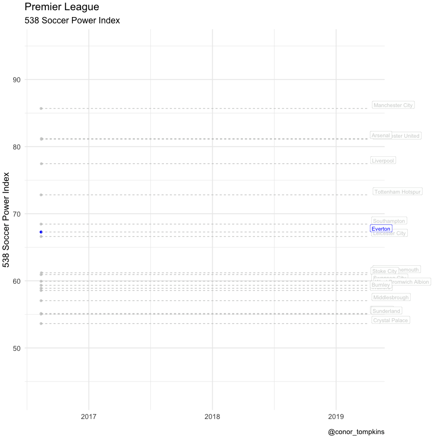
Observers of the EPL will know that in any given season there are 2-3 tiers of teams, given the economics and relegation structure of the league. In 2018 the difference between the top 6 and the rest of the league was particularly stark. This is partly due to the difficulties that Everton experienced after they sold Lukaku and signed older and less skilled players. This graph highlights Everton’s SPI:
everton_gif <- df_epl_smooth %>%
  mutate(everton_flag = case_when(team == "Everton" ~ "Everton",
                                  team != "Everton" ~ "")) %>%
  ggplot(aes(date, spi_smooth, color = everton_flag, group = team)) +
  geom_line() +
  geom_point(size = 2) +
  geom_segment(aes(xend = ymd("2019-04-05"), yend = spi_smooth), linetype = 2, colour = 'grey') +
  geom_label(aes(x = ymd("2019-04-05"), label = team),
             hjust = -.1,
             vjust = 0) +
  geom_rect(xmin = ymd("2017-05-25"), xmax = ymd("2017-08-12"),
            ymin = -Inf, ymax = Inf,
            fill = "white", color = "white") +
  geom_rect(xmin = ymd("2018-05-18"), xmax = ymd("2018-08-10"),
                ymin = -Inf, ymax = Inf, fill = "white", color = "white") +
  scale_color_manual(values = c("light grey", "blue")) +
  guides(color = FALSE) +
  labs(title = "Premier League",
       subtitle = "538 Soccer Power Index",
       x = NULL,
       y = "538 Soccer Power Index",
       caption = "@conor_tompkins") +
  transition_reveal(date) +
  coord_cartesian(clip = 'off') +
  theme(plot.margin = margin(5.5, 110, 5.5, 5.5))

animate(everton_gif, height = 900, width = 900, duration = 15, nframes = 300)