Networking USL Club Similarity With Euclidean Distance
Euclidean distance is a simple way to measure the distance between two points. It can also be used to measure how similar two sports teams are, given a set of variables. In this post, I use Euclidean distance to calculate the similarity between USL clubs and map that data to a network graph. I will use the 538 Soccer Power Index data to calculate the distance.
Setup
library(tidyverse)
library(broom)
library(ggraph)
library(tidygraph)
library(viridis)

set_graph_style()

set.seed(1234)
Download data
This code downloads the data from 538’s GitHub repo and does some light munging.
read_csv("https://projects.fivethirtyeight.com/soccer-api/club/spi_global_rankings.csv", progress = FALSE) %>%
  filter(league == "United Soccer League") %>%
  mutate(name = str_replace(name, "Arizona United", "Phoenix Rising")) -> df

df
## # A tibble: 35 x 7
## rank prev_rank name league off def spi
## <dbl> <dbl> <chr> <chr> <dbl> <dbl> <dbl>
## 1 263 257 Phoenix Rising United Soccer League 1.59 1.77 42.4
## 2 419 428 San Antonio FC United Soccer League 1.17 1.82 32.0
## 3 460 475 Pittsburgh Riverhounds United Soccer League 0.98 1.69 29.7
## 4 465 454 Tampa Bay Rowdies United Soccer League 0.96 1.67 29.7
## 5 478 482 Reno 1868 FC United Soccer League 1.06 1.92 27.9
## 6 498 496 Indy Eleven United Soccer League 0.81 1.66 26.2
## 7 505 489 Orange County SC United Soccer League 0.86 1.76 25.8
## 8 520 518 Louisville City FC United Soccer League 0.85 1.84 24.2
## 9 533 528 New Mexico United United Soccer League 0.9 2.01 22.9
## 10 534 532 Sacramento Republic FC United Soccer League 0.75 1.79 22.9
## # … with 25 more rowsCalculate Euclidean distance
This is the code that measures the distance between the clubs. It uses the 538 offensive and defensive ratings.
df %>%
  select(name, off, def) %>%
  column_to_rownames(var = "name") -> df_dist

#df_dist
#rownames(df_dist) %>%
#  head()

df_dist <- dist(df_dist, "euclidean", upper = FALSE, diag = FALSE)
#head(df_dist)

df_dist %>%
  tidy() %>%
  arrange(desc(distance)) -> df_dist

#df_dist %>%
#  count(item1, sort = TRUE) %>%
#  ggplot(aes(item1, n)) +
#  geom_point() +
#  coord_flip() +
#  theme_bw()
Network graph
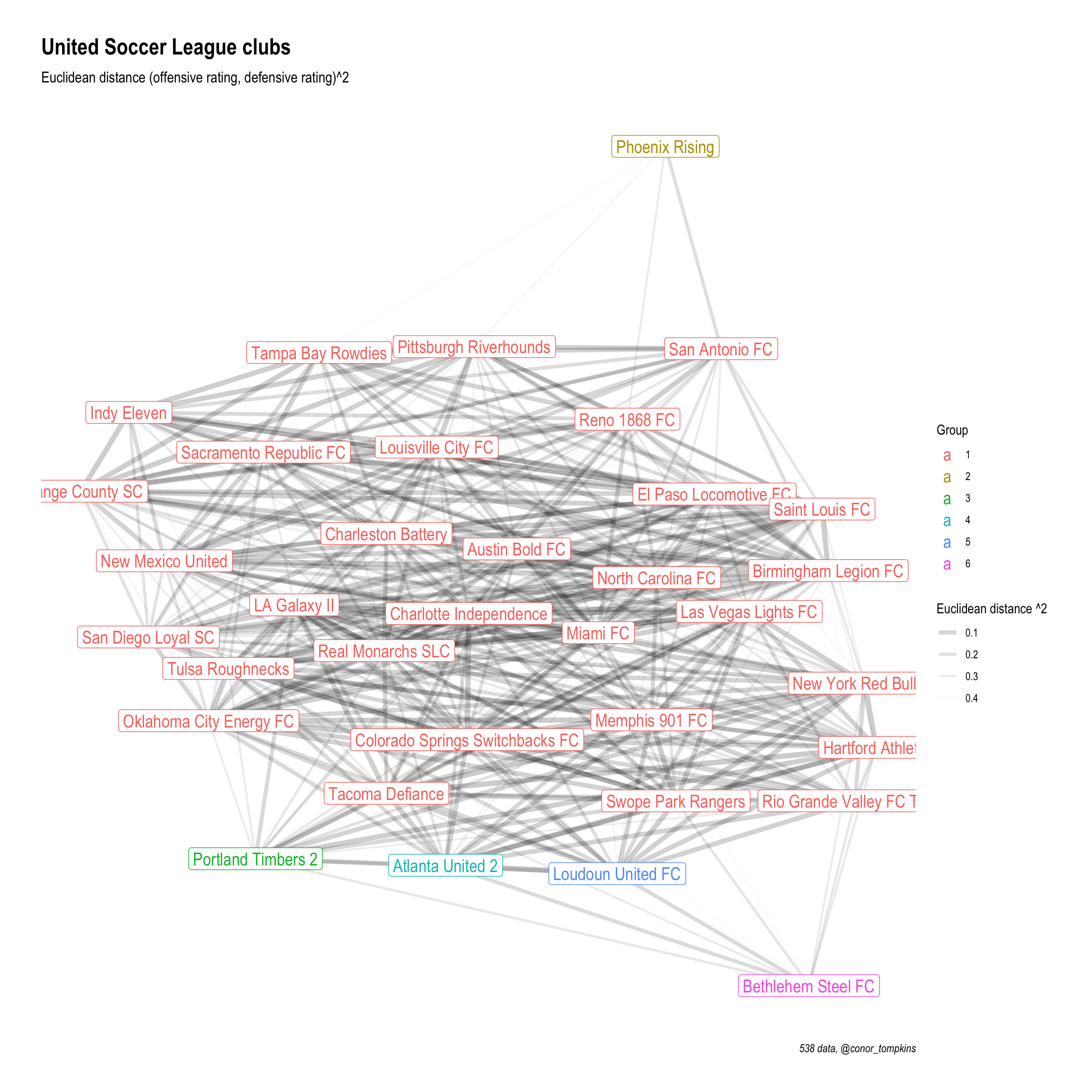
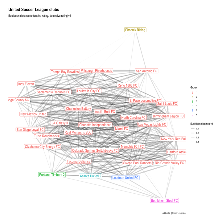
In this snippet I set a threshhold for how similar clubs need to be to warrant a connection. Then I graph it using tidygraph and ggraph. Teams that are closer together on the graph are more similar. Darker and thicker lines indicate higher similarity.
distance_filter <- .5

df_dist %>%
  mutate(distance = distance^2) %>%
  filter(distance <= distance_filter) %>%
  as_tbl_graph(directed = FALSE) %>%
  mutate(community = as.factor(group_edge_betweenness())) %>%
  ggraph(layout = "kk", maxiter = 1000) +
    geom_edge_fan(aes(edge_alpha = distance, edge_width = distance)) +
    geom_node_label(aes(label = name, color = community), size = 5) +
    scale_color_discrete("Group") +
    scale_edge_alpha_continuous("Euclidean distance ^2", range = c(.2, 0)) +
    scale_edge_width_continuous("Euclidean distance ^2", range = c(2, 0)) +
    labs(title = "United Soccer League clubs",
       subtitle = "Euclidean distance (offensive rating, defensive rating)^2",
       x = NULL,
       y = NULL,
       caption = "538 data, @conor_tompkins")