R 311 Pothole Workshop Code for Pittsburgh

Goals
- Learn how R works
- Gain basic skills for exploratory analysis with R
- Learn something about local data and potholes!
If we are successful, you should be able to hit the ground running on your own project with R
Setup
Install R from CRAN
- Use the default options in the installation process
Install RStudio from RStudio
- RStudio Desktop
What is R
R is an interpreted programming language for statistics
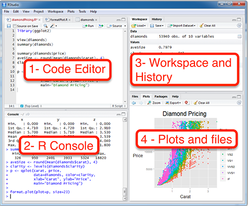
RStudio
Integrated Development Environment for R
- Code editor
- Console
- Workspace (Environment, History, Connections, Git)
- Plots and Files (Packages, Help, Viewer)
We will enter our code in the Code Editor panel. When you execute code in the code editor, the output is shown in the Console (or the Plots or Viewer) panel.
Install the tidyverse, lubridate, and ggmap packages
install.packages(c("tidyverse", "lubridate", "ggmap"))
#you will see activity in the console as the packages are installed
Create a folder called “R workshop”
Download the 311 data from the WPRDC
Move that CSV into the “R workshop” folder
How Does R Work?
Basic Functions
- add
- subtract
- strings
1## [1] 11 + 2## [1] 310 / 2## [1] 55 * 2## [1] 10"this is a string. strings in R are surrounded by quotation marks."## [1] "this is a string. strings in R are surrounded by quotation marks."Type matters
"1" + 1## Error in "1" + 1: non-numeric argument to binary operatorstr() checks the type of the object
str(1)## num 1str("1")## chr "1"Objects, Functions, and Assignment
Reminder that objects are shown in the Environment panel (top right panel)
x## Error in eval(expr, envir, enclos): object 'x' not foundYou assign values to objects using “<-”
x <- 1
x
## [1] 1Type out the object’s name and execute it to print it in the console
You can overwrite (or update) an object’s value
x <- 2
x
## [1] 2You can manipulate objects with operators
x <- 1
y <- 5

x + y
## [1] 6c() means “concatenate”. It creates vectors
a <- c(x, y)
a
## [1] 1 5: creates a sequence of numbers
1:10## [1] 1 2 3 4 5 6 7 8 9 10You can perform functions on objects
z <- sum(a)
z
## [1] 6Dataframes
Dataframes are rectangular objects that consist of rows and columns, similar to what you see in an Excel spreadsheet
my_df <- data.frame(a = 1:5,
                b = 6:10,
                c = c("a", "b", "c", "d", "e"))
my_df
## a b c
## 1 1 6 a
## 2 2 7 b
## 3 3 8 c
## 4 4 9 d
## 5 5 10 eSelect individual columns in a dataframe with the $ operator
my_df$a## [1] 1 2 3 4 5“<-” and “=” do the same thing. To minimize confusion, many people use “<-” for objects and “=” for assigning variables within functions or dataframes
x <- 1

z <- data.frame(a = 1:5,
                b = 6:10)
z
## a b
## 1 1 6
## 2 2 7
## 3 3 8
## 4 4 9
## 5 5 10Logic
“x == y” means “is x equal to y?”
1 == 2## [1] FALSE“!” means “not”
!FALSE## [1] TRUETRUE = 1, FALSE = 0
TRUE + FALSE## [1] 1TRUE + TRUE## [1] 2R is case-sensitive
"a" == "A"## [1] FALSELoading packages
library(package_name)You have to load your packages each time you start R. Do not use quotation marks in the library() function
Commenting
Any code that follows a “#” is treated as a comment, and is not executed
1 + 1## [1] 2#1 + 1
#code that is "commented out" will not be executedComment your code to make sure you understand it. It is aso useful to other people who use your code, including Future You.
Be kind to Future You. Comment your code.
Getting help with R
Use the built-in documentation. Put a “?” before the name of a function to access the documentation in the Help panel
?meanWorking Directory
The working directory is where your R scripts and your data are stored
How to set up the working directory
This command prints the current working directory
getwd()Use the menu to set up your working directory
Session menu -> Set working directory -> choose your folder
This command does the same thing
setwd()Compare to Excel
R separates the data from the analysis. The data is stored in files (CSV, JSON, etc). The analysis is stored in scripts. This makes it easier to share analysis performed in R. No need to take screenshots of your workflow in Excel. You have a record of everything that was done to the data. R also allows you to scale your analysis up to larger datasets and more complex workflows, where Excel would require lots of risky repetition of the same task.
What is the Tidyverse?
A group of R packages that use a common grammar for wrangling, analyzing, modeling, and graphing data
- Focus on dataframes
- Columns and rows
Key Tidyverse functions and operators
- select columns
- filter rows
- mutate new columns
- group_by and summarize rows
- ggplot2 your data
- The pipe %>%
library(tidyverse)## ── Attaching packages ──────────────── tidyverse 1.3.0 ──## ✓ ggplot2 3.3.2 ✓ purrr 0.3.4
## ✓ tibble 3.0.3 ✓ dplyr 1.0.2
## ✓ tidyr 1.1.2 ✓ stringr 1.4.0
## ✓ readr 1.3.1 ✓ forcats 0.5.0## ── Conflicts ─────────────────── tidyverse_conflicts() ──
## x dplyr::filter() masks stats::filter()
## x dplyr::lag() masks stats::lag()library(lubridate)##
## Attaching package: 'lubridate'## The following objects are masked from 'package:base':
##
## date, intersect, setdiff, unionread_csv() reads CSV files from your working directory
df <- read_csv("your_file_name_here.csv")## Parsed with column specification:
## cols(
## `_id` = col_double(),
## REQUEST_ID = col_double(),
## CREATED_ON = col_datetime(format = ""),
## REQUEST_TYPE = col_character(),
## REQUEST_ORIGIN = col_character(),
## STATUS = col_double(),
## DEPARTMENT = col_character(),
## NEIGHBORHOOD = col_character(),
## COUNCIL_DISTRICT = col_double(),
## WARD = col_double(),
## TRACT = col_double(),
## PUBLIC_WORKS_DIVISION = col_double(),
## PLI_DIVISION = col_double(),
## POLICE_ZONE = col_double(),
## FIRE_ZONE = col_character(),
## X = col_double(),
## Y = col_double(),
## GEO_ACCURACY = col_character()
## )colnames(df) <- tolower(colnames(df)) #make all the column names lowercase
#initial data munging to get the dates in shape
df %>%
mutate(date = ymd(str_sub(created_on, 1, 10)),
time = hms(str_sub(created_on, 11, 18)),
month = month(date, label = TRUE),
year = year(date),
yday = yday(date)) %>%
select(-c(created_on, time)) -> dfExplore the data
df #type the name of the object to preview it## # A tibble: 225,189 x 21
## `_id` request_id request_type request_origin status department neighborhood
## <dbl> <dbl> <chr> <chr> <dbl> <chr> <chr>
## 1 154245 54111 Rodent cont… Call Center 1 Animal Ca… Middle Hill
## 2 154246 53833 Rodent cont… Call Center 1 Animal Ca… Squirrel Hi…
## 3 154247 52574 Potholes Call Center 1 DPW - Str… Larimer
## 4 154248 54293 Building Wi… Control Panel 1 Permits, … <NA>
## 5 154249 53560 Potholes Call Center 1 DPW - Str… Homewood No…
## 6 154250 49519 Potholes Call Center 1 DPW - Str… Homewood No…
## 7 154251 49484 Potholes Call Center 1 DPW - Str… Homewood No…
## 8 154252 53787 Rodent cont… Call Center 1 Animal Ca… South Side …
## 9 154253 52887 Potholes Call Center 1 DPW - Str… East Hills
## 10 154254 53599 Rodent cont… Call Center 1 Animal Ca… East Allegh…
## # … with 225,179 more rows, and 14 more variables: council_district <dbl>,
## # ward <dbl>, tract <dbl>, public_works_division <dbl>, pli_division <dbl>,
## # police_zone <dbl>, fire_zone <chr>, x <dbl>, y <dbl>, geo_accuracy <chr>,
## # date <date>, month <ord>, year <dbl>, yday <dbl>glimpse(df) #get a summary of the dataframe## Rows: 225,189
## Columns: 21
## $ `_id` <dbl> 154245, 154246, 154247, 154248, 154249, 154250,…
## $ request_id <dbl> 54111, 53833, 52574, 54293, 53560, 49519, 49484…
## $ request_type <chr> "Rodent control", "Rodent control", "Potholes",…
## $ request_origin <chr> "Call Center", "Call Center", "Call Center", "C…
## $ status <dbl> 1, 1, 1, 1, 1, 1, 1, 1, 1, 1, 1, 1, 1, 1, 1, 1,…
## $ department <chr> "Animal Care & Control", "Animal Care & Control…
## $ neighborhood <chr> "Middle Hill", "Squirrel Hill North", "Larimer"…
## $ council_district <dbl> 6, 8, 9, NA, 9, 9, 9, 3, 9, 1, 4, 4, 9, 9, 9, 7…
## $ ward <dbl> 5, 14, 12, NA, 13, 13, 13, 16, 13, 23, 19, 32, …
## $ tract <dbl> 42003050100, 42003140300, 42003120800, NA, 4200…
## $ public_works_division <dbl> 3, 3, 2, NA, 2, 2, 2, 4, 2, 1, 4, 4, 2, 2, 2, 2…
## $ pli_division <dbl> 5, 14, 12, NA, 13, 13, 13, 16, 13, 23, 19, 32, …
## $ police_zone <dbl> 2, 4, 5, NA, 5, 5, 5, 3, 5, 1, 6, 3, 5, 5, 4, 5…
## $ fire_zone <chr> "2-1", "2-18", "3-12", NA, "3-17", "3-17", "3-1…
## $ x <dbl> -79.97765, -79.92450, -79.91455, NA, -79.89539,…
## $ y <dbl> 40.44579, 40.43986, 40.46527, NA, 40.45929, 40.…
## $ geo_accuracy <chr> "APPROXIMATE", "APPROXIMATE", "EXACT", "OUT_OF_…
## $ date <date> 2016-03-10, 2016-03-09, 2016-03-03, 2016-03-11…
## $ month <ord> Mar, Mar, Mar, Mar, Mar, Feb, Feb, Mar, Mar, Ma…
## $ year <dbl> 2016, 2016, 2016, 2016, 2016, 2016, 2016, 2016,…
## $ yday <dbl> 70, 69, 63, 71, 68, 53, 53, 69, 64, 68, 69, 71,…The pipe
%>% means “and then”
%>% passes the dataframe to the next function
select
select() selects the columns you want to work with. You can also exclude columns using “-”
df %>% #select the dataframe
  select(date, request_type) #select the date and request_type columns
## # A tibble: 225,189 x 2
## date request_type
## <date> <chr>
## 1 2016-03-10 Rodent control
## 2 2016-03-09 Rodent control
## 3 2016-03-03 Potholes
## 4 2016-03-11 Building Without a Permit
## 5 2016-03-08 Potholes
## 6 2016-02-22 Potholes
## 7 2016-02-22 Potholes
## 8 2016-03-09 Rodent control
## 9 2016-03-04 Potholes
## 10 2016-03-08 Rodent control
## # … with 225,179 more rowsfilter
filter() uses logic to include or exclude rows based on the criteria you set
You can translate the following code into this English sentence: Take our dataframe “df”, and then select the date and request_type columns, and then filter only the rows where the request_type is “Potholes”.
df %>%
  select(date, request_type) %>%
  filter(request_type == "Potholes") #use the string "Potholes" to filter the dataframe
## # A tibble: 31,735 x 2
## date request_type
## <date> <chr>
## 1 2016-03-03 Potholes
## 2 2016-03-08 Potholes
## 3 2016-02-22 Potholes
## 4 2016-02-22 Potholes
## 5 2016-03-04 Potholes
## 6 2016-03-11 Potholes
## 7 2016-03-08 Potholes
## 8 2016-03-08 Potholes
## 9 2016-03-08 Potholes
## 10 2016-03-08 Potholes
## # … with 31,725 more rowsmutate
mutate() adds new columns, or modifies existing columns
df %>%
  select(date, request_type) %>%
  filter(request_type == "Potholes") %>%
  mutate(weekday = wday(date, label = TRUE)) #add the wday column for day of the week
## # A tibble: 31,735 x 3
## date request_type weekday
## <date> <chr> <ord>
## 1 2016-03-03 Potholes Thu
## 2 2016-03-08 Potholes Tue
## 3 2016-02-22 Potholes Mon
## 4 2016-02-22 Potholes Mon
## 5 2016-03-04 Potholes Fri
## 6 2016-03-11 Potholes Fri
## 7 2016-03-08 Potholes Tue
## 8 2016-03-08 Potholes Tue
## 9 2016-03-08 Potholes Tue
## 10 2016-03-08 Potholes Tue
## # … with 31,725 more rowsgroup_by and summarize
group_by() and summarize() allow you to gather groups of rows and perform functions on them
Typical functions
- sum()
- mean()
- sd() standard deviation
- n() the number of rows
(df %>%
  select(date, request_type) %>% #select columns
  filter(request_type == "Potholes") %>% #filter by "Potholes"
  mutate(month = month(date, label = TRUE)) %>% #add month column
  group_by(request_type, month) %>% #group by the unqiue request_type values and month values
  summarize(count = n()) %>% #summarize to count the number of rows in each combination of request_type and month
  arrange(desc(count)) -> df_potholes_month) #arrange the rows by the number of requests
## `summarise()` regrouping output by 'request_type' (override with `.groups` argument)## # A tibble: 12 x 3
## # Groups: request_type [1]
## request_type month count
## <chr> <ord> <int>
## 1 Potholes Feb 5569
## 2 Potholes Mar 3961
## 3 Potholes Apr 3873
## 4 Potholes May 3388
## 5 Potholes Jan 3089
## 6 Potholes Jun 2896
## 7 Potholes Jul 2688
## 8 Potholes Aug 1913
## 9 Potholes Nov 1344
## 10 Potholes Sep 1260
## 11 Potholes Oct 1113
## 12 Potholes Dec 641Put your code in parentheses to execute it AND print the output in the console
Making graphs with 311 data
ggplot2
- aesthetics (the columns you want to graph with)
- geoms (the shapes you want to use to graph the data)
ggplot(data = _ , aes(x = _, y = _)) +
  geom_()
Graph the number of pothole requests per month
ggplot(data = df_potholes_month, aes(x = month, y = count)) +
  geom_col()
Pipe your data directly into ggplot2
df_potholes_month %>%
  ggplot(aes(x = month, y = count)) + #put the month column on the x axis, count on the y axis
  geom_col() #graph the data with columns
Make it pretty. Add a title, subtitle, axes labels, captions, and themes
df_potholes_month %>%
  ggplot(aes(month, count)) +
  geom_col() +
  labs(title = "Pothole requests to Pittsburgh 311",
       x = "",
       y = "Number of requests",
       caption = "Source: Western Pennsylvania Regional Datacenter") +
  theme_bw()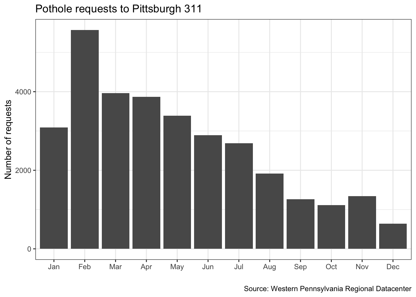
One problems with this graph is that the data is not complete for the years 2015 and 2018
df %>%
  distinct(year, date) %>% #get the unique combinations of year and date
  count(year) #shortcut for group_by + summarize for counting. returns column "n". calculate how many days of data each year has
## # A tibble: 4 x 2
## year n
## <dbl> <int>
## 1 2015 231
## 2 2016 366
## 3 2017 365
## 4 2018 100Instead of plotting the raw sum, we can calculate and plot the mean number of requests per month
(df %>%
  filter(date >= "2016-01-01", #only select the rows where the date is after 2016-01-01 and before 2018-01-1
         date <= "2018-01-01",
         request_type == "Potholes") %>%
  count(request_type, year, month) -> df_filtered)
## # A tibble: 24 x 4
## request_type year month n
## <chr> <dbl> <ord> <int>
## 1 Potholes 2016 Jan 222
## 2 Potholes 2016 Feb 594
## 3 Potholes 2016 Mar 973
## 4 Potholes 2016 Apr 759
## 5 Potholes 2016 May 822
## 6 Potholes 2016 Jun 784
## 7 Potholes 2016 Jul 604
## 8 Potholes 2016 Aug 556
## 9 Potholes 2016 Sep 364
## 10 Potholes 2016 Oct 318
## # … with 14 more rowsdf_filtered %>%
group_by(month) %>%
summarize(mean_requests = mean(n)) -> df_filtered_months## `summarise()` ungrouping output (override with `.groups` argument)df_filtered_months %>%
ggplot(aes(month, mean_requests)) +
geom_col() +
labs(title = "Pothole requests to Pittsburgh 311",
x = "",
y = "Mean number of requests",
caption = "Source: Western Pennsylvania Regional Datacenter") +
theme_bw()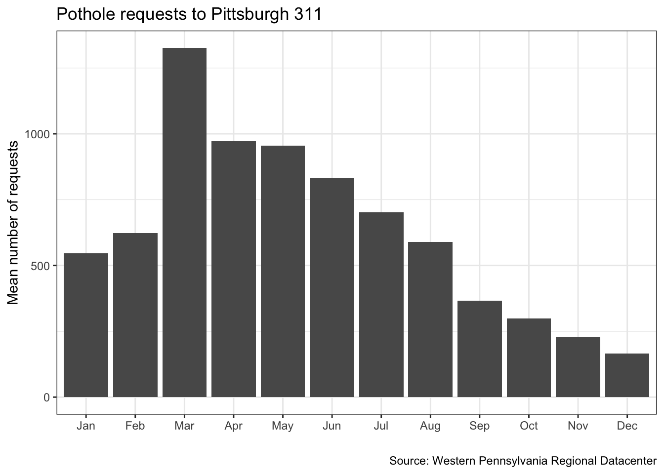
Make a line graph of the number of pothole requests in the dataset by date
df %>%
  filter(request_type == "Potholes") %>%
  count(date) #group_by and summarize the number of rows per date
## # A tibble: 983 x 2
## date n
## <date> <int>
## 1 2015-04-20 119
## 2 2015-04-21 101
## 3 2015-04-22 109
## 4 2015-04-23 102
## 5 2015-04-24 84
## 6 2015-04-27 85
## 7 2015-04-28 101
## 8 2015-04-29 107
## 9 2015-04-30 83
## 10 2015-05-01 66
## # … with 973 more rows#assign labels to objects to save some typing
my_title <- "Pothole requests to Pittsburgh 311"
my_caption <- "Source: Western Pennsylvania Regional Datacenter"
df %>%
filter(request_type == "Potholes") %>%
count(date) %>%
ggplot(aes(date, n)) +
geom_line() + #use a line to graph the data
labs(title = my_title, #use the object you created earlier
x = "",
y = "Number of requests",
caption = my_caption) + #use the object you created earlier
theme_bw(base_size = 18) #base_family modifies the size of the font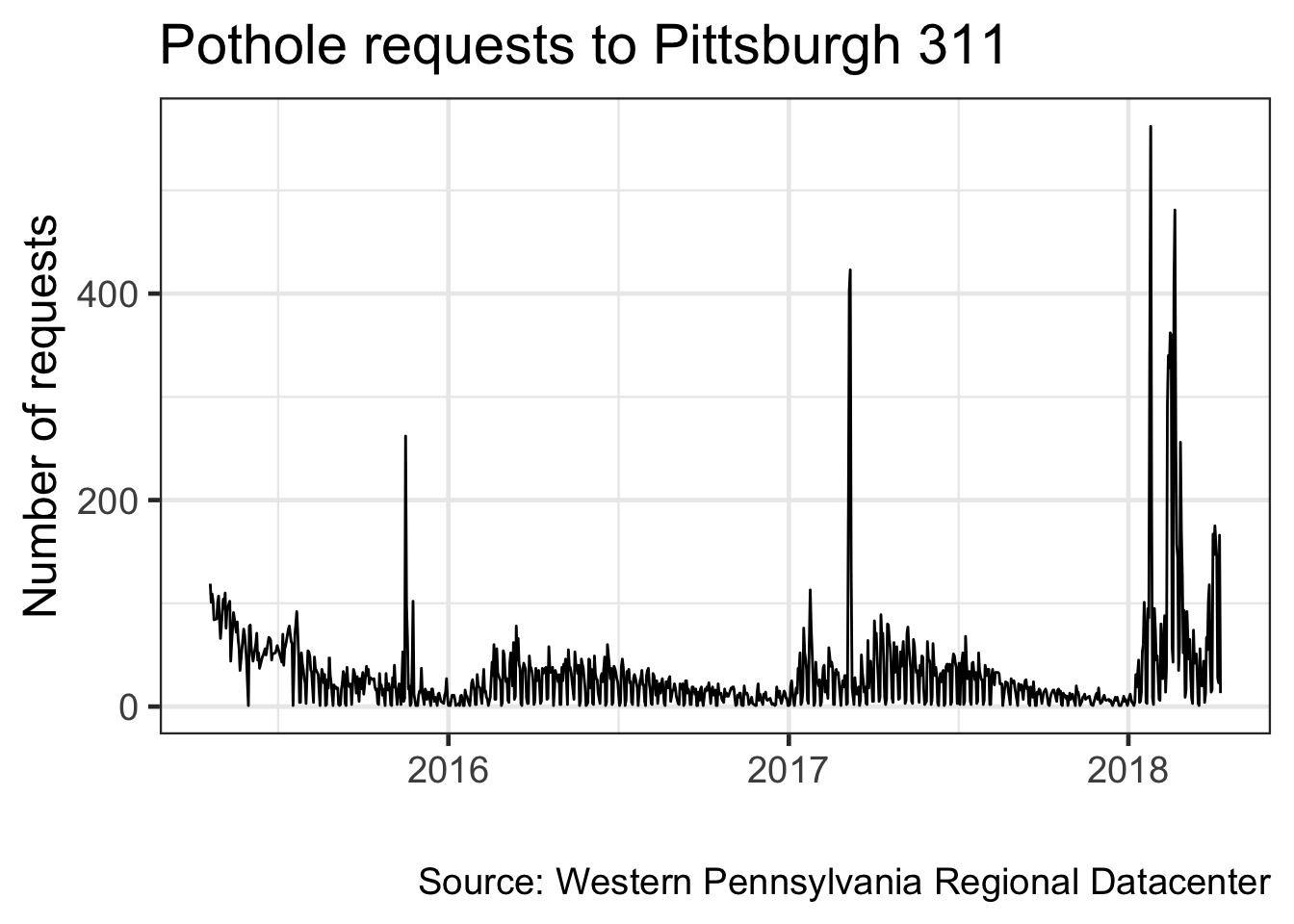
Note that ggplot2 automatically formats the axis labels for dates
Graph the data by number of requests per day of the year
(df %>%
  select(request_type, date) %>%
  filter(request_type == "Potholes") %>%
  mutate(year = year(date), #create a year column
         yday = yday(date)) %>% #create a day of the year column
  count(year, yday) -> df_day_of_year)
## # A tibble: 983 x 3
## year yday n
## <dbl> <dbl> <int>
## 1 2015 110 119
## 2 2015 111 101
## 3 2015 112 109
## 4 2015 113 102
## 5 2015 114 84
## 6 2015 117 85
## 7 2015 118 101
## 8 2015 119 107
## 9 2015 120 83
## 10 2015 121 66
## # … with 973 more rowsdf_day_of_year %>%
ggplot(aes(yday, n, group = year)) + #color the lines by year. as.factor() turns the year column from integer to factor, which has an inherent order
geom_line() +
labs(title = my_title,
x = "Day of the year",
y = "Number of requests",
caption = my_caption) +
theme_bw(base_size = 18)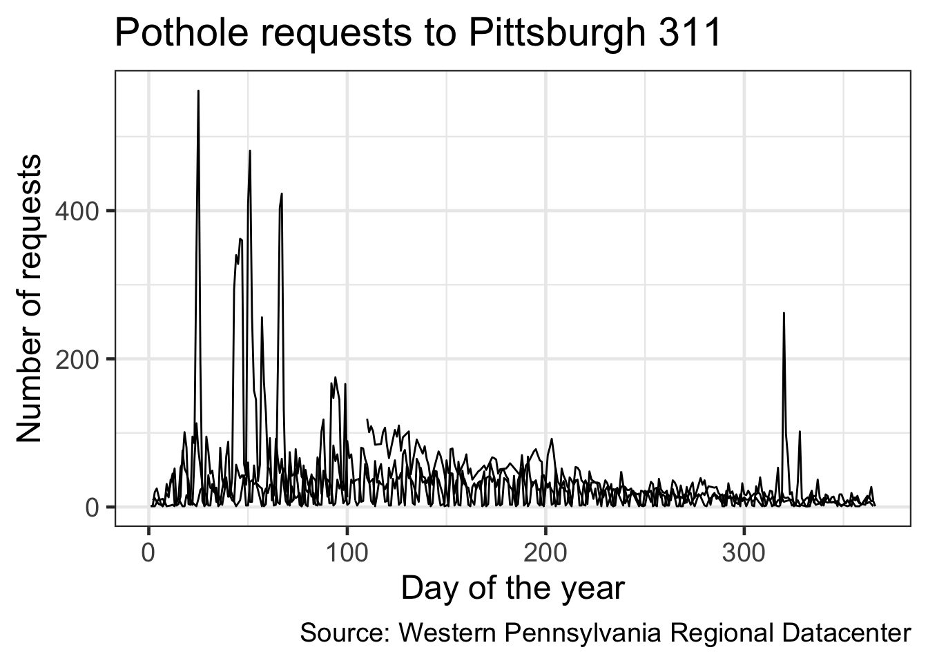
That plotted a line for each year, but there is no way to tell which line corresponds with which year
Color the lines by the year
df_day_of_year %>%
  ggplot(aes(yday, n, color = as.factor(year))) + #color the lines by year. #as.factor() turns the year column from integer to factor (ordinal string)
  geom_line() +
  labs(title = my_title,
       x = "Day of the year",
       y = "Number of requests",
       caption = my_caption) +
  theme_bw(base_size = 18)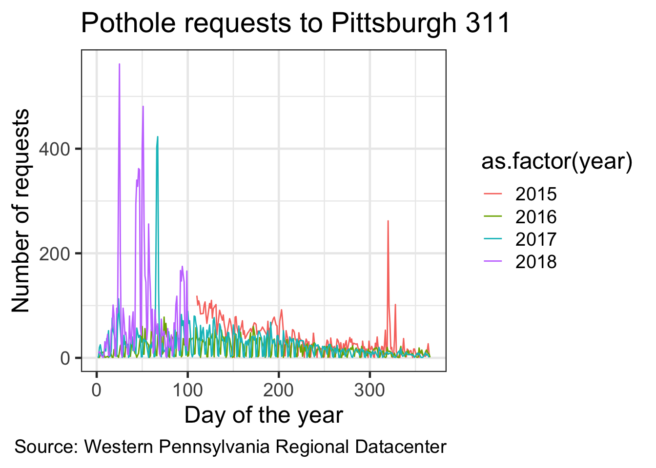
Graph the cumulative sum of pothole requests per year
(df %>%
  select(request_type, date) %>%
  filter(request_type == "Potholes") %>%
  mutate(year = year(date),
         yday = yday(date)) %>%
  arrange(date) %>% #always arrange your data for cumulative sums
  group_by(year, yday) %>%
  summarize(n = n()) %>%
  ungroup() %>% #ungroup () resets whatever grouping you had before
  group_by(year) %>%
  mutate(cumsum = cumsum(n)) -> df_cumulative_sum) #calculate the cumulative sum per year
## `summarise()` regrouping output by 'year' (override with `.groups` argument)## # A tibble: 983 x 4
## # Groups: year [4]
## year yday n cumsum
## <dbl> <dbl> <int> <int>
## 1 2015 110 119 119
## 2 2015 111 101 220
## 3 2015 112 109 329
## 4 2015 113 102 431
## 5 2015 114 84 515
## 6 2015 117 85 600
## 7 2015 118 101 701
## 8 2015 119 107 808
## 9 2015 120 83 891
## 10 2015 121 66 957
## # … with 973 more rowsdf_cumulative_sum %>%
ggplot(aes(yday, cumsum, color = as.factor(year))) +
geom_line(size = 2) +
labs(title = my_title,
x = "Day of the year",
y = "Cumulative sum of requests",
caption = my_caption) +
scale_color_discrete("Year") +
theme_bw(base_size = 18)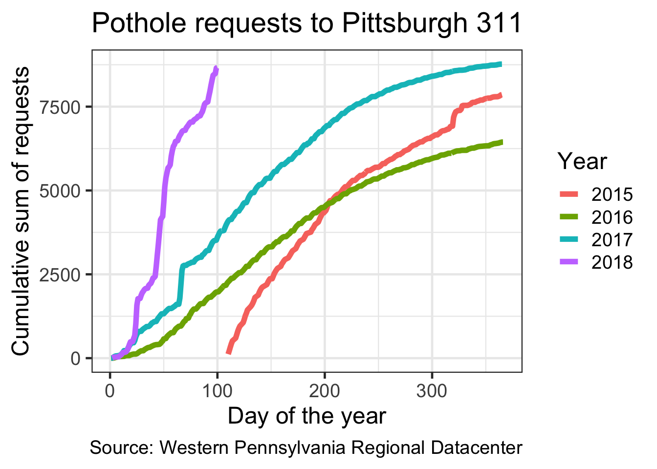
Making an area chart
Since 2015 and 2018 have incomplete data, filter them out
df %>%
  count(request_type, sort = TRUE) %>%
  top_n(5) %>% #select the top 5 request types
  ungroup() -> df_top_requests
df %>%
filter(date >= "2016-01-01", #only select the rows where the date is after 2016-01-01 and before 2018-01-1
date <= "2018-01-01") %>%
semi_join(df_top_requests) %>% #joins are ways to combine two dataframes
count(request_type, month) %>%
ggplot(aes(month, n, group = request_type, fill = request_type)) +
geom_area() +
scale_fill_discrete("Request type") + #change the name of the color legend
scale_y_continuous(expand = c(0, 0)) + #remove the padding around the edges
scale_x_discrete(expand = c(0, 0)) +
labs(title = "Top 5 types of 311 requests in Pittsburgh",
subtitle = "2016 to 2017",
x = "",
y = "Number of requests",
caption = my_caption) +
theme_bw(base_size = 18) +
theme(panel.grid = element_blank()) #remove the gridlines fom the plot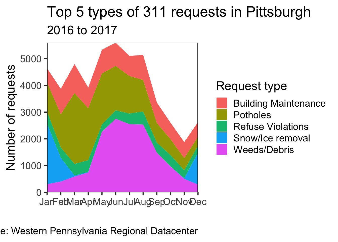
Faceting
Facets allow you to split a chart by a variable
Where do pothole requests come from?
df %>%
  count(request_origin, sort = TRUE)
## # A tibble: 10 x 2
## request_origin n
## <chr> <int>
## 1 Call Center 143716
## 2 Website 41106
## 3 Control Panel 26144
## 4 Report2Gov iOS 6272
## 5 Twitter 4425
## 6 Report2Gov Android 2371
## 7 Text Message 1086
## 8 Report2Gov Website 42
## 9 Email 22
## 10 QAlert Mobile iOS 5Make a line chart for the number of requests per day
Use facets to distinguish where the request came from
df %>%
  select(date, request_type, request_origin) %>%
  filter(request_type == "Potholes") %>%
  count(date, request_type, request_origin) %>%
  ggplot(aes(x = date, y = n)) +
    geom_line() +
    facet_wrap(~request_origin) + #facet by request_origin
    labs(title = my_title,
         subtitle = "By Request Origin",
         x = "",
         y = "Number of requests",
         caption = my_caption) +
    theme_bw(base_size = 18)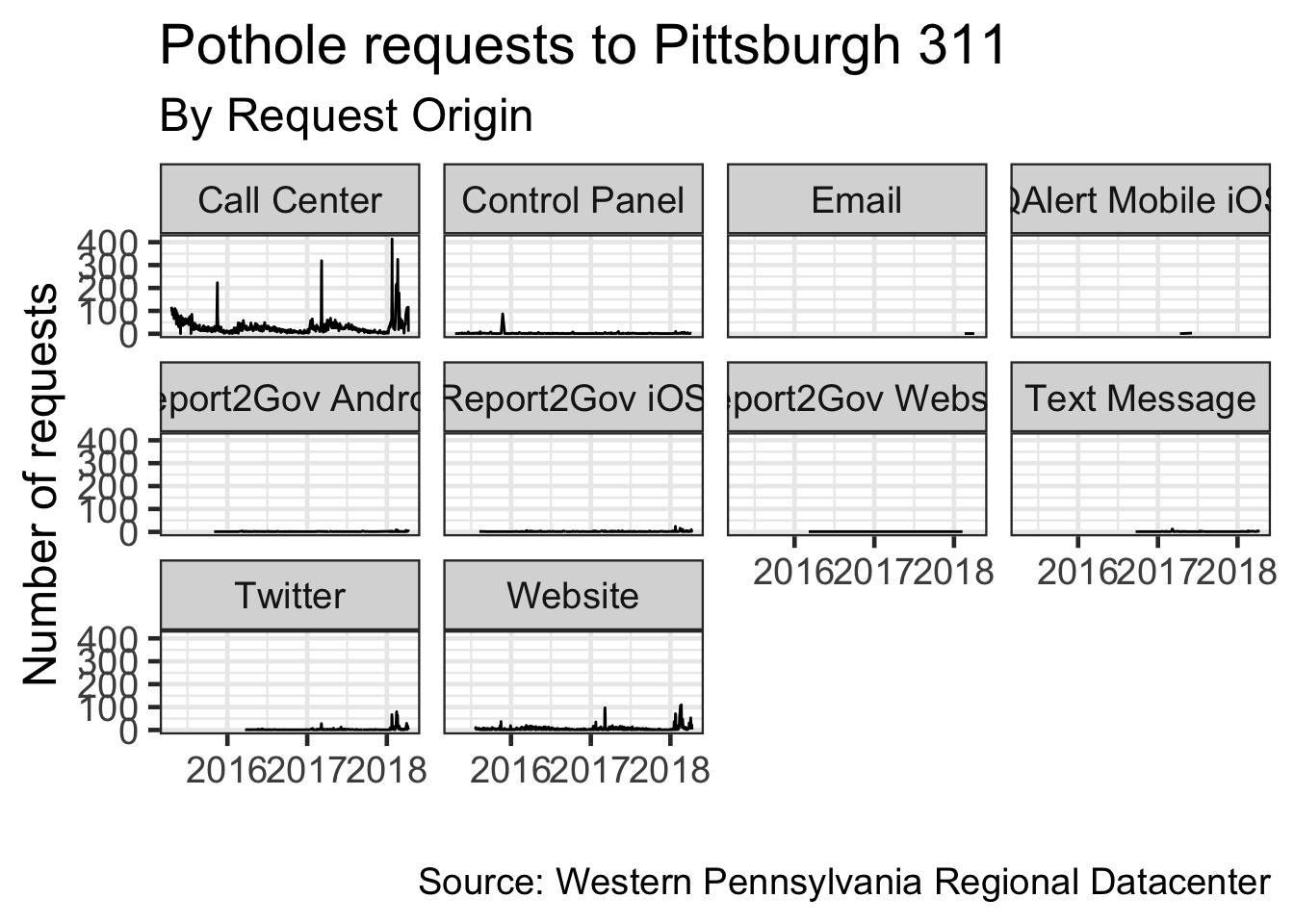
Mapping
Load the ggmap package, which works with ggplot2
library(ggmap)## Google's Terms of Service: https://cloud.google.com/maps-platform/terms/.## Please cite ggmap if you use it! See citation("ggmap") for details.Select the request_type, x, and y columns. x and y are longitude and latitude
(df %>%
  select(request_type, x, y) %>%
  filter(!is.na(x), !is.na(y),
         request_type == "Potholes") -> df_map) #remove missing x and y values
## # A tibble: 31,735 x 3
## request_type x y
## <chr> <dbl> <dbl>
## 1 Potholes -79.9 40.5
## 2 Potholes -79.9 40.5
## 3 Potholes -79.9 40.5
## 4 Potholes -79.9 40.5
## 5 Potholes -79.9 40.5
## 6 Potholes -80.0 40.4
## 7 Potholes -79.9 40.5
## 8 Potholes -79.9 40.5
## 9 Potholes -79.9 40.5
## 10 Potholes -79.9 40.5
## # … with 31,725 more rowspgh_coords <- c(lon = -79.9, lat = 40.4)
city_map <- get_googlemap(pgh_coords, zoom = 11)## Source : https://maps.googleapis.com/maps/api/staticmap?center=40.4,-79.9&zoom=11&size=640x640&scale=2&maptype=terrain&key=xxx(city_map <- ggmap(city_map))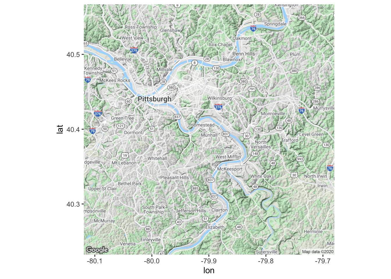
Put the data on the map
city_map +
  geom_point(data = df_map, aes(x, y, color = request_type)) #graph the data with dots
There is too much data on the graph. Make the dots more transparent to show density
city_map +
  geom_point(data = df_map, aes(x, y, color = request_type), alpha = .1) #graph the data with dots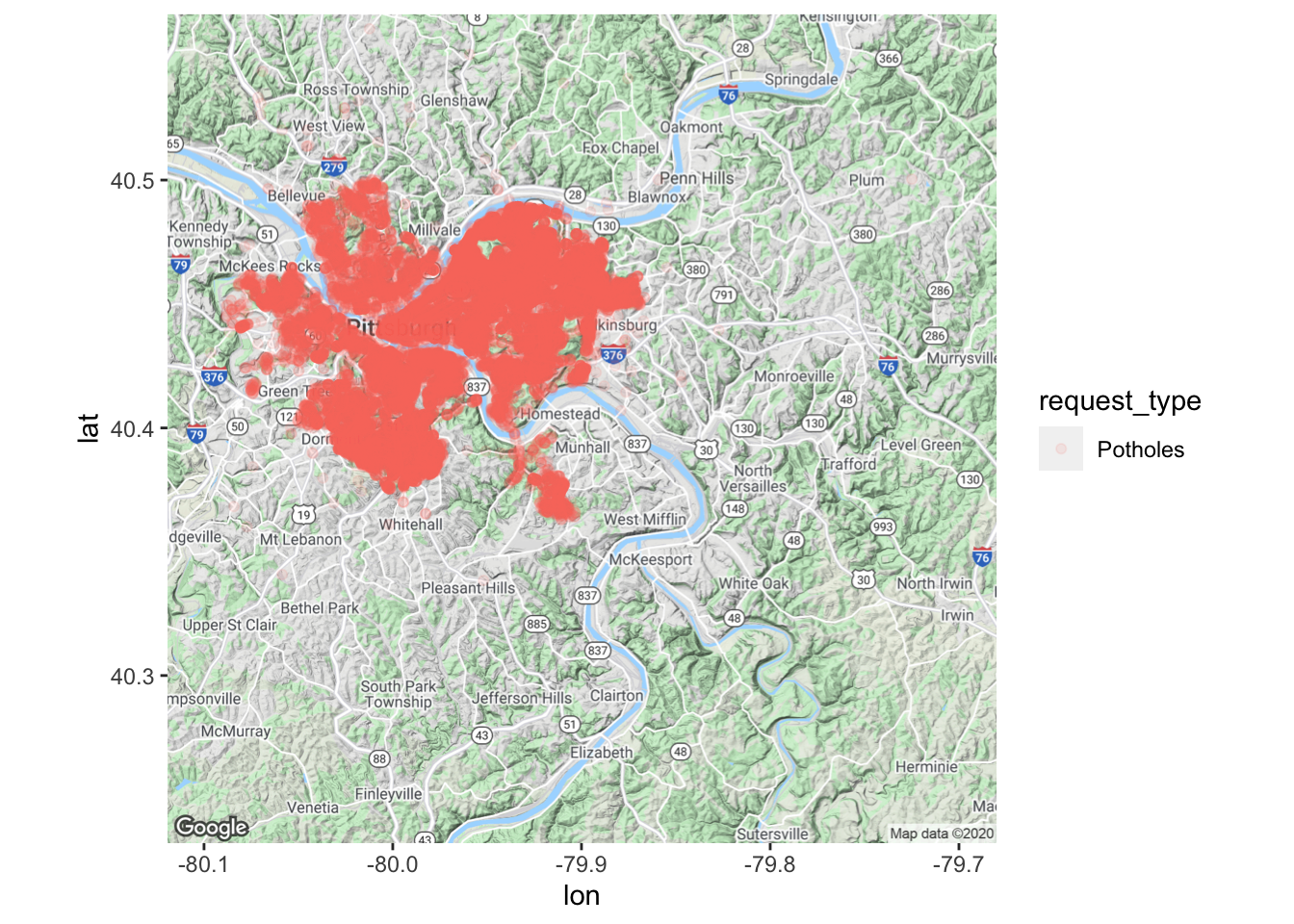
Still not great
Density plots are better for showing overplotted data
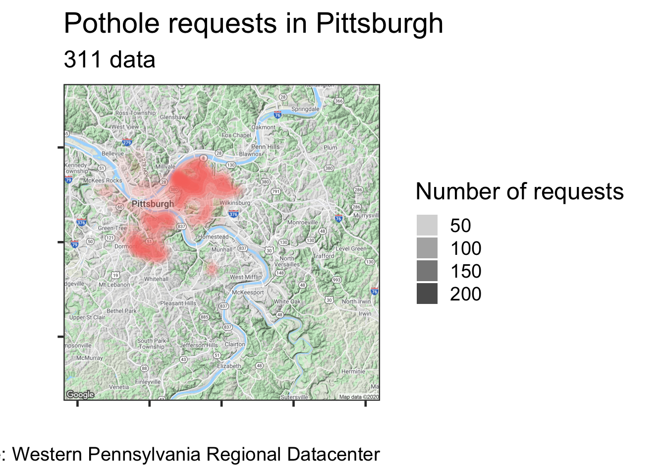
#Put the data on the map
city_map +
  stat_density_2d(data = df_map, #Using a 2d density contour
                  aes(x, #longitude
                      y, #latitude,
                      fill = request_type,
                      alpha = ..level..), #Use alpha so you can see the map under the data
                  geom = "polygon") + #We want the contour in a polygon
  scale_alpha_continuous(range = c(.1, 1)) + #manually set the range for the alpha
  guides(alpha = guide_legend("Number of requests"),
         fill = FALSE) +
  labs(title = "Pothole requests in Pittsburgh",
       subtitle = "311 data",
       x = "",
       y = "",
       caption = my_caption) +
  theme_bw(base_size = 18) +
  theme(axis.text = element_blank())