Animating Growth of Allegheny County
In this post I will show how to create animated graphs that illustrate the increase in buildings in Allegheny County.
One caveat about the data: it only includes parcels that were sold at some point. If the parcel was not sold, it is not included in this data. For example, a structure that was torn down and replaced but was not sold is not included. It is also reasonable to assume that the data quality decreases the older the records are. There may be a large amount of missing data.
The shapefiles for the parcels come from Pennsylvania Spatial Data Access.
The data about the construction dates comes from the WPRDC’s Parcels n’at dashboard. To get the relevant data, draw a box around entire county, select the “Year Built” field in the Property Assessments section, and then download the data. It will take a while to download data for the entire county.
Set up the environment:
library(tidyverse)
library(janitor)
library(broom)
library(sf)
library(scales)
library(gganimate)
library(lwgeom)

options(scipen = 999, digits = 4)

theme_set(theme_bw())

my_caption <- "@conor_tompkins - data from @WPRDC"
This reads in data about the land parcel (lot lines):
df <- read_csv("data/parcel_data.csv", progress = FALSE) %>%
  clean_names() %>%
  select(-geom)
This reads in the parcel geometry
file <- "data/AlleghenyCounty_Parcels202008/AlleghenyCounty_Parcels202008.shp"
file
## [1] "data/AlleghenyCounty_Parcels202008/AlleghenyCounty_Parcels202008.shp"shapefile <- st_read(file)## Reading layer `AlleghenyCounty_Parcels202008' from data source `/Users/conortompkins/github_repos/blog_hugo_academic/content/post/animating-growth-of-allegheny-county/data/AlleghenyCounty_Parcels202008/AlleghenyCounty_Parcels202008.shp' using driver `ESRI Shapefile'
## Simple feature collection with 582504 features and 9 fields
## geometry type: MULTIPOLYGON
## dimension: XY
## bbox: xmin: 1241000 ymin: 321300 xmax: 1430000 ymax: 497900
## projected CRS: NAD83 / Pennsylvania South (ftUS)Next we have to clean up the parcel geometry:
valid_check <- shapefile %>%
  slice(1:nrow(shapefile)) %>%
  pull(geometry) %>%
  map(st_is_valid) %>%
  unlist()

shapefile$validity_check <- valid_check

shapefile <- shapefile %>%
  filter(validity_check == TRUE)
shapefile <- shapefile %>%
st_make_valid() %>%
clean_names() %>%
mutate(pin = as.character(pin))Then, join the parcel geometry and parcel data:
parcel_data <- shapefile %>%
  left_join(df)
This turns the parcel geometry into (x, y) coordinates:
centroids <- parcel_data %>%
  st_centroid() %>%
  st_coordinates() %>%
  as_tibble() %>%
  clean_names()
We can plot the coordinates to confirm that the locations make sense:
centroids %>%
  distinct(x, y) %>%
  ggplot(aes(x, y)) +
  geom_point(size = .1, alpha = .1) +
  theme_void() +
  coord_equal()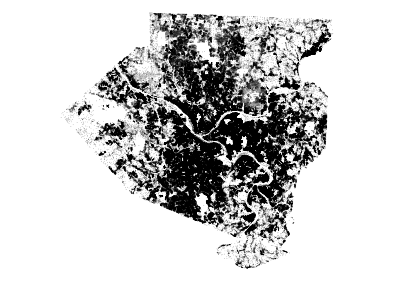
This plot shows that there is one row where yearblt_asmt is zero. That doesn’t make sense, so we will exclude it later.
df %>%
  ggplot(aes(yearblt_asmt)) +
  geom_density() +
  geom_rug() +
  labs(title = "Structures in Allegheny County",
       x = "Year built",
       y = "Density",
       subtitle = my_caption)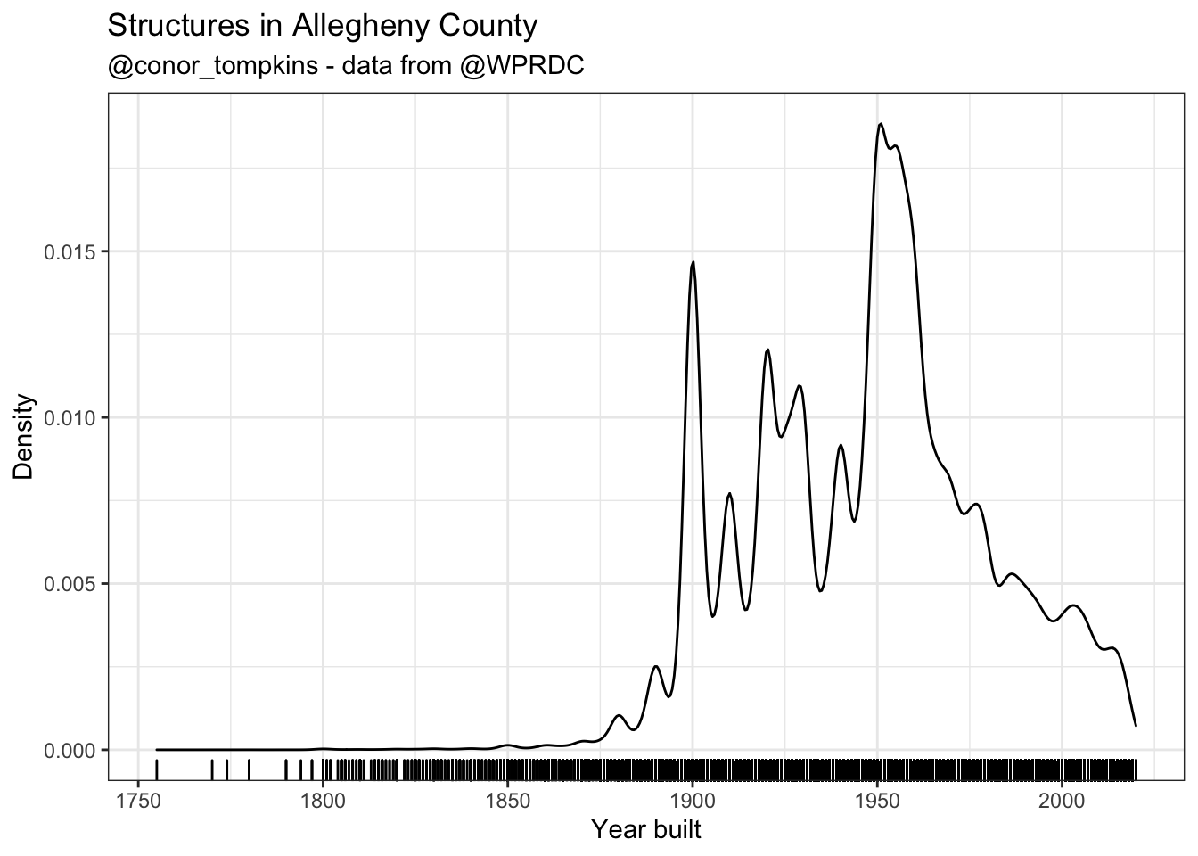
This combines the parcel_data and centroid data:
parcel_geometry_cleaned <- bind_cols(parcel_data, centroids) %>%
  select(pin, x, y, yearblt_asmt) %>%
  mutate(yearblt_asmt = as.integer(yearblt_asmt)) %>%
  filter(!is.na(yearblt_asmt),
         yearblt_asmt > 1000) %>%
  st_set_geometry(NULL)
This plots the culmulative sum of structures built:
parcel_cumulative <- parcel_geometry_cleaned %>%
  select(pin, yearblt_asmt) %>%
  arrange(yearblt_asmt) %>%
  count(yearblt_asmt) %>%
  mutate(cumulative_n = cumsum(n)) %>%
  ggplot(aes(yearblt_asmt, cumulative_n)) +
  geom_line() +
  geom_point() +
  scale_y_continuous(label = comma) +
    labs(title = "Cumulative sum of structures built in Allegheny County",
       x = "Year Built",
       y = "Cumulative sum",
       caption = my_caption) +
  transition_reveal(yearblt_asmt)

parcel_cumulative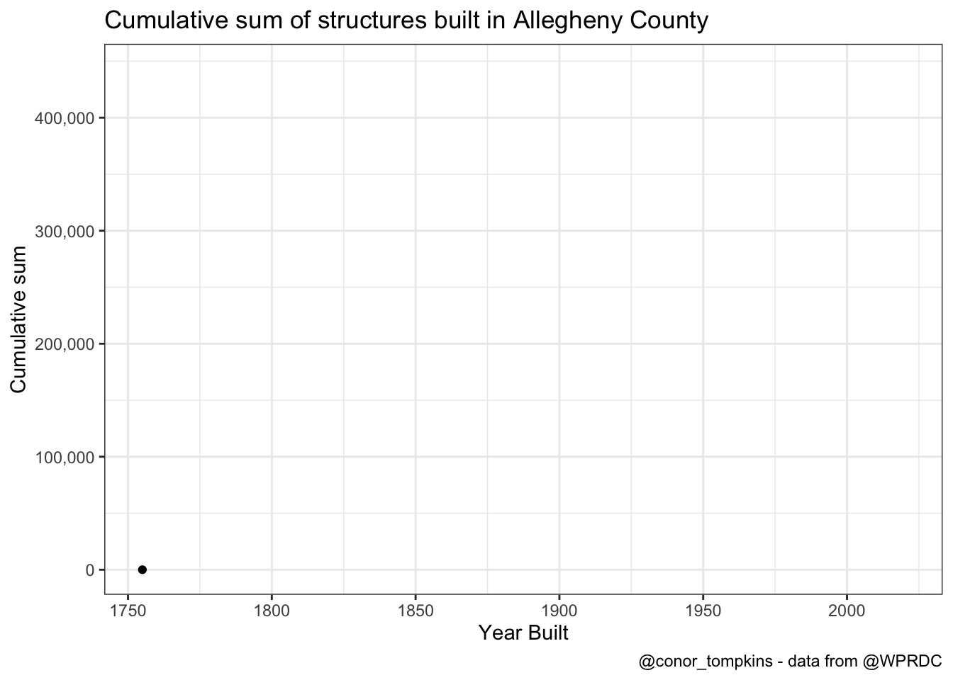
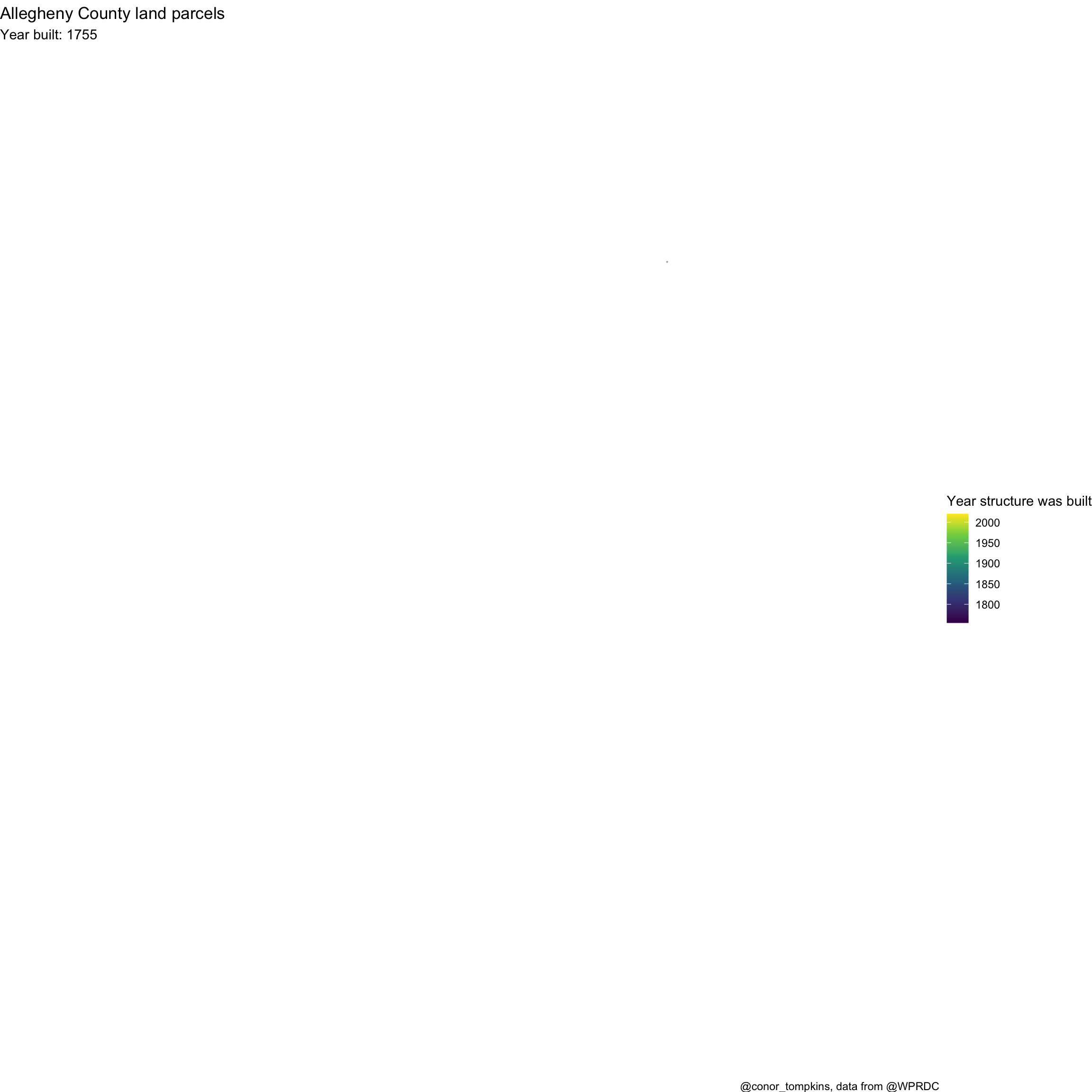
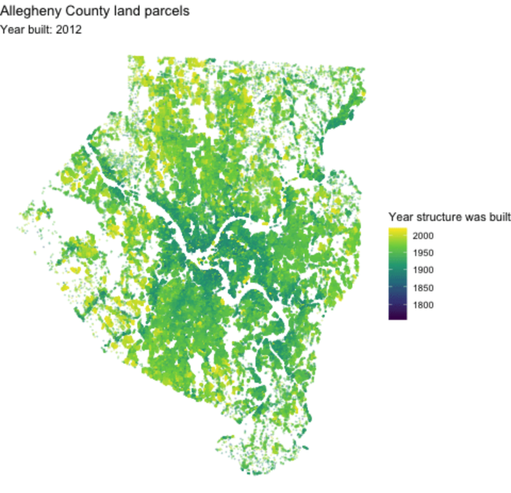
This creates a graph of the structures built in Allegheny County, colored by the construction year.
parcel_geometry_cleaned %>%
  ggplot(aes(x, y, color = yearblt_asmt, group = pin)) +
  geom_point(alpha = .3, size = .1) +
  scale_color_viridis_c("Year structure was built") +
  theme_void() +
  theme(axis.text = element_blank(),
        axis.title = element_blank()) +
  labs(title = "Allegheny County land parcels",
       subtitle = "Year built: {frame_along}",
       caption = "@conor_tompkins, data from @WPRDC") +
  transition_reveal(yearblt_asmt)