Graphing Seasonality in Ebird Bird Sightings

Over the winter I became interested in birding. Sitting in your back yard doing nothing but watching birds fly around is quite relaxing. Naturally I am looking for ways to optimize and quantify this relaxing activity. eBird lets you track your bird sightings and research which birds are common or more rare in your area. Luckily, the folks at ROpenSci have the {rebird} package, which provides an easy interface to the eBird API.
In this post I will graph the seasonality of observation frequency of the top 10 birds in Pennsylvania. Frequency in this context is the % of eBird checklists that the bird appeared in during a given period.
Load up packages:
library(tidyverse)
library(lubridate)
library(vroom)
library(janitor)
library(rebird)
library(hrbrthemes)
library(ggrepel)
library(gganimate)

theme_set(theme_ipsum())
The ebirdfreq takes a location and time period and returns the frequency and sample size for the birds returned in the query.
df_freq_raw <- ebirdfreq(loctype = 'states', loc = 'US-PA', startyear = 2019,
                         endyear = 2019, startmonth = 1, endmonth = 12)

df_freq_raw
## # A tibble: 22,176 x 4
## comName monthQt frequency sampleSize
## <chr> <chr> <dbl> <dbl>
## 1 Black-bellied Whistling-Duck January-1 0 4448
## 2 Snow Goose January-1 0.0220 4448
## 3 Ross's Goose January-1 0.000674 4448
## 4 Snow x Ross's Goose (hybrid) January-1 0 4448
## 5 Snow/Ross's Goose January-1 0 4448
## 6 Graylag Goose (Domestic type) January-1 0.000225 4448
## 7 Swan Goose (Domestic type) January-1 0 4448
## 8 Graylag x Swan Goose (Domestic type) (hybrid) January-1 0 4448
## 9 Greater White-fronted Goose January-1 0.00360 4448
## 10 Domestic goose sp. (Domestic type) January-1 0.00292 4448
## # … with 22,166 more rowsThis does some light data munging to get the data in shape.
df_freq_clean <- df_freq_raw %>%
  clean_names() %>%
  separate(month_qt, into = c("month", "week")) %>%
  mutate(week = as.numeric(week),
         month = ymd(str_c("2019", month, "01", sep = "-")),
         month = month(month, label = TRUE, abbr = TRUE),
         state = "PA") %>%
  rename(common_name = com_name) %>%
  arrange(common_name, month, week)

df_freq_clean
## # A tibble: 22,176 x 6
## common_name month week frequency sample_size state
## <chr> <ord> <dbl> <dbl> <dbl> <chr>
## 1 Acadian Flycatcher Jan 1 0 4448 PA
## 2 Acadian Flycatcher Jan 2 0 3382 PA
## 3 Acadian Flycatcher Jan 3 0 3306 PA
## 4 Acadian Flycatcher Jan 4 0 4830 PA
## 5 Acadian Flycatcher Feb 1 0 3890 PA
## 6 Acadian Flycatcher Feb 2 0 3605 PA
## 7 Acadian Flycatcher Feb 3 0 7848 PA
## 8 Acadian Flycatcher Feb 4 0 3636 PA
## 9 Acadian Flycatcher Mar 1 0 3737 PA
## 10 Acadian Flycatcher Mar 2 0 4406 PA
## # … with 22,166 more rowsThis takes the month-week time series and summarizes to the month level:
df_month <- df_freq_clean %>%
  group_by(common_name, month) %>%
  summarize(sample_size_mean = mean(sample_size),
            frequency_mean = mean(frequency) %>% round(2)) %>%
  ungroup()

df_month
## # A tibble: 5,544 x 4
## common_name month sample_size_mean frequency_mean
## <chr> <ord> <dbl> <dbl>
## 1 Acadian Flycatcher Jan 3992. 0
## 2 Acadian Flycatcher Feb 4745. 0
## 3 Acadian Flycatcher Mar 4748 0
## 4 Acadian Flycatcher Apr 5392. 0
## 5 Acadian Flycatcher May 5868. 0.04
## 6 Acadian Flycatcher Jun 3367. 0.06
## 7 Acadian Flycatcher Jul 2639 0.05
## 8 Acadian Flycatcher Aug 2876. 0.02
## 9 Acadian Flycatcher Sep 3198. 0
## 10 Acadian Flycatcher Oct 2894. 0
## # … with 5,534 more rowsHere I find the top 10 birds in terms of average monthly observation frequency:
df_top_birds <- df_freq_clean %>%
  group_by(common_name) %>%
  summarize(sample_size_mean = mean(sample_size),
            frequency_mean = mean(frequency) %>% round(2)) %>%
  ungroup() %>%
  arrange(desc(frequency_mean)) %>%
  select(common_name) %>%
  slice(1:10)

df_top_birds
## # A tibble: 10 x 1
## common_name
## <chr>
## 1 Northern Cardinal
## 2 Blue Jay
## 3 Mourning Dove
## 4 American Robin
## 5 Song Sparrow
## 6 American Crow
## 7 Red-bellied Woodpecker
## 8 American Goldfinch
## 9 Carolina Wren
## 10 Downy WoodpeckerThis basic line graph shows some of the pattern of seasonality, but fails to show the cyclical nature of the data.
df_month %>%
  semi_join(df_top_birds) %>%
  ggplot(aes(month, frequency_mean, group = common_name)) +
    geom_line() +
    scale_y_percent() +
    labs(title = "Bird observation frequency",
         subtitle = "Top 10 birds in PA, 2019",
         x = NULL,
         y = "Mean frequency",
         caption = "Data from ebird.org. @conorotompkins")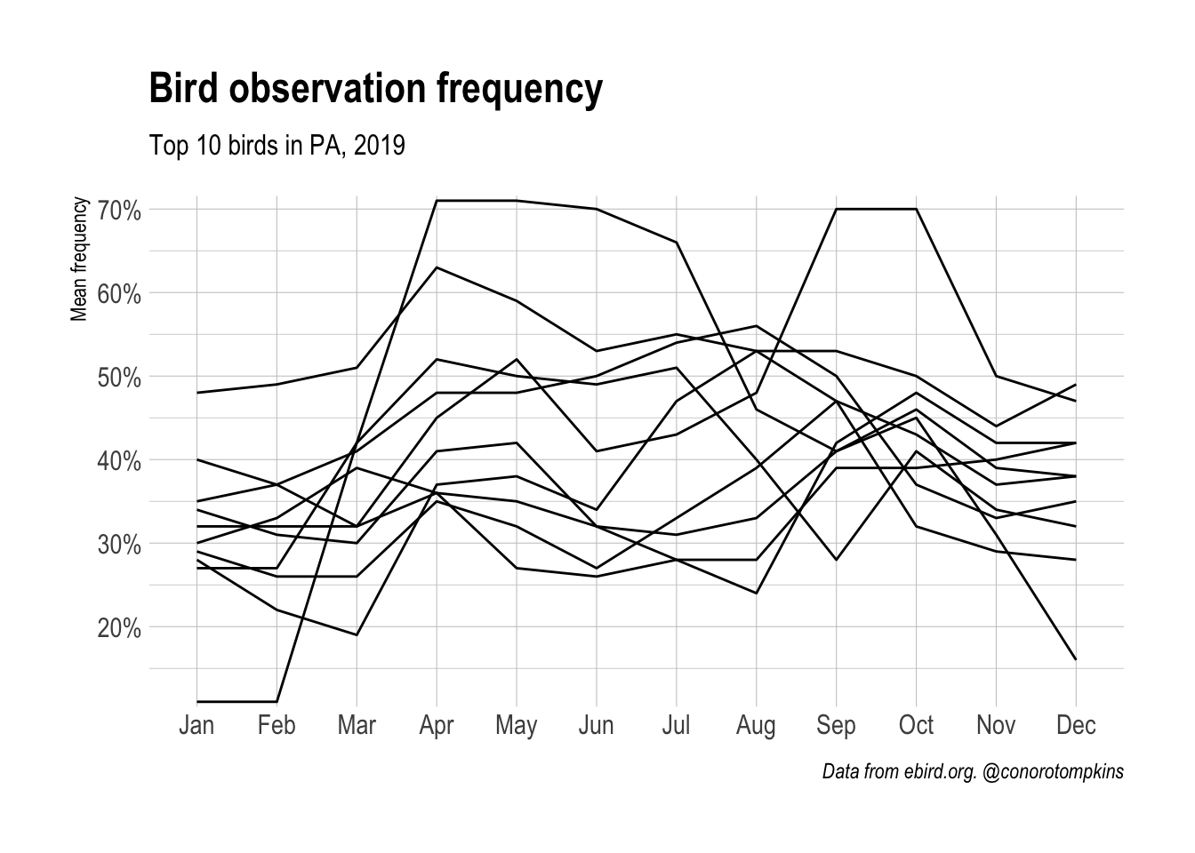
I use coord_polar to change the coordinate system to match the cyclical flow of the months:
df_month %>%
  semi_join(df_top_birds) %>%
  ggplot(aes(month, frequency_mean, group = common_name)) +
    geom_polygon(color = "black", fill = NA, size = .5) +
    coord_polar() +
    scale_y_percent() +
    labs(title = "Bird observation frequency",
         subtitle = "Top 10 birds in PA, 2019",
         x = NULL,
         y = "Mean frequency",
         caption = "Data from ebird.org. @conorotompkins")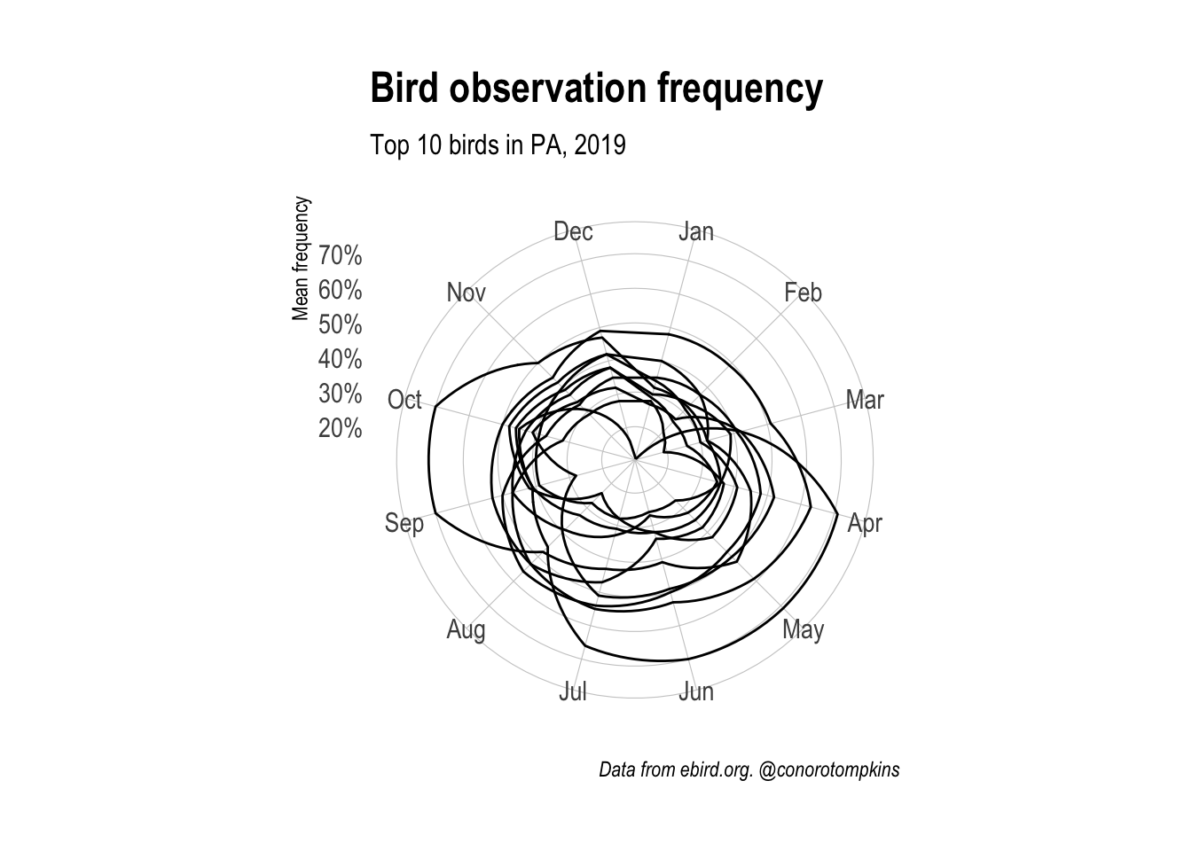
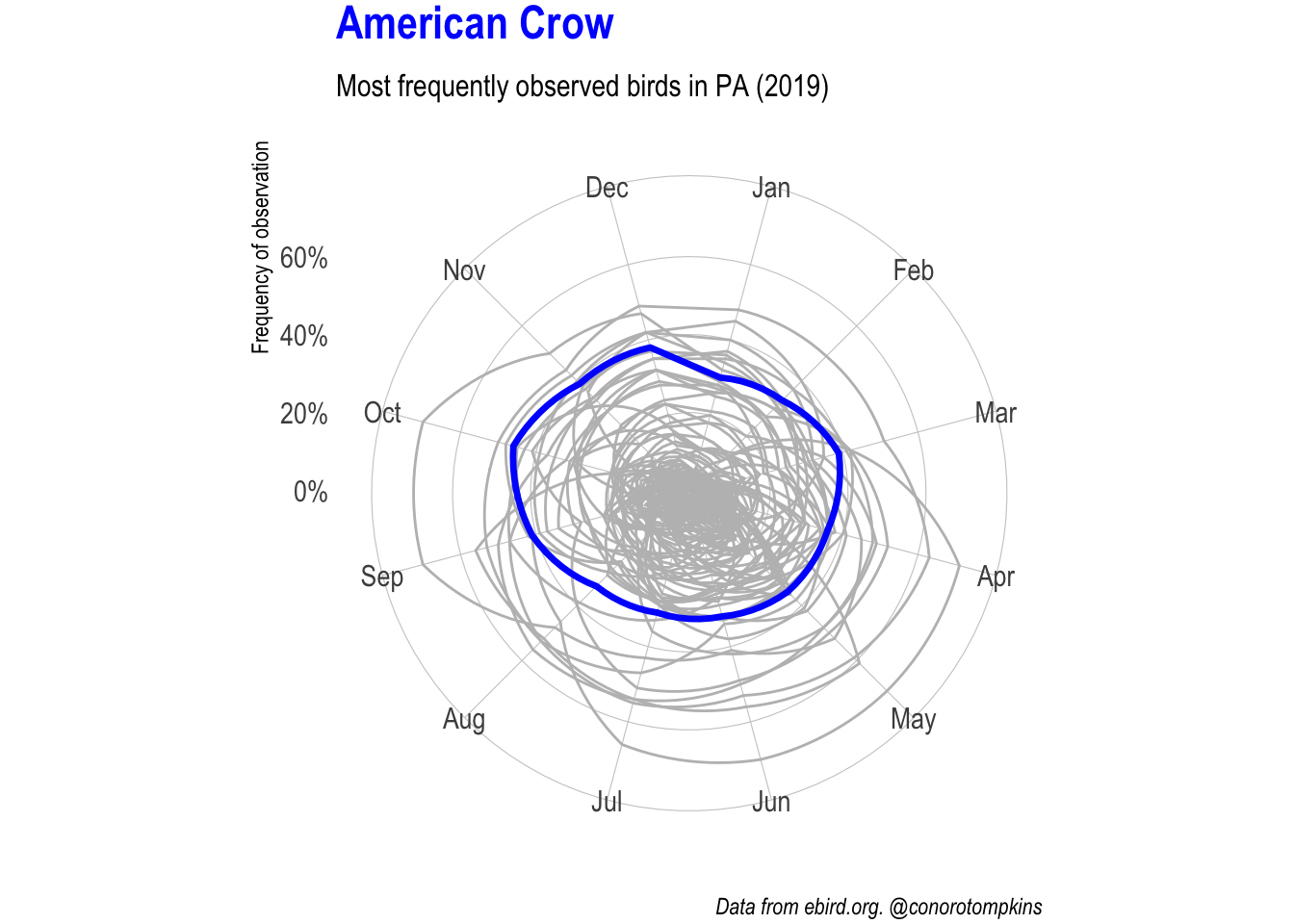
gganimate lets me focus on one species at a time while showing all the data.
plot_animated <- df_month %>%
  semi_join(df_top_birds) %>%
  mutate(common_name = fct_inorder(common_name)) %>%
  ggplot(aes(month, frequency_mean)) +
  geom_polygon(data = df_month %>% rename(name = common_name),
               aes(group = name),
               color = "grey", fill = NA, size = .5) +
  geom_polygon(aes(group = common_name),
               color = "blue", fill = NA, size = 1.2) +
  coord_polar() +
  #facet_wrap(~common_name) +
  scale_y_percent() +
   labs(subtitle = "Most frequently observed birds in PA (2019)",
        x = NULL,
        y = "Frequency of observation",
        caption = "Data from ebird.org. @conorotompkins") +
  theme(plot.margin = margin(2, 2, 2, 2),
        plot.title = element_text(color = "blue"))

plot_animated +
  transition_manual(common_name) +
  ggtitle("{current_frame}")