Clustering Bird Species With Seasonality
In this post, I use k-means clustering to identify clusters of bird species based on frequency of observations per month. I use bird sightings in Allegheny County from eBird.
Load the relevant libraries:
library(tidyverse)
library(lubridate)
library(janitor)
library(vroom)
library(broom)
library(hrbrthemes)

theme_set(theme_bw())

set.seed(1234)
Load and filter the data:
df <- vroom("data/ebd_US-PA-003_201001_202003_relFeb-2020.zip", delim = "\t") %>%
  clean_names() %>%
  mutate_at(vars(observer_id, locality, observation_date, time_observations_started, protocol_type), str_replace_na, "NA") %>%
  mutate(observation_count = as.numeric(str_replace(observation_count, "X", as.character(NA))),
         observation_event_id = str_c(observer_id, locality, observation_date, time_observations_started, sep = "-"),
         observation_date = ymd(observation_date)) %>%
  filter(all_species_reported == 1)
df_top_protocols <- df %>%
count(protocol_type, sort = TRUE) %>%
slice(1:2)
df <- df %>%
semi_join(df_top_protocols) %>%
filter(year(observation_date) >= 2016)df %>%
select(common_name, observation_date, observation_count) %>%
glimpse()## Rows: 405,148
## Columns: 3
## $ common_name <chr> "American Black Duck", "American Black Duck", "Amer…
## $ observation_date <date> 2016-01-31, 2016-01-24, 2016-01-30, 2016-01-31, 20…
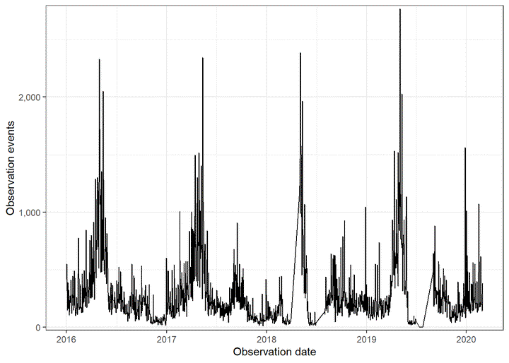
## $ observation_count <dbl> 2, 2, 2, 3, 2, 3, 57, 7, 2, 4, 1, 5, 8, 1, 1, 4, 1,…This graph shows general seasonality in bird observations:
df %>%
  count(observation_date) %>%
  ggplot(aes(observation_date, n)) +
    geom_line() +
    labs(x = "Observation date",
         y = "Observation events") +
    scale_y_comma()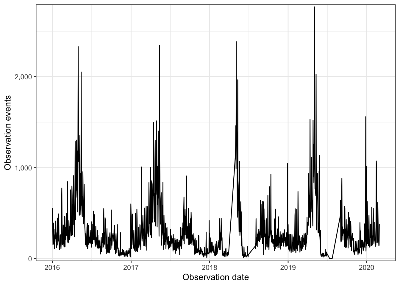
This code chunk calculates the average number of observations by species and month. Then, it interpolates a value of 0 for birds where there were no sightings in a given month:
months <- df %>%
  mutate(observation_month = month(observation_date, label = TRUE)) %>%
  distinct(observation_month) %>%
  pull(observation_month)

df_seasonality <- df %>%
  mutate(observation_month = month(observation_date, label = TRUE),
         observation_year = year(observation_date)) %>%
  group_by(common_name, observation_year, observation_month) %>%
  summarize(observation_count = sum(observation_count, na.rm = TRUE)) %>%
  group_by(common_name, observation_month) %>%
  summarize(observation_count_mean = mean(observation_count) %>% round(1)) %>%
  ungroup() %>%
  complete(common_name, observation_month = months) %>%
  replace_na(list(observation_count_mean = 0)) %>%
  arrange(common_name, observation_month)

glimpse(df_seasonality)
## Rows: 3,504
## Columns: 3
## $ common_name <chr> "Acadian Flycatcher", "Acadian Flycatcher", "A…
## $ observation_month <ord> Jan, Feb, Mar, Apr, May, Jun, Jul, Aug, Sep, O…
## $ observation_count_mean <dbl> 0.0, 0.0, 0.0, 0.0, 219.5, 98.5, 60.5, 16.5, 1…This transforms the mean monthly observation into log10:
df_seasonality <- df_seasonality %>%
  mutate(observation_count_mean_log10 = log10(observation_count_mean),
         observation_count_mean_log10 = case_when(is.infinite(observation_count_mean_log10) ~ 0,
                                                  TRUE ~ observation_count_mean_log10)) %>%
  select(-observation_count_mean)
These graphs show that observations generally increase in the spring and fall, but there is wide variation:
df_seasonality %>%
  ggplot(aes(observation_month, observation_count_mean_log10)) +
    geom_boxplot() +
    labs(x = "Observation month",
         y = "Mean observation count (log10)")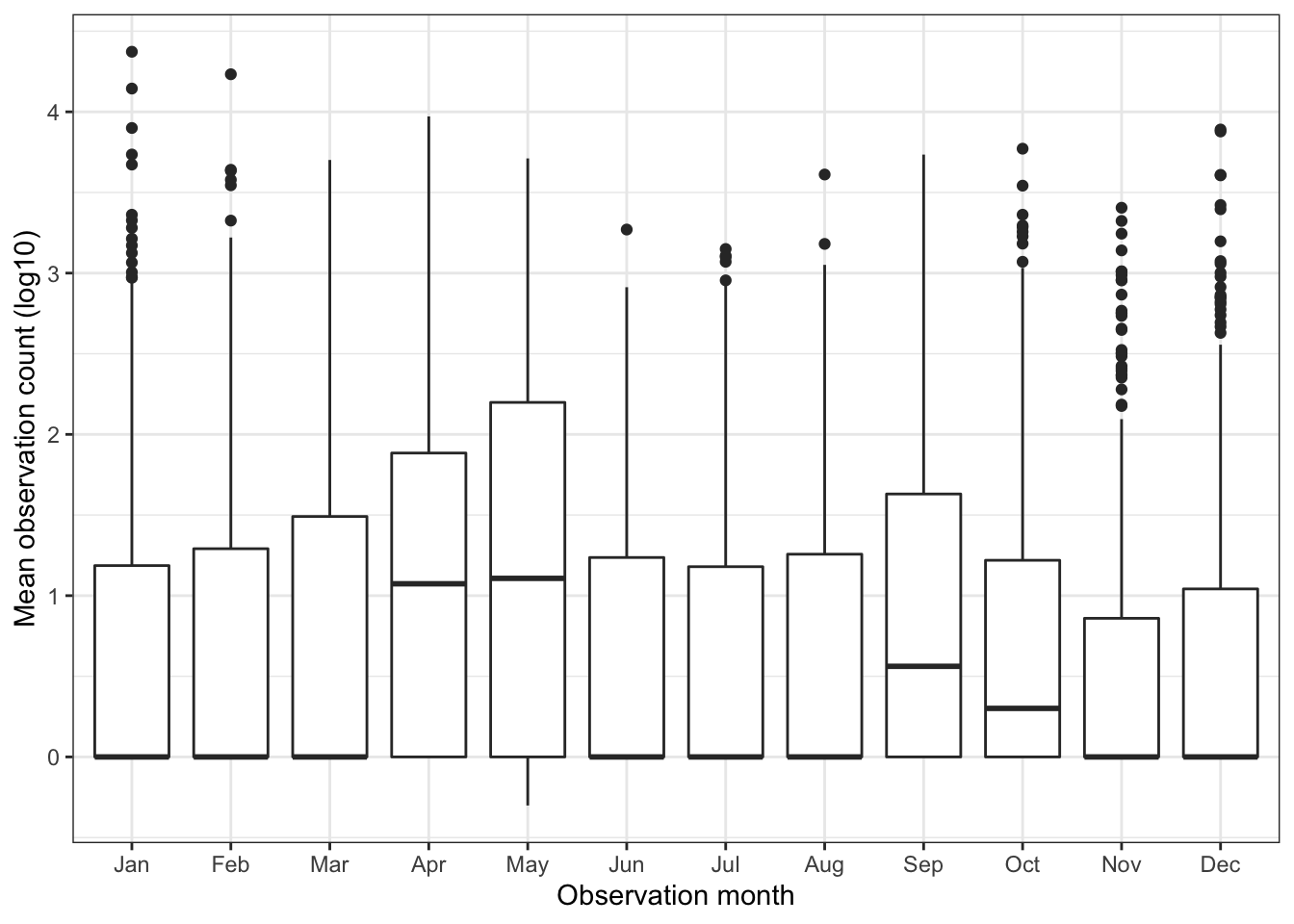
This tile graph shows the seasonality trends per species. I sort the birds by ascending mean observation count by month. It shows there are birds that appear year-round, some that appear seasonally, and some that only appear sporatically:
vec_common_name <- df_seasonality %>%
  pivot_wider(names_from = observation_month, values_from = observation_count_mean_log10, names_prefix = "month_") %>%
  clean_names() %>%
  arrange(month_jan, month_feb, month_mar, month_apr, month_may, month_jun, month_jul, month_aug, month_sep, month_oct, month_nov, month_dec) %>%
  pull(common_name)
df_seasonality %>%
mutate(common_name = factor(common_name, levels = vec_common_name)) %>%
ggplot(aes(observation_month, common_name, fill = observation_count_mean_log10)) +
geom_tile() +
scale_fill_viridis_c("Mean observation count (log10)") +
scale_x_discrete(expand = c(0,0)) +
scale_y_discrete(expand = c(0,0)) +
labs(x = "Observation month",
y = "Species") +
theme(panel.grid = element_blank(),
axis.text.y = element_blank(),
axis.ticks.y = element_blank())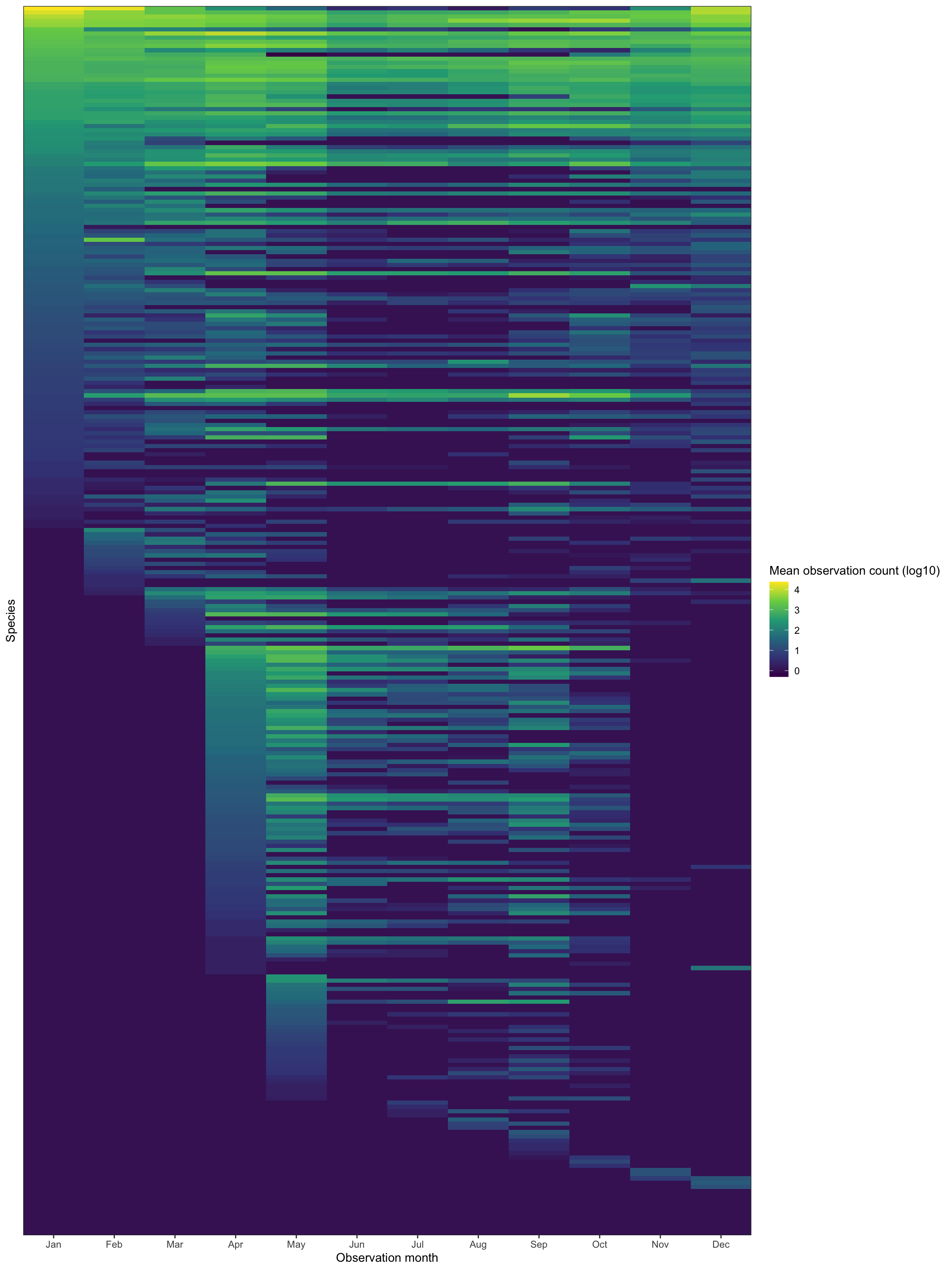
You can subjectively see clusters of bird types in the above graph. I will use k-means to attempt to find those clusters.
This code chunk pivots the data wide to prepare it for clustering:
df_seasonality_wide <- df_seasonality %>%
  select(common_name, observation_month, observation_count_mean_log10) %>%
  pivot_wider(names_from = observation_month, values_from = observation_count_mean_log10, names_prefix = "month_") %>%
  clean_names()

glimpse(df_seasonality_wide)
## Rows: 292
## Columns: 13
## $ common_name <chr> "Acadian Flycatcher", "Accipiter sp.", "Alder/Willow Flyc…
## $ month_jan <dbl> 0.0000000, 0.0000000, 0.0000000, 0.0000000, 0.0000000, 1.…
## $ month_feb <dbl> 0.000000, 0.000000, 0.000000, 0.000000, 0.000000, 1.10380…
## $ month_mar <dbl> 0.0000000, 0.0000000, 0.0000000, 0.0000000, 0.0000000, 0.…
## $ month_apr <dbl> 0.0000000, 0.3010300, 0.0000000, 0.0000000, 0.7781513, 0.…
## $ month_may <dbl> 2.3414345, 0.0000000, 0.4771213, 0.0000000, 0.0000000, 0.…
## $ month_jun <dbl> 1.993436, 0.000000, 0.000000, 0.000000, 0.000000, 0.00000…
## $ month_jul <dbl> 1.7817554, 0.0000000, 0.6989700, 0.0000000, 0.0000000, 0.…
## $ month_aug <dbl> 1.2174839, 0.0000000, 0.4771213, 0.9030900, 0.0000000, 0.…
## $ month_sep <dbl> 1.0128372, 0.0000000, 1.0086002, 0.0000000, 0.0000000, 0.…
## $ month_oct <dbl> 0.0000000, 0.3010300, 0.0000000, 0.0000000, 0.0000000, 0.…
## $ month_nov <dbl> 0.0000000, 0.0000000, 0.0000000, 0.0000000, 0.0000000, 0.…
## $ month_dec <dbl> 0.0000000, 0.0000000, 0.0000000, 0.0000000, 0.0000000, 1.…This uses purrr to cluster the data with varying numbers of clusters (1 to 9):
kclusts <- tibble(k = 1:9) %>%
  mutate(
    kclust = map(k, ~kmeans(df_seasonality_wide %>% select(-common_name), .x)),
    tidied = map(kclust, tidy),
    glanced = map(kclust, glance),
    augmented = map(kclust, augment, df_seasonality_wide %>% select(-common_name))
  )

kclusts
## # A tibble: 9 x 5
## k kclust tidied glanced augmented
## <int> <list> <list> <list> <list>
## 1 1 <kmeans> <tibble [1 × 15]> <tibble [1 × 4]> <tibble [292 × 13]>
## 2 2 <kmeans> <tibble [2 × 15]> <tibble [1 × 4]> <tibble [292 × 13]>
## 3 3 <kmeans> <tibble [3 × 15]> <tibble [1 × 4]> <tibble [292 × 13]>
## 4 4 <kmeans> <tibble [4 × 15]> <tibble [1 × 4]> <tibble [292 × 13]>
## 5 5 <kmeans> <tibble [5 × 15]> <tibble [1 × 4]> <tibble [292 × 13]>
## 6 6 <kmeans> <tibble [6 × 15]> <tibble [1 × 4]> <tibble [292 × 13]>
## 7 7 <kmeans> <tibble [7 × 15]> <tibble [1 × 4]> <tibble [292 × 13]>
## 8 8 <kmeans> <tibble [8 × 15]> <tibble [1 × 4]> <tibble [292 × 13]>
## 9 9 <kmeans> <tibble [9 × 15]> <tibble [1 × 4]> <tibble [292 × 13]>clusters <- kclusts %>%
unnest(tidied)
assignments <- kclusts %>%
unnest(augmented)
clusterings <- kclusts %>%
unnest(glanced)This scree plot shows that 2 clusters is probably optimal, but 4 could also be useful:
ggplot(clusterings, aes(k, tot.withinss)) +
  geom_line() +
  geom_vline(xintercept = 2, linetype = 2) +
  geom_vline(xintercept = 4, linetype = 2) +
  scale_x_continuous(breaks = seq(1:9)) +
  labs(x = "Number of clusters")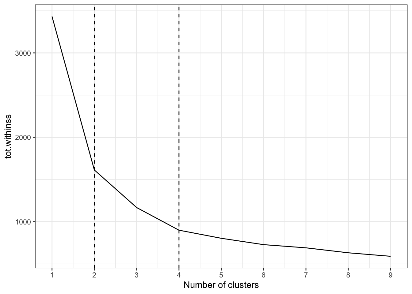
This graph shows how the clustering performed by comparing the observation value in January to the value in the other months, for each k cluster value 1 through 4:
assignments %>%
  select(k, .cluster, contains("month_")) %>%
  mutate(id = row_number()) %>%
  pivot_longer(cols = contains("month_"), names_to = "observation_month", values_to = "observation_count_mean_log10") %>%
  mutate(month_jan = case_when(observation_month == "month_jan" ~ observation_count_mean_log10,
                               TRUE ~ as.numeric(NA))) %>%
  group_by(k, .cluster, id) %>%
  fill(month_jan, .direction = c("down")) %>%
  ungroup() %>%
  filter(observation_month != "month_jan",
         k <= 4) %>%
  mutate(k = str_c(k, "cluster(s)", sep = " ")) %>%
  ggplot(aes(observation_count_mean_log10, month_jan, color = .cluster)) +
    geom_point() +
    facet_grid(k ~ observation_month) +
    labs(x = "Observation month",
         y = "January")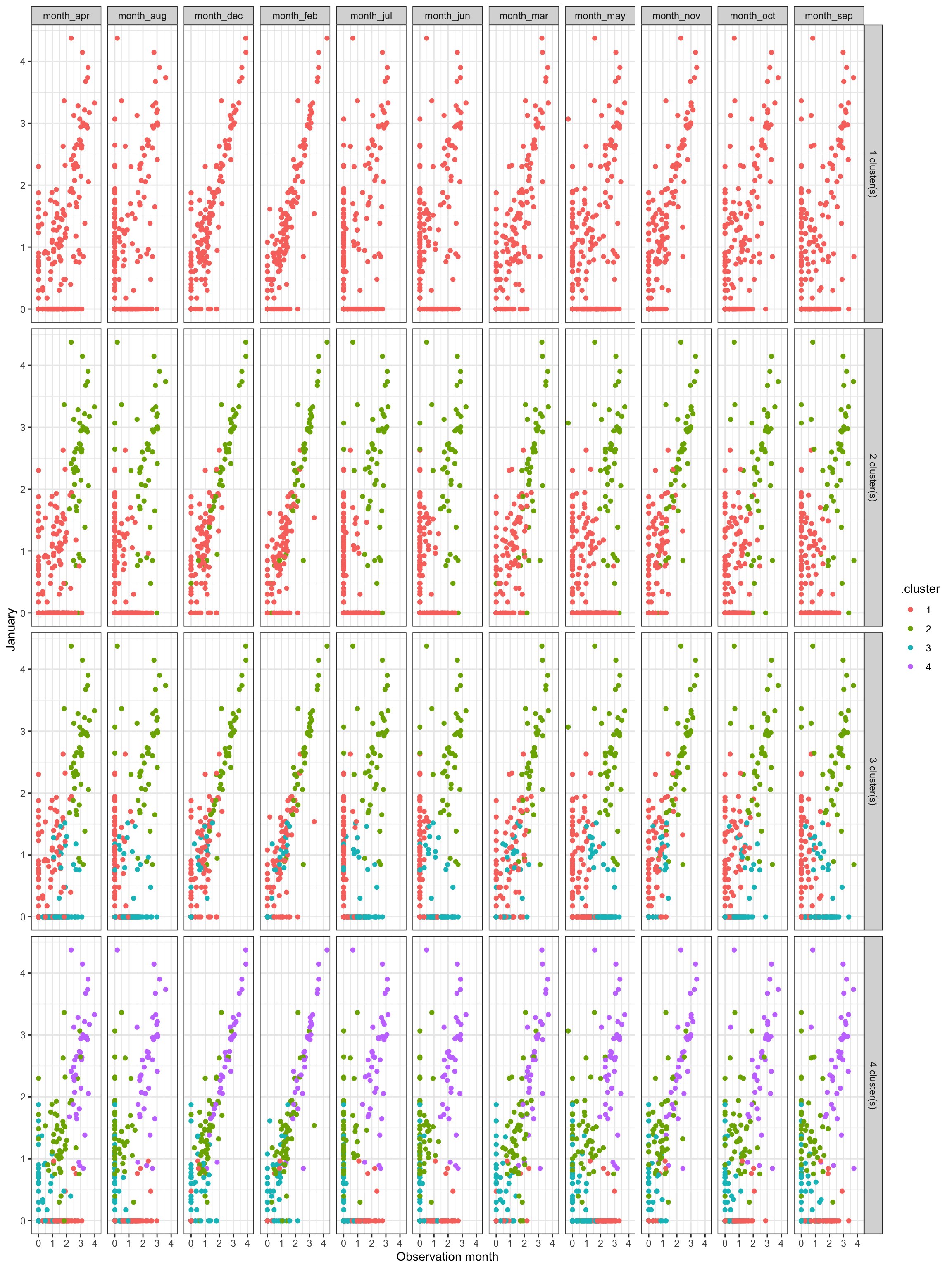
Subjectively, I think the optimal number of clusters is 4. It is noiser, but could show more interesting granularity in seasonality.
This clusters the data using 4 clusters:
df_kmeans <- df_seasonality_wide %>%
  select(-common_name) %>%
  kmeans(centers = 4)
df_clustered <- augment(df_kmeans, df_seasonality_wide) %>%
select(common_name, .cluster)
df_clustered## # A tibble: 292 x 2
## common_name .cluster
## <chr> <fct>
## 1 Acadian Flycatcher 2
## 2 Accipiter sp. 3
## 3 Alder/Willow Flycatcher (Traill's Flycatcher) 3
## 4 American Avocet 3
## 5 American Bittern 3
## 6 American Black Duck 4
## 7 American Coot 4
## 8 American Crow 1
## 9 American Golden-Plover 3
## 10 American Goldfinch 1
## # … with 282 more rowsThis shows the same style of tile graph as shown previously, but facets it by cluster.
vec_common_name_cluster <- df_seasonality %>%
  left_join(df_clustered) %>%
  pivot_wider(names_from = observation_month, values_from = observation_count_mean_log10, names_prefix = "month_") %>%
  clean_names() %>%
  arrange(cluster, month_jan, month_feb, month_mar, month_apr, month_may, month_jun, month_jul, month_aug, month_sep, month_oct, month_nov, month_dec) %>%
  pull(common_name)
df_seasonality_clustered <- df_seasonality %>%
left_join(df_clustered) %>%
mutate(common_name = factor(common_name, levels = vec_common_name_cluster))
df_seasonality_clustered %>%
mutate(.cluster = str_c("Cluster", .cluster, sep = " ")) %>%
ggplot(aes(observation_month, common_name, fill = observation_count_mean_log10)) +
geom_tile() +
facet_wrap(~.cluster, scales = "free_y") +
scale_fill_viridis_c("Mean observation count (log10)") +
scale_x_discrete(expand = c(0,0)) +
scale_y_discrete(expand = c(0,0)) +
labs(x = "Observation month",
y = "Species") +
theme(panel.grid = element_blank(),
axis.text.y = element_blank(),
axis.ticks.y = element_blank())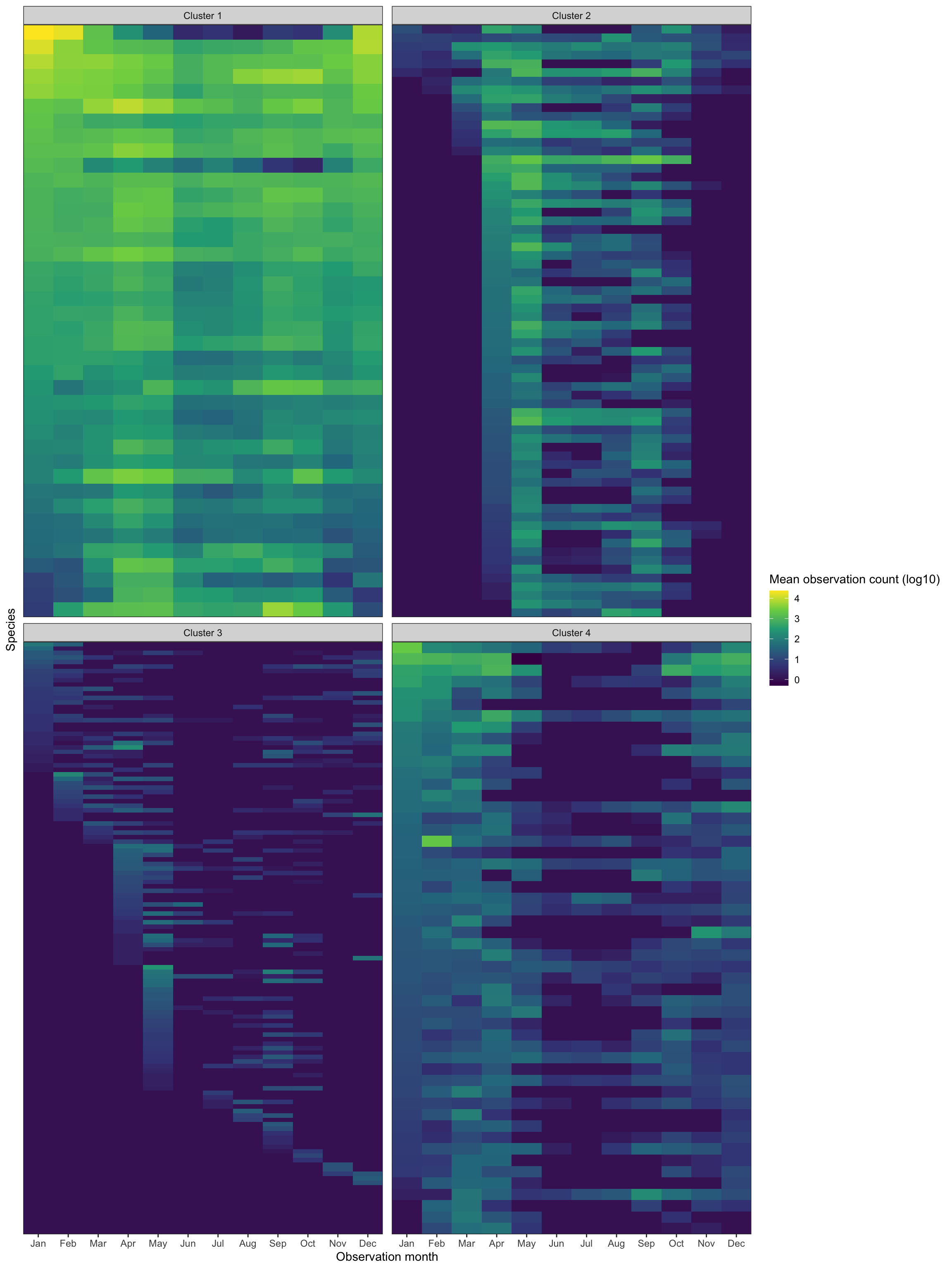
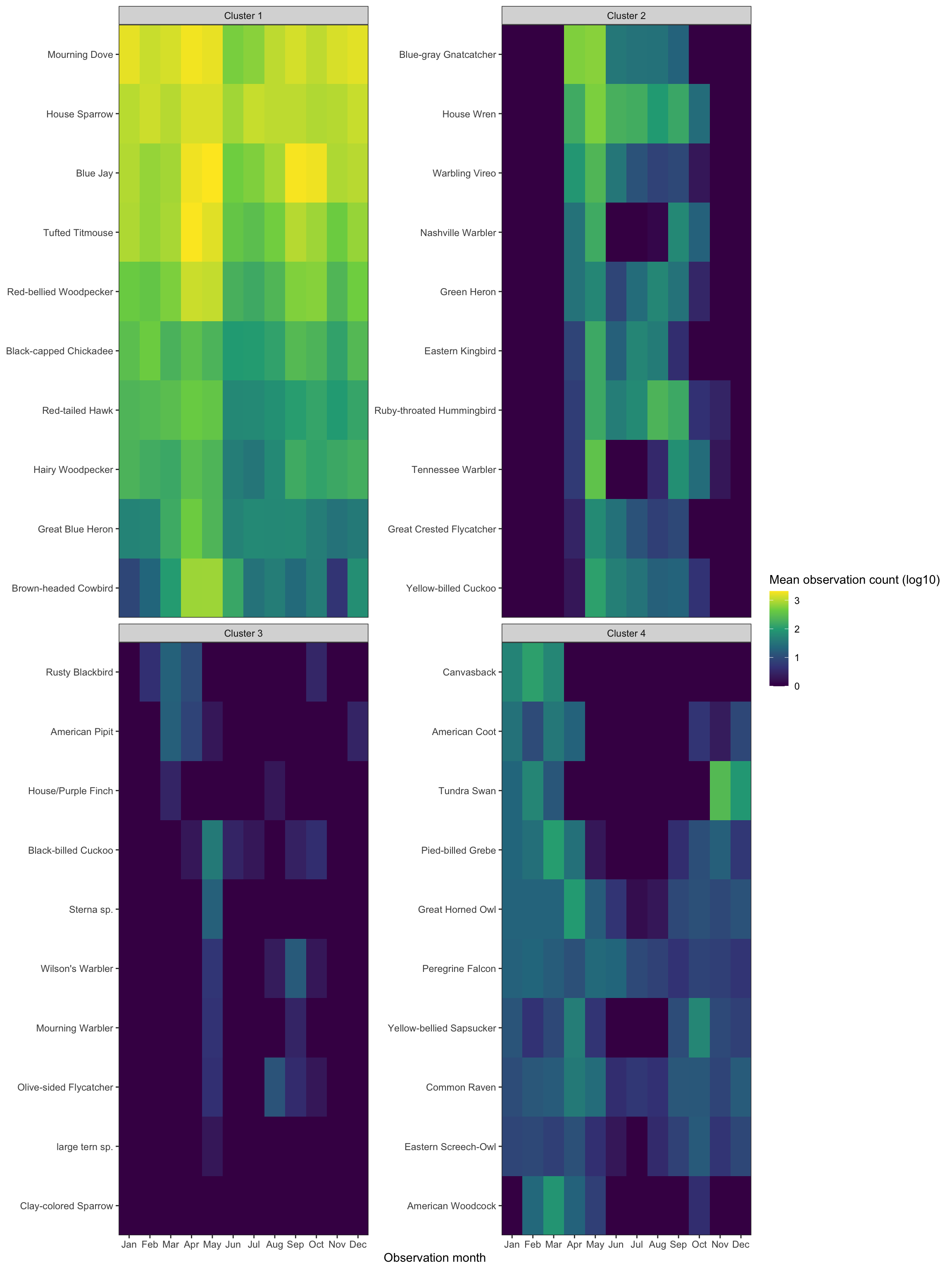
Cluster 1 shows birds that only appear sporatically. I think these are birds that migrate through Allegheny County, but do not stick around. Cluster 2 shows birds that are generally around all year. Cluster 3 shows birds that are seen mostly during the summer, and cluster 4 contains birds that appear in the winter.
This shows a sample of each cluster:
df_cluster_sample <- df_clustered %>%
  group_by(.cluster) %>%
  sample_n(10, replace = FALSE) %>%
  ungroup()

df_seasonality_clustered %>%
  semi_join(df_cluster_sample) %>%
  mutate(.cluster = str_c("Cluster", .cluster, sep = " ")) %>%
  ggplot(aes(observation_month, common_name, fill = observation_count_mean_log10)) +
    geom_tile() +
    facet_wrap(~.cluster, scales = "free_y") +
    scale_fill_viridis_c("Mean observation count (log10)") +
    scale_x_discrete(expand = c(0,0)) +
    scale_y_discrete(expand = c(0,0)) +
    labs(x = "Observation month",
         y = NULL) +
    theme(panel.grid = element_blank())