Suburbanization of Allegheny County
This March, researchers at the University of Georgia and Florida State University released the HHUUD10 dataset, which contains estimates of the number of housing units for decennial census years 1940-2010 and 2019. A “housing unit” could be a studio apartment or 5 bedroom single-family home. The data uses 2010 census tracts, which allows for historical comparison of housing trends across constant geometry. The full paper explains the approach.
This paper and the dataset can be used for a wide variety of socioeconomic issues. I will focus on suburbanization trends in the Pittsburgh area.
Configuration and load data
library(tidyverse)
library(sf)
library(units)
library(hrbrthemes)
library(gganimate)
library(scales)
library(leaflet)
library(leaflet.extras)
library(widgetframe)

theme_set(theme_bw(base_size = 13))

options(digits = 4, scipen = 999)
The dataset is available in multiple formats, but I chose the Esri geodatabase format because plays nice with {sf}. The dataset uses the value 2035 in some numeric fields to indicate missing data, so I replace those values with NA. I also use the fancy new tigris::erase_water() function to easily “erase” the water from the census tracts to make the rivers stand out.
ac_housing <- st_read("data/HHUUD10.gdb") %>%
  rename(geometry = Shape) %>%
  mutate(UY1 = na_if(UY1, 2035),
         UY2 = na_if(UY2, 2035)) %>%
  filter(STATE == "PA",
         COUNTY == "Allegheny") %>%
  select(STATE, COUNTY, GEOID10, UY1, UY2, starts_with("hu"), starts_with("sqmi"), starts_with("pdev")) %>%
  tigris::erase_water()
## Reading layer `HHUUD10' from data source
## `/Users/conortompkins/github_repos/blog_hugo_academic/content/post/2022-04-03-suburbanization-of-allegheny-county/data/HHUUD10.gdb'
## using driver `OpenFileGDB'
## Simple feature collection with 72271 features and 29 fields
## Geometry type: MULTIPOLYGON
## Dimension: XY
## Bounding box: xmin: -2356114 ymin: -1337505 xmax: 2258244 ymax: 1565782
## Projected CRS: USA_Contiguous_Albers_Equal_Area_Conicbest_crs <- ac_housing %>%
crsuggest::suggest_crs() %>%
slice_head(n = 1) %>%
select(crs_code) %>%
pull() %>%
as.numeric()
ac_housing <- ac_housing %>%
st_transform(crs = best_crs)
glimpse(ac_housing)## Rows: 402
## Columns: 27
## $ STATE <chr> "PA", "PA", "PA", "PA", "PA", "PA", "PA", "PA", "PA", "PA", "…
## $ COUNTY <chr> "Allegheny", "Allegheny", "Allegheny", "Allegheny", "Alleghen…
## $ GEOID10 <chr> "42003560500", "42003560400", "42003552400", "42003552300", "…
## $ UY1 <dbl> 1940, 1940, 1940, 1940, 1940, 1940, 1940, 1940, 1940, 1940, 1…
## $ UY2 <dbl> 1940, 1940, 1940, 1940, 1940, 1940, 1940, 1940, 1940, 1940, 1…
## $ hu40 <dbl> 1348.923130, 1329.439203, 2069.012388, 1951.162823, 1041.2765…
## $ hu50 <dbl> 1509.124351, 1409.404128, 2099.138113, 1928.245345, 1034.3810…
## $ hu60 <dbl> 1514.715863, 1405.699459, 1873.230933, 2184.758559, 909.61341…
## $ hu70 <dbl> 1440.543582, 943.962771, 1838.675696, 2038.151435, 828.132059…
## $ hu80 <dbl> 1423.674148, 1219.525102, 1687.918905, 1935.480028, 842.82760…
## $ hu90 <dbl> 1433.35, 1151.33, 1674.71, 1725.23, 767.89, 909.00, 882.08, 1…
## $ hu00 <dbl> 1381.24, 1069.21, 1607.74, 1454.10, 692.14, 639.00, 928.18, 1…
## $ hu10 <dbl> 1349, 994, 1560, 1230, 582, 569, 849, 1386, 731, 778, 746, 12…
## $ hu19 <dbl> 1487, 1140, 1759, 1336, 622, 574, 807, 1381, 157, 877, 855, 1…
## $ sqmi40 <dbl> 0.1794050, 0.1973404, 0.8134750, 0.3208447, 0.3147333, 0.2716…
## $ sqmi50 <dbl> 0.1794050, 0.1973404, 0.8134750, 0.3208447, 0.3147333, 0.2716…
## $ sqmi60 <dbl> 0.1794050, 0.1973404, 0.8134750, 0.3208447, 0.3147333, 0.2716…
## $ sqmi70 <dbl> 0.1794050, 0.1973404, 0.8134750, 0.3208447, 0.3147333, 0.2716…
## $ sqmi80 <dbl> 0.1794050, 0.1973404, 0.8134750, 0.3208447, 0.3147333, 0.2716…
## $ sqmi90 <dbl> 0.1794050, 0.1973404, 0.8134750, 0.3208447, 0.3147333, 0.2716…
## $ sqmi00 <dbl> 0.1794050, 0.1973404, 0.8134750, 0.3208447, 0.3147333, 0.2716…
## $ sqmi10 <dbl> 0.1794050, 0.1973404, 0.8134750, 0.3208447, 0.3147333, 0.2716…
## $ sqmi19 <dbl> 0.1794050, 0.1973404, 0.8134750, 0.3208447, 0.3147333, 0.2716…
## $ pdev92 <dbl> 0.8766859, 0.9416961, 0.7430328, 0.8684492, 0.7596983, 0.8391…
## $ pdev01 <dbl> 1.0000000, 1.0000000, 0.8912580, 1.0000000, 0.9370079, 0.9886…
## $ pdev11 <dbl> 1.0000000, 1.0000000, 0.9078891, 1.0000000, 0.9370079, 0.9886…
## $ geometry <POLYGON [US_survey_foot]> POLYGON ((1373906 410181.9,..., POLYGON …Overall trend
Fix date formatting
Since the data comes in a wide format, I pivot it long and fix up the year column to make it easy to graph with.
ac_housing_hu <- ac_housing %>%
  select(GEOID10, starts_with("hu")) %>%
  pivot_longer(cols = starts_with("hu"), names_to = "year", values_to = "housing_units")

year_lookup <- ac_housing_hu %>%
  st_drop_geometry() %>%
  distinct(year) %>%
  mutate(year_fixed = c(1940, 1950, 1960, 1970, 1980, 1990, 2000, 2010, 2019))

ac_housing_hu <- ac_housing_hu %>%
  left_join(year_lookup) %>%
  select(-year) %>%
  rename(year = year_fixed)

glimpse(ac_housing_hu)
## Rows: 3,618
## Columns: 4
## $ GEOID10 <chr> "42003560500", "42003560500", "42003560500", "4200356050…
## $ geometry <POLYGON [US_survey_foot]> POLYGON ((1373906 410182, 1..., POL…
## $ housing_units <dbl> 1349, 1509, 1515, 1441, 1424, 1433, 1381, 1349, 1487, 13…
## $ year <dbl> 1940, 1950, 1960, 1970, 1980, 1990, 2000, 2010, 2019, 19…The number of housing units in the county stagnated after 1960, which is expected given the collapse of the steel industry.
ac_housing_hu %>%
  st_drop_geometry() %>%
  mutate(year = as.character(year) %>% fct_inorder()) %>%
  group_by(year) %>%
  summarize(housing_units = sum(housing_units)) %>%
  ungroup() %>%
  ggplot(aes(year, housing_units, group = 1)) +
  geom_line() +
  geom_point() +
  scale_y_comma() +
  labs(x = "Year",
       y  = "Housing units")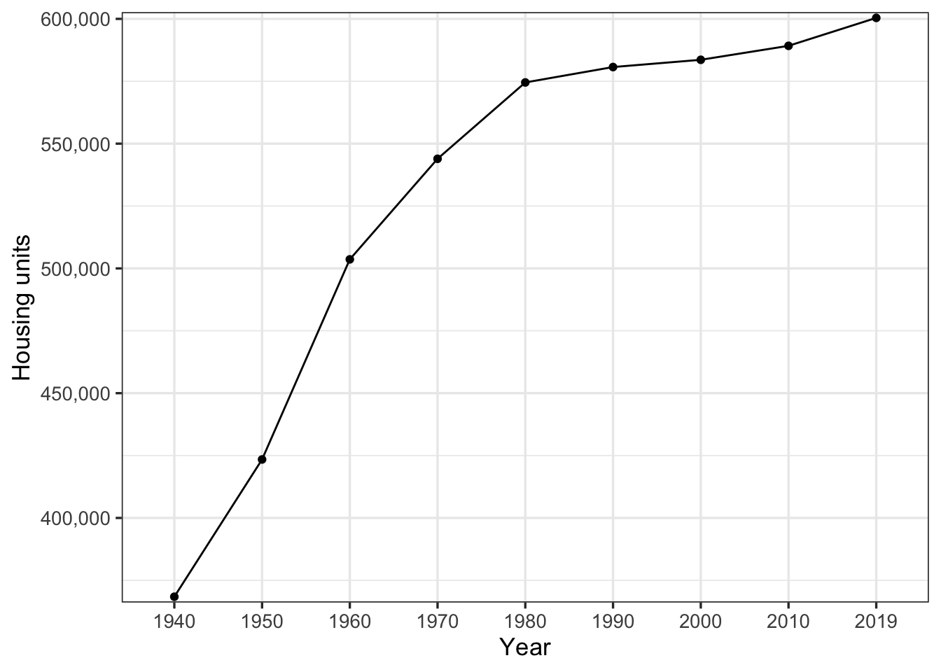
The decennial difference in “gross” housing units also shows that growth stagnated after 1960.
ac_housing_hu %>%
  st_drop_geometry() %>%
  mutate(year = as.character(year) %>% fct_inorder()) %>%
  group_by(year) %>%
  summarize(housing_units = sum(housing_units)) %>%
  ungroup() %>%
  mutate(diff = housing_units - lag(housing_units)) %>%
  ggplot(aes(year, diff, group = 1)) +
  geom_line() +
  geom_point() +
  scale_y_comma(prefix = "+ ") +
  coord_cartesian(ylim = c(0, 90000)) +
  labs(title = "Growth stagnated after 1960",
       x = "Year",
       y  = "Change in housing units")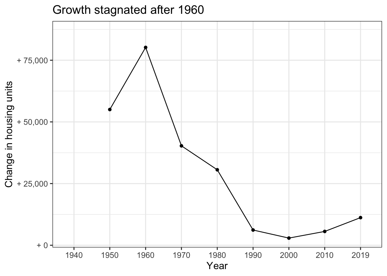
Change from 1940 to 2019
This interactive map shows the areas that gained or lost the most housing units from 1940-2019. Dense housing around industrial areas along the Allegheny and Monongahela Rivers was erased. Homestead and Braddock stand out.
hu_diff <- ac_housing_hu %>%
  group_by(GEOID10) %>%
  filter(year == min(year) | year == max(year)) %>%
  ungroup() %>%
  select(GEOID10, year, housing_units) %>%
  pivot_wider(names_from = year, names_prefix = "units_", values_from = housing_units) %>%
  mutate(diff = units_2019 - units_1940) %>%
  st_as_sf()

pal <- colorNumeric(
  palette = "viridis",
  domain = hu_diff$diff)

leaflet_map <- hu_diff %>%
  mutate(diff_formatted = comma(diff, accuracy = 1),
         diff_label = str_c("Census tract: ", GEOID10, "<br/>", "Difference: ", diff_formatted)) %>%
  st_transform(crs = 4326) %>%
  leaflet() %>%
  setView(lat = 40.441606, lng = -80.010957, zoom = 10) %>%
  addProviderTiles(providers$Stamen.TonerLite,
                   options = providerTileOptions(noWrap = TRUE,
                                                 minZoom = 9),
                   group = "Base map") %>%
  addPolygons(popup = ~ diff_label,
              fillColor = ~pal(diff),
              fillOpacity = .7,
              color = "black",
              weight = 1,
              group = "Housing") %>%
  addLegend("bottomright", pal = pal, values = ~diff,
            title = "Difference",
            opacity = 1) %>%
  addLayersControl(overlayGroups = c("Base map", "Housing"),
                   options = layersControlOptions(collapsed = FALSE)) %>%
  addFullscreenControl()

frameWidget(leaflet_map, options=frameOptions(allowfullscreen = TRUE))
The North Side and the Hill were targets of “urban renewal” in the middle of the century. Dense housing in heavily African-American communities were demolished to make way for an opera house, the 279 and 579 highways, and parking lots. The highways are directly related to the white flight exodus to the suburbs, especially in the west and north. Those highways made it easy for the new suburbanites to commute longer distances in single passenger vehicles.
These graphs shows that the areas with the most housing in 1940 lost thousands of units, while outlying areas gained thousands of units.
slope_graph_anim <- hu_diff %>%
  pivot_longer(cols = c(units_1940, units_2019), names_to = "year", values_to = "housing_units") %>%
  mutate(year = str_remove(year, "^units_")) %>%
  ggplot(aes(year, housing_units)) +
  geom_line(aes(group = GEOID10), alpha = .1) +
  geom_point(aes(group = str_c(year, GEOID10)), alpha = .05) +
  scale_y_comma() +
  transition_reveal(diff) +
  labs(title = "Housing unit change from 1940-2019",
       subtitle = "From areas with the most units in 1940 to the least",
       x = "Year",
       y = "Housing units",
       alpha = "Difference") +
  theme(panel.grid.minor.y = element_blank(),
        panel.grid.major.y = element_blank(),
        panel.grid.major.x = element_blank(),
        panel.border = element_blank(),
        axis.title.x = element_blank())

slope_graph_anim <- animate(slope_graph_anim, duration = 10, fps = 20, end_pause = 60)

slope_graph_anim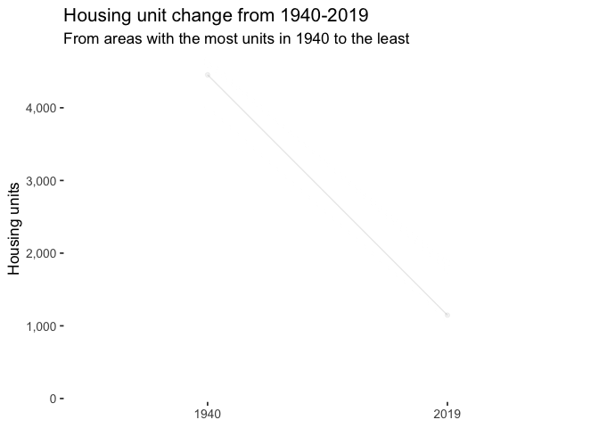
hu_diff %>%
  ggplot(aes(units_1940, units_2019)) +
  geom_abline(lty = 2) +
  geom_point(alpha = .2) +
  annotate("text", x = 3500, y = 3800, label = "No change", angle = 45) +
  annotate("text", x = 300, y = 4500, label = "Gain") +
  annotate("text", x = 4300, y = 100, label = "Loss") +
  tune::coord_obs_pred() +
  scale_x_comma() +
  scale_y_comma() +
  labs(title = "Change in housing units",
       x = "Units in 1940",
       y = "Units in 2019")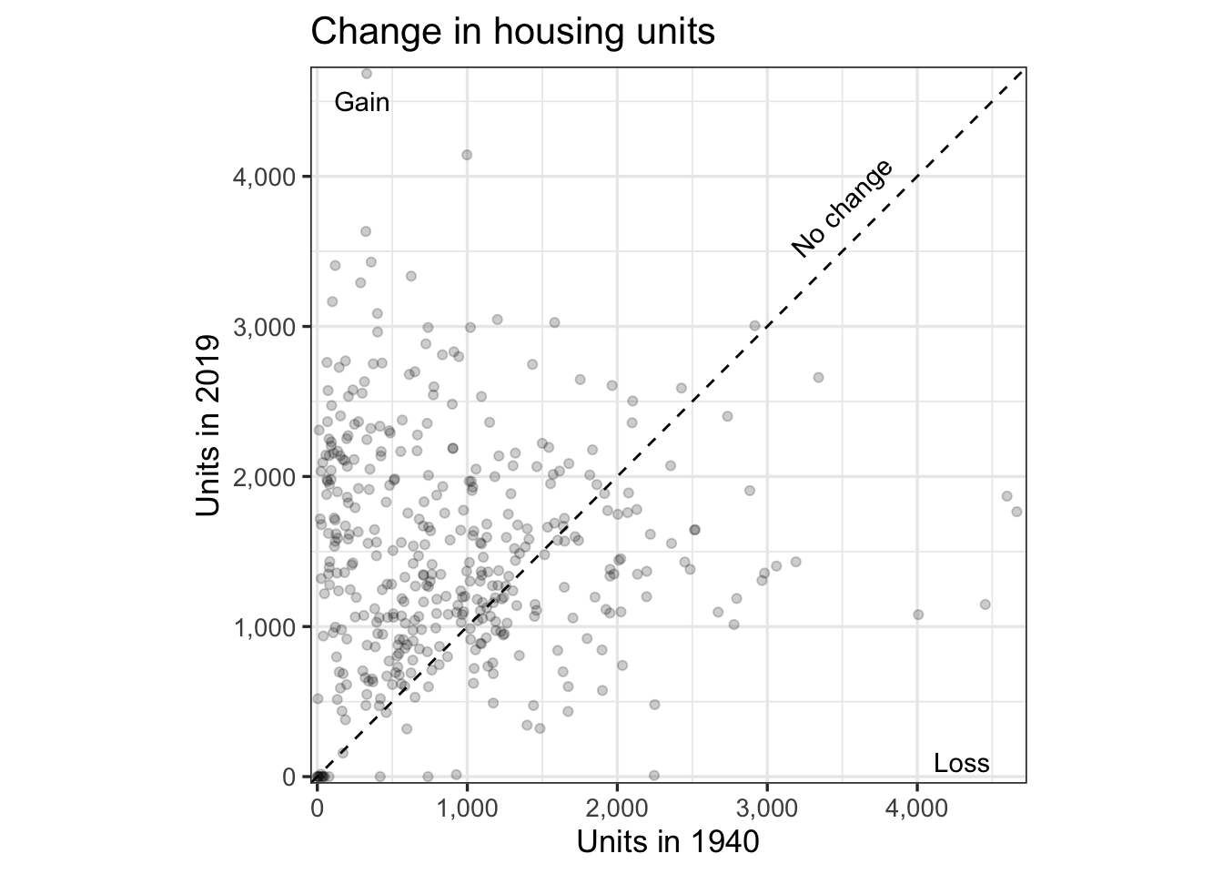
Moving north and west
These maps show the estimates of housing units for each decennial period. Outlying areas in the north and west, directly served by the new highway system, gained thousands of housing units.
ac_housing_hu %>%
  ggplot() +
  geom_sf(aes(fill = housing_units), color = NA) +
  scale_fill_viridis_c("Housing units", labels = comma) +
  facet_wrap(~year) +
  theme_bw() +
  theme(panel.grid.major = element_blank(),
        panel.grid.minor = element_blank(),
        axis.text.x = element_blank(),
        axis.text.y = element_blank(),
        axis.ticks = element_blank())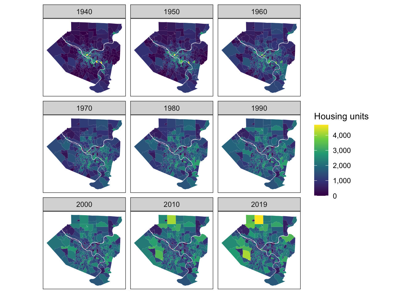
Geographically larger Census tracts gained more of the % of total housing over time.
ac_sqmi <- ac_housing %>%
  select(GEOID10, starts_with("sqmi")) %>%
  st_drop_geometry() %>%
  as_tibble() %>%
  pivot_longer(starts_with("sqmi"), names_to = "year", values_to = "sqmi")

ac_sqmi_year <- ac_sqmi %>%
  distinct(year) %>%
  mutate(year_fixed = c(1940, 1950, 1960, 1970, 1980, 1990, 2000, 2010, 2019))

ac_sqmi <- ac_sqmi %>%
  left_join(ac_sqmi_year) %>%
  select(-year) %>%
  rename(year = year_fixed)

ac_density <- ac_housing_hu %>%
  select(GEOID10, year, housing_units) %>%
  left_join(ac_sqmi) %>%
  mutate(density = housing_units / sqmi)

curve_anim <- ac_density %>%
  st_drop_geometry() %>%
  select(GEOID10, year, housing_units, sqmi) %>%
  mutate(year = as.character(year) %>% fct_inorder()) %>%
  arrange(year, sqmi) %>%
  group_by(year) %>%
  mutate(housing_units_cumsum = cumsum(housing_units),
         pct_units = housing_units_cumsum / sum(housing_units)) %>%
  ungroup() %>%
  ggplot(aes(sqmi, pct_units, color = year)) +
  geom_line() +
  scale_y_percent() +
  labs(title = "Housing moves to outlying areas over time",
       subtitle = "Year: {closest_state}",
       x = "Square miles",
       y = "Cumulative percent of units",
       color = "Year") +
  transition_states(year) +
  shadow_mark()

curve_anim <- animate(curve_anim, duration = 10, fps = 20)

curve_anim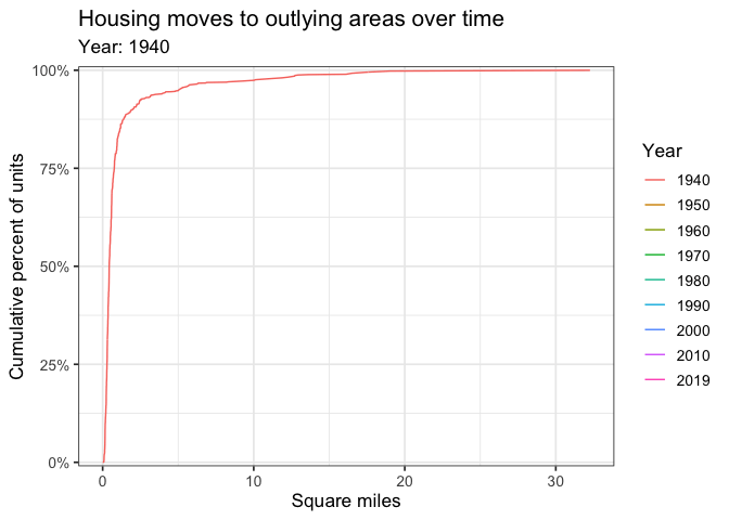
Housing peaks
This shows the year that each census tract peaked in terms of housing units. The areas that attracted heavy industry in the late 19th/early 20th century (and built housing nearby to support it) were crushed by the collapse of that industry. The single census tract that makes up “Downtown” has clawed back some housing recently.
ac_housing_hu %>%
  group_by(GEOID10) %>%
  filter(housing_units == max(housing_units)) %>%
  ungroup() %>%
  rename(max_year = year) %>%
  ggplot() +
  geom_sf(aes(fill = max_year), color = NA) +
  scale_fill_viridis_c(direction = -1) +
  labs(title = "Year of peak housing",
       fill = "Peak") +
  theme(panel.grid.major = element_blank(),
        axis.text.x = element_blank(),
        axis.text.y = element_blank(),
        axis.ticks = element_blank(),
        panel.border = element_blank())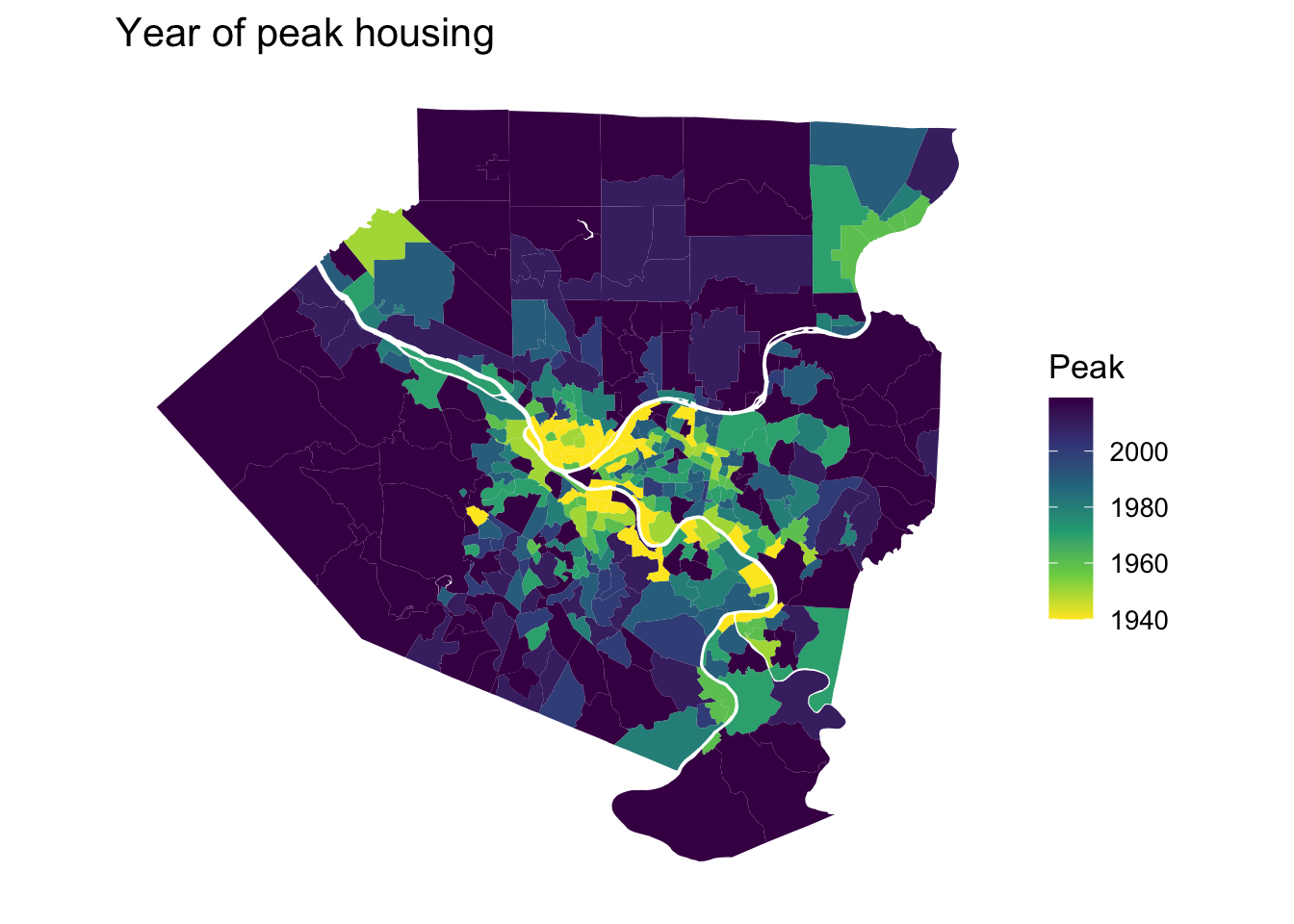
Housing moves away from the center
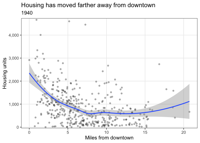
A major trend from 1940-2019 is the significant shift in housing from around the core to outlying suburbs. This code calculates the distance between each tract and the “Downtown” tract (42003020100), and plots the number of units compared to that distance.
downtown_tract <- ac_housing_hu %>%
  filter(GEOID10 == "42003020100") %>%
  distinct(GEOID10, geometry) %>%
  mutate(centroid = st_point_on_surface(geometry)) %>%
  st_set_geometry("centroid") %>%
  select(-geometry)

distance_anim <- ac_housing_hu %>%
  select(GEOID10, year, housing_units) %>%
  mutate(centroid = st_point_on_surface(geometry),
         geoid = str_c(GEOID10, year, sep = "_"),
         year = as.integer(year)) %>%
  mutate(distance_to_downtown = st_distance(centroid, downtown_tract) %>% as.numeric() / 5280) %>%
  ggplot(aes(distance_to_downtown, housing_units)) +
  geom_point(aes(group = GEOID10), alpha = .3) +
  geom_smooth(aes(group = year)) +
  scale_x_continuous() +
  scale_y_comma() +
  transition_states(year,
                    state_length = 10) +
  labs(title = "Housing has moved farther away from downtown",
       subtitle = "{closest_state}",
       x = "Miles from downtown",
       y = "Housing units") +
  theme(panel.grid.minor = element_blank())

distance_anim <- animate(distance_anim)

distance_anim
Land use
The HHUUD10 data also contains estimates for the percentage of land in a tract that is “developed” for the years 1992, 2001, and 2011. “Developed” in this context means “covered by an urban land use”.
ac_dev <- ac_housing %>%
select(GEOID10, starts_with("pdev")) %>%
pivot_longer(cols = starts_with("pdev"), names_to = "year", values_to = "pct_dev")
dev_years <- ac_dev %>%
st_drop_geometry() %>%
distinct(year) %>%
mutate(year_fixed = c(1992, 2001, 2011))
ac_dev <- ac_dev %>%
left_join(dev_years) %>%
select(-year) %>%
rename(year = year_fixed)
ac_dev %>%
ggplot() +
geom_sf(aes(fill = pct_dev), color = NA) +
facet_wrap(~year) +
scale_fill_viridis_c(labels = percent) +
labs(title = "Percent of land that is developed",
fill = NULL) +
theme_bw() +
theme(panel.grid.major = element_blank(),
panel.grid.minor = element_blank(),
axis.text.x = element_blank(),
axis.text.y = element_blank(),
axis.ticks = element_blank())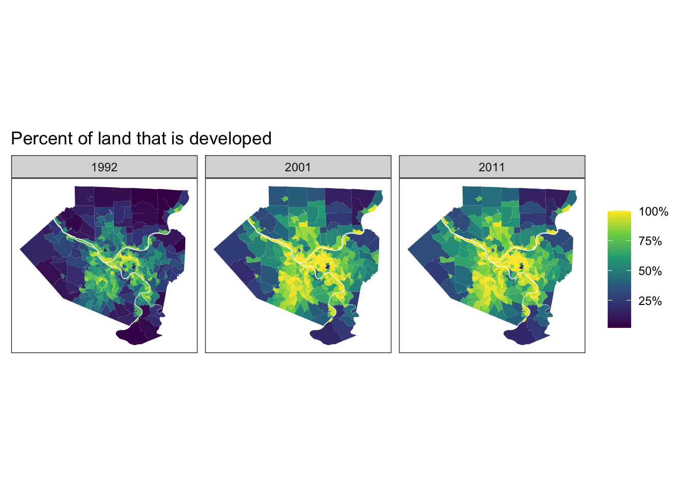 I find it interesting that more of the South Hills is developed than the North Hills. I would have expected more development in the North Hills due to the McKnight Road area and Wexford. My guess is that the tracts in the North Hills cover more land area, which decreases the % that is developed. Conversely, the tracts in the South Hills cover less land area, and less of the South Hills is useful for development because of steep hills and creeks. This concentrates development in a smaller area.
Conclusion
Over the past 80 years, Allegheny County has lost a significant amount of housing in its core urban area. Much of this is directly related to the collapse of the steel industry and “urban renewal”. At the same time, new housing development has been pushed out to the suburbs. This is a loss in terms of housing density, which has become a major discussion point in urban planning over the past 20 years.
Higher density areas have a lower per capita carbon footprint due to non-car commute modes and agglomeration effects. Higher density also does not expand the wildland-urban interface. This leaves more land for the natural environment, moves humans away from dangers such as wildfires, and lowers the frequency of interaction between wild animals and humans, which can transfer disease (coronavirus, ebola). It will be interesting to see whether the suburbanization trend continues after the initial shocks of COVID-19 pandemic subside.