Code
library(tidyverse)
library(fpp3)
library(broom)
library(fredr)
library(hrbrthemes)
library(GGally)
library(scales)
library(plotly)
library(here)
library(ggthemes)
library(ggrepel)

theme_set(theme_ipsum())

options(scipen = 999, digits = 4)While looking through FRED data for work, I ran across the Labor Force Participation category. There are some interesting trend and seasonality patterns that I want to investigate with time series methods. There is a useful FRED blog post that provides a good overview of the topic of labor force participation rate (LFPR). Their definition is:
“…those who want to work (i.e., have a job or want one) relative to those who could work (the entire population over age 16 that isn’t incarcerated or on active military duty).”
For this analysis I will focus on men and women over 20 years old, which is more specific than the above definition. The data is available monthly since 1948.
library(tidyverse)
library(fpp3)
library(broom)
library(fredr)
library(hrbrthemes)
library(GGally)
library(scales)
library(plotly)
library(here)
library(ggthemes)
library(ggrepel)
theme_set(theme_ipsum())
options(scipen = 999, digits = 4)This code takes the FRED series ID and uses map_dfr to read in the data from the FRED API with fredr and combine the results into one dataframe. I specifically chose the non-seasonally adjusted datasets because I want to look at the seasonality.
fred_df_raw <- c("men >= age 20" = "LNU01300025",
             "women >= age 20" = "LNU01300026") |>
map_dfr(fredr, .id = "series")glimpse(fred_df_raw)Rows: 1,850
Columns: 6
$ series <chr> "men >= age 20", "men >= age 20", "men >= age 20", "men…
$ date <date> 1948-01-01, 1948-02-01, 1948-03-01, 1948-04-01, 1948-0…
$ series_id <chr> "LNU01300025", "LNU01300025", "LNU01300025", "LNU013000…
$ value <dbl> 87.9, 88.1, 87.8, 88.1, 88.1, 88.9, 89.3, 89.5, 89.1, 8…
$ realtime_start <date> 2025-02-07, 2025-02-07, 2025-02-07, 2025-02-07, 2025-0…
$ realtime_end <date> 2025-02-07, 2025-02-07, 2025-02-07, 2025-02-07, 2025-0…#set manual color palette for men and women
series_vec <- fred_df_raw |>
distinct(series) |>
pull()
#RColorBrewer::brewer.pal(3, "Dark2")[1:2]
series_pal <- colorblind_pal()(2)
names(series_pal) <- series_vec
#show_col(series_pal)Here I use the tsibble package to transform the dataframe into a time series table. Then I plot the data with autoplot and use {plotly} to make it interactive.
fred_df <- fred_df_raw |>
  select(series, date, value) |>
  rename(participation_rate = value) |>
  mutate(date = yearmonth(date)) |>
  as_tsibble(key = series, index = date)

x <- autoplot(fred_df) +
  scale_y_percent(scale = 1) +
  scale_color_manual(values = series_pal) +
  labs(title = "Labor Force Participation Rate",
       x = "Date",
       y = "LFPR",
       color = "Series")

ggplotly(x)
There are a couple general trends in this data.
The LFPR among men declined in the 50’s and 60’s, stabilized briefly in the 80s, and continued to decline afterwards. There were steep declines due to the 2008 financial crisis and COVID-19 in 2020.
Among women, the LFPR rose steeply from the 50’s to the 2000’s. This reflects the increase in the types of jobs that were available to women over time.
The LFPR in the two groups reacted differently to the financial crisis and COVID-19. In general, men’s LFPR didn’t decrease as much as women’s, but the LFPR among women bounced back stronger in each case.
Seasonality
The strong seasonailty among men peaks early in this series and becomes weaker over time.
The pattern of seasonality among women appears to be strong but highly variable early on, and then becomes weaker over time.
My hypothesis is that the decreasing seasonality is due to changes in what types of jobs are available and people’s preference for those jobs. For example, agricultural labor and construction are highly seasonal, but may have become a smaller % of the available jobs over time.
For context, the overall LFPR increased starting in the late 1960s, but has declined since 2000:
The FRED post linked above states that the overall decline is due to demographic factors:
…explained by the Baby Boomers retiring and slower U.S. population growth: Subsequent generations have been smaller than the Baby Boomer generation, so their entry into the labor force hasn’t made up for the retiring Boomers.
The trend among men and women are subsets of this overall trend, although the steep decline in these subsets didn’t begin until the 2008 financial crisis.
Here I use STL (Multiple seasonal decomposition by Loess) to decompose each time series into trend, seasonality, and remainder. This models the strength of the trend and seasonality over time. The remainder is the noise in the data that cannot be explained by the trend or seasonality. I use components to extract the components of the decomposition to analyze them further. I also transform participation_rate to the log scale, which makes the STL decomposition multiplicative instead of additive. This makes it easier to compare the magnitude of seasonality (season_year) and remainder between series.
stl_models <- fred_df |>
  model(stl = STL(log(participation_rate) ~ trend() + season()))

stl_components <- stl_models |>
  components()

stl_components
# A dable: 1,850 x 8 [1M]
# Key: series, .model [2]
# : log(participation_rate) = trend + season_year + remainder
series .model date log(participation_ra…¹ trend season_year remainder
<chr> <chr> <mth> <dbl> <dbl> <dbl> <dbl>
1 men >= ag… stl 1948 Jan 4.48 4.48 -0.00709 0.00132
2 men >= ag… stl 1948 Feb 4.48 4.48 -0.00601 0.00221
3 men >= ag… stl 1948 Mar 4.48 4.48 -0.00343 -0.00409
4 men >= ag… stl 1948 Apr 4.48 4.48 -0.00213 -0.00228
5 men >= ag… stl 1948 May 4.48 4.48 -0.000316 -0.00431
6 men >= ag… stl 1948 Jun 4.49 4.48 0.00431 -0.000127
7 men >= ag… stl 1948 Jul 4.49 4.48 0.00631 0.00215
8 men >= ag… stl 1948 Aug 4.49 4.48 0.00693 0.00357
9 men >= ag… stl 1948 Sep 4.49 4.48 0.00362 0.00221
10 men >= ag… stl 1948 Oct 4.49 4.48 0.000450 0.00294
# ℹ 1,840 more rows
# ℹ abbreviated name: ¹`log(participation_rate)`
# ℹ 1 more variable: season_adjust <dbl>In the following graphs, the season_year variable represents the seasonality. The grey bars on the left indicate the reverse magnitude of the effect of each STL component.
The decomposition for men shows that the magnitude of the seasonality shrinks over time, and the pattern in which months are peaks and troughs changes as well. Among men, the remainder seems to have a stronger effect than seasonality (seasonal_year), though that is probably skewed by the singularly large outlier value of the COVID-19 pandemic.
stl_components |>
  filter(str_starts(series, "men")) |>
  autoplot()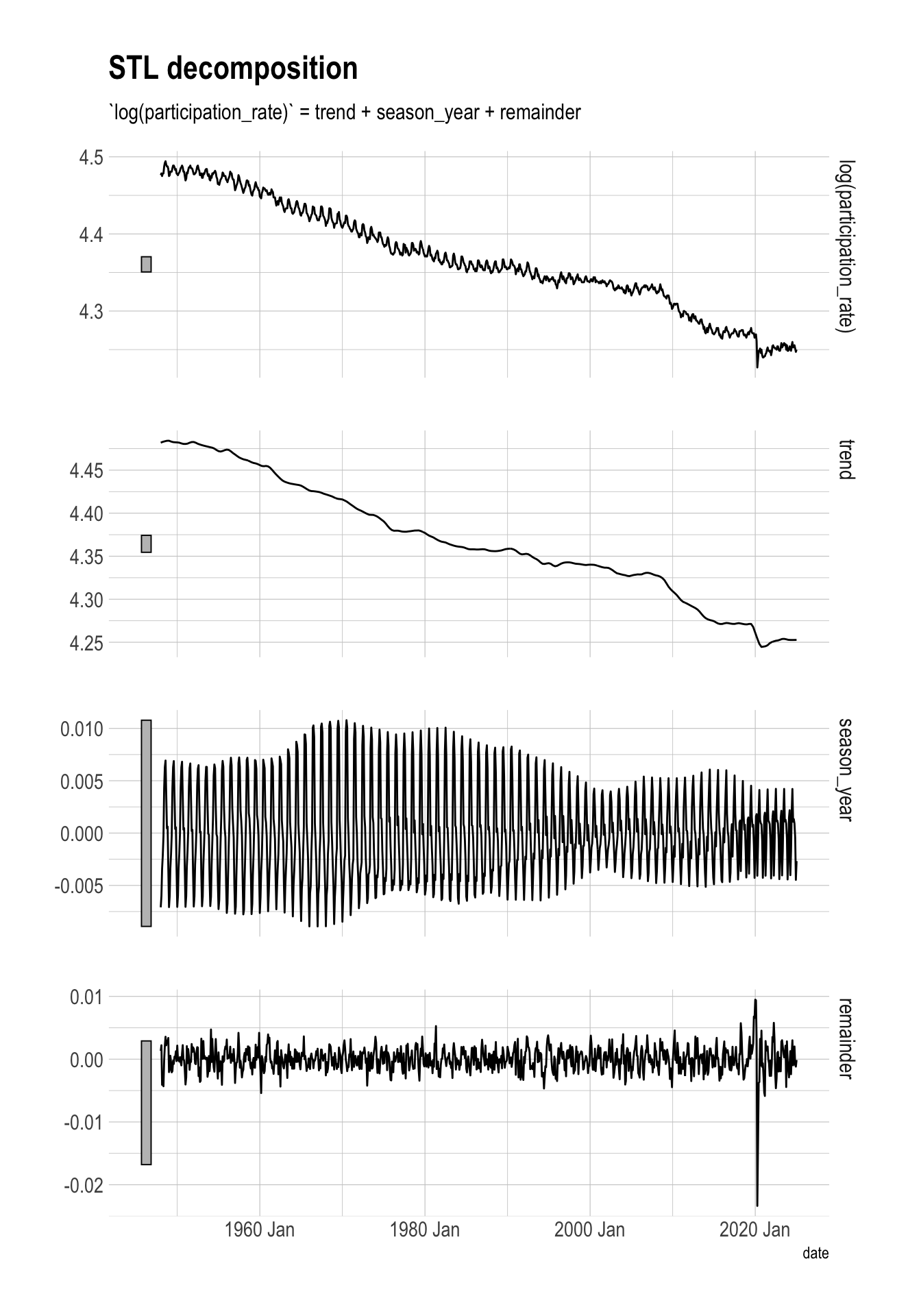
The seasonality pattern for women changes drastically multiple times over the course of the time series. The early years of this series have many large remainder values (in absolute terms), which could indicate the change in job types that were available to women at the time.
stl_components |>
  filter(str_starts(series, "women")) |>
  autoplot()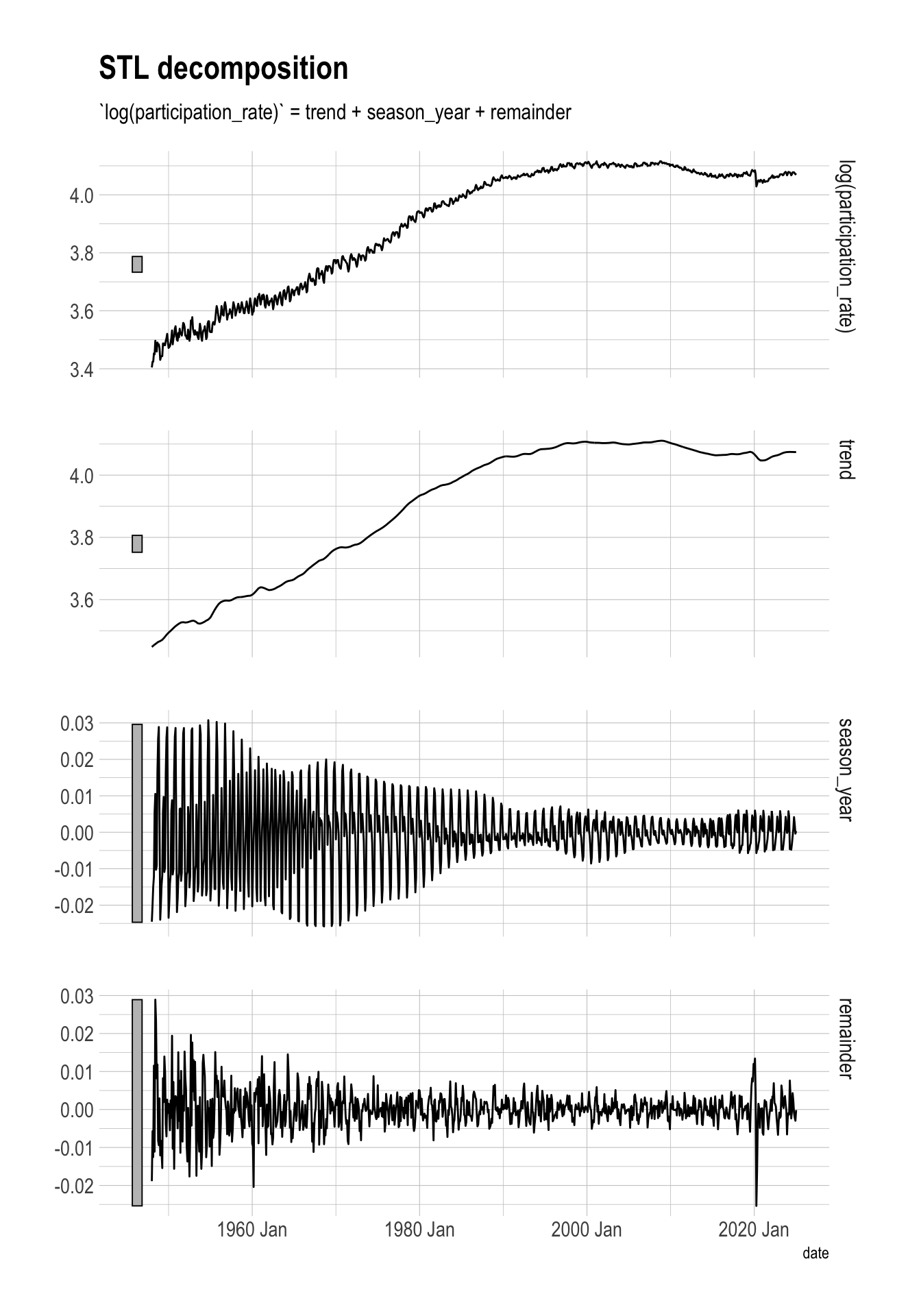
This shows the de-seasonalized trend among men and women:
stl_components |>
  ggplot(aes(date, trend, color = series)) +
  geom_line(lwd = 1.5) +
  scale_color_manual(values = series_pal) +
  labs(title = "Labor Force Participation Rate",
       x = "Date",
       y = "LFPR trend") +
  theme(legend.position = "bottom")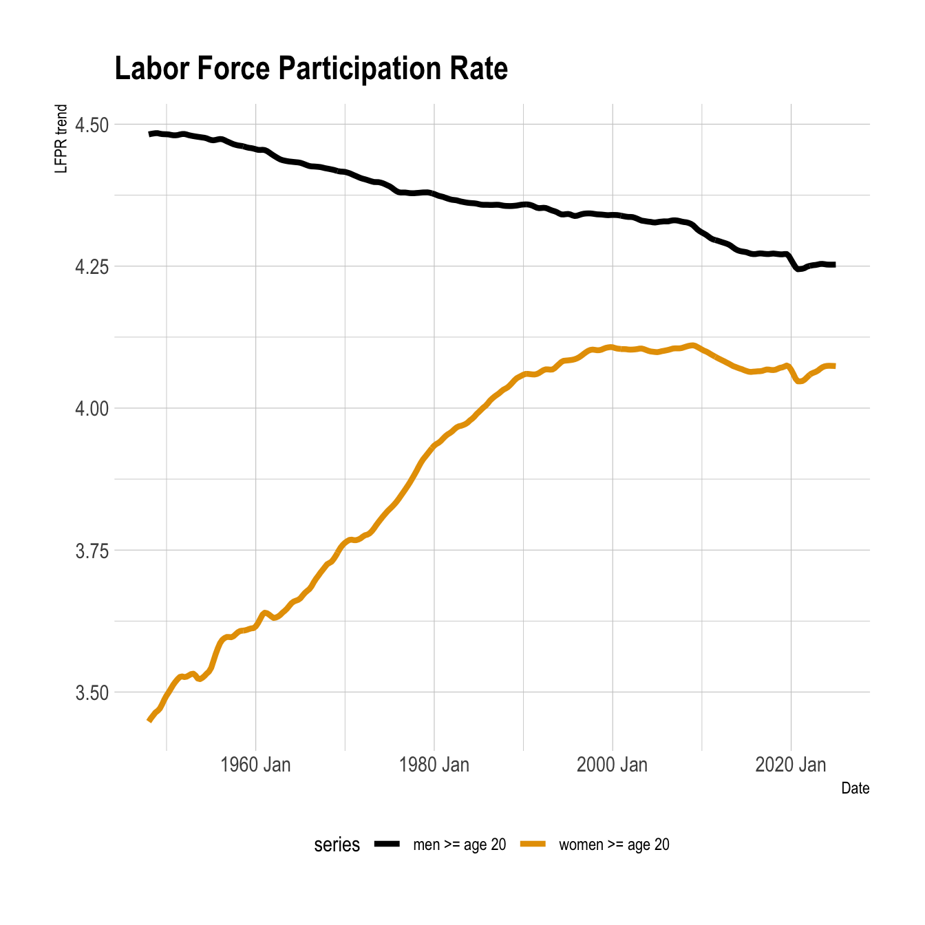
The LFPR trend for women actually increased at the height of the 2008 financial crisis. This could indicate that some women were pulled into the labor force in response to increased economic pressure on them and/or their household.
stl_components |>
  filter(between(year(date), 2005, 2010)) |>
  ggplot(aes(date, trend, color = series)) +
  geom_line(lwd = 1.5) +
  scale_color_manual(values = series_pal) +
  facet_wrap(vars(series), scales = "free_y", ncol = 1) +
  labs(title = "LFPR during 2008 financial crisis",
       x = "Date",
       y = "LFPR trend",
       color = "Series") +
  theme(legend.position = "bottom")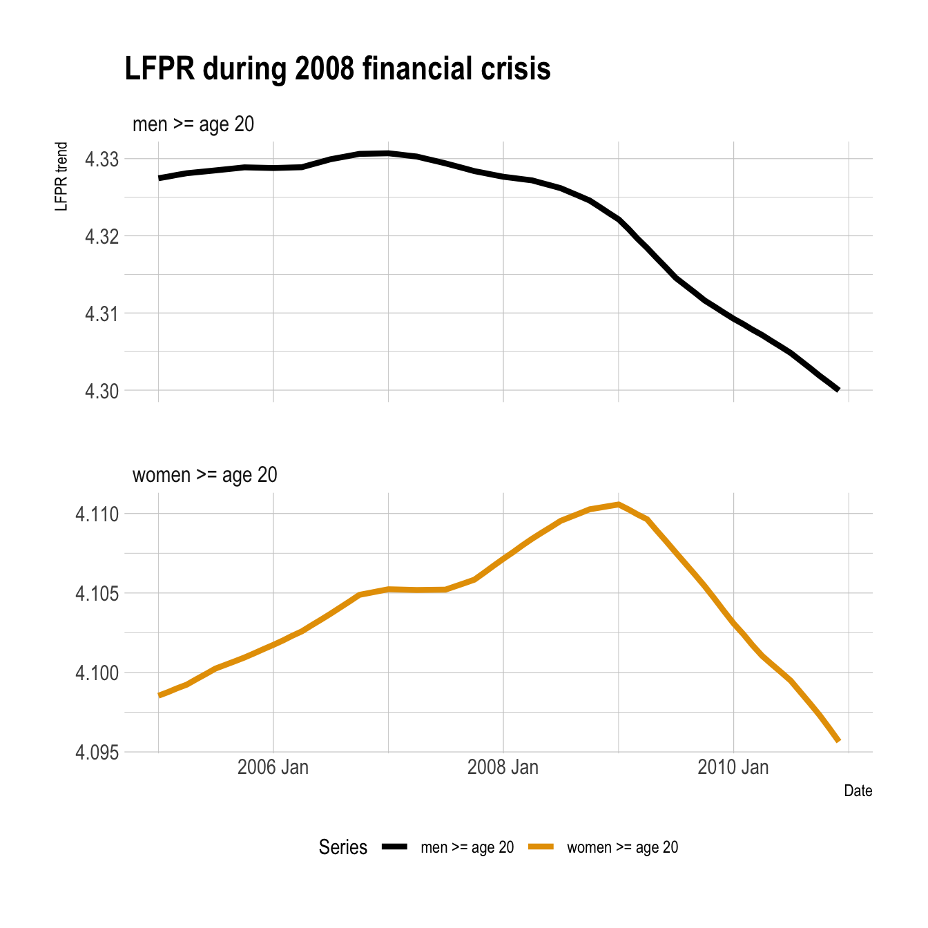
This code uses the {feasts} package to calculate summary statistics about each time series. I will focus on the strength of the trend and seasonality, and the amount of noise in each series.
fred_features <- fred_df |>
  features(participation_rate, feature_set(pkgs = "feasts"))

fred_features |>
  select(series, trend_strength, seasonal_strength_year, spectral_entropy)
# A tibble: 2 × 4
series trend_strength seasonal_strength_year spectral_entropy
<chr> <dbl> <dbl> <dbl>
1 men >= age 20 0.999 0.841 0.0457
2 women >= age 20 1.00 0.787 0.0423Both series have very strong trends, but the series for men has stronger seasonality (seasonal_strength_year). This confirms my impressions from the graphs above. Both series have very similar low spectral_entropy values which shows that there is very little noise in the data. I would expect both series to be easily forecastable in the near term.
Another way to summarize a time series is to calculate the average peak and trough of the seasonality.
month_lookup <- tibble(month_int = c(1:12),
                       month = month.abb)

peak_trough <- fred_features |>
  select(series, seasonal_peak_year, seasonal_trough_year) |>
  left_join(month_lookup, by = c("seasonal_peak_year" = "month_int")) |>
  select(-seasonal_peak_year) |>
  rename(seasonal_peak_year = month) |>
  left_join(month_lookup, by = c("seasonal_trough_year" = "month_int")) |>
  select(-seasonal_trough_year) |>
  rename(seasonal_trough_year = month)

peak_trough
# A tibble: 2 × 3
series seasonal_peak_year seasonal_trough_year
<chr> <chr> <chr>
1 men >= age 20 Jul Jan
2 women >= age 20 Oct Jul In men, the peak is July and the trough is in January. In women, the peak is in October and the trough is in July. These metrics are calculated over the entire series, so it does not reflect changes over time.
To capture how each time series changes over time, I turn each into a tiled time series. I create exclusive blocks of 48 consecutive months, and then treat each as its own “mini” time series. This creates 19 48-month time series for men and women.
fred_tile <- tile_tsibble(fred_df, .size = 4*12) |>
  arrange(series, .id) |>
  group_by(series, .id) |>
  filter(n() == 4*12) |> #only keep complete tiles
  ungroup()

fred_tile |>
  as_tibble() |>
  distinct(series, .id) |>
  count(series)
# A tibble: 2 × 2
series n
<chr> <int>
1 men >= age 20 19
2 women >= age 20 19glimpse(fred_tile)Rows: 1,824
Columns: 4
Key: .id, series [38]
$ series <chr> "men >= age 20", "men >= age 20", "men >= age 20", …
$ date <mth> 1948 Jan, 1948 Feb, 1948 Mar, 1948 Apr, 1948 May, 1…
$ participation_rate <dbl> 87.9, 88.1, 87.8, 88.1, 88.1, 88.9, 89.3, 89.5, 89.…
$ .id <int> 1, 1, 1, 1, 1, 1, 1, 1, 1, 1, 1, 1, 1, 1, 1, 1, 1, …This code calculates the starting year-month of each time period and calculates the features for each.
period_start <- fred_tile |>
  as_tibble() |>
  group_by(series, .id) |>
  summarize(period_starting = min(date)) |>
  ungroup()

fred_tile_features <- fred_tile |>
  features(participation_rate, feature_set(pkgs = "feasts")) |>
  left_join(period_start, by = c("series", ".id")) |>
  select(.id, series, period_starting, everything()) |>
  arrange(series, .id)
The strength of the trend has a fair amount of variance over time for both series, but decreased more for men in the 4-year period starting January 2020. This reflects the recent flattening of that trend.
The strength of seasonality (seasonal_strength_year) decreased over time in both series. The amount of noise in each series has increased over the past ~10 years. That lines up with the decrease in seasonal strength.
fred_tile_features |>
  select(.id, period_starting, series, trend_strength, seasonal_strength_year, spectral_entropy) |>
  pivot_longer(-c(.id, series, period_starting)) |>
  mutate(name = fct_inorder(name)) |>
  ggplot(aes(period_starting, value, color = series, fill = series)) +
  geom_point() +
  geom_smooth() +
  scale_color_manual(values = series_pal) +
  scale_fill_manual(values = series_pal) +
  facet_wrap(vars(name), ncol = 1, scales = "free_y") +
  labs(title = "Labor Force Participation Rate",
       x = "Period start",
       y = "Value",
       color = "Series",
       fill = "Series") +
  theme(legend.position = "bottom")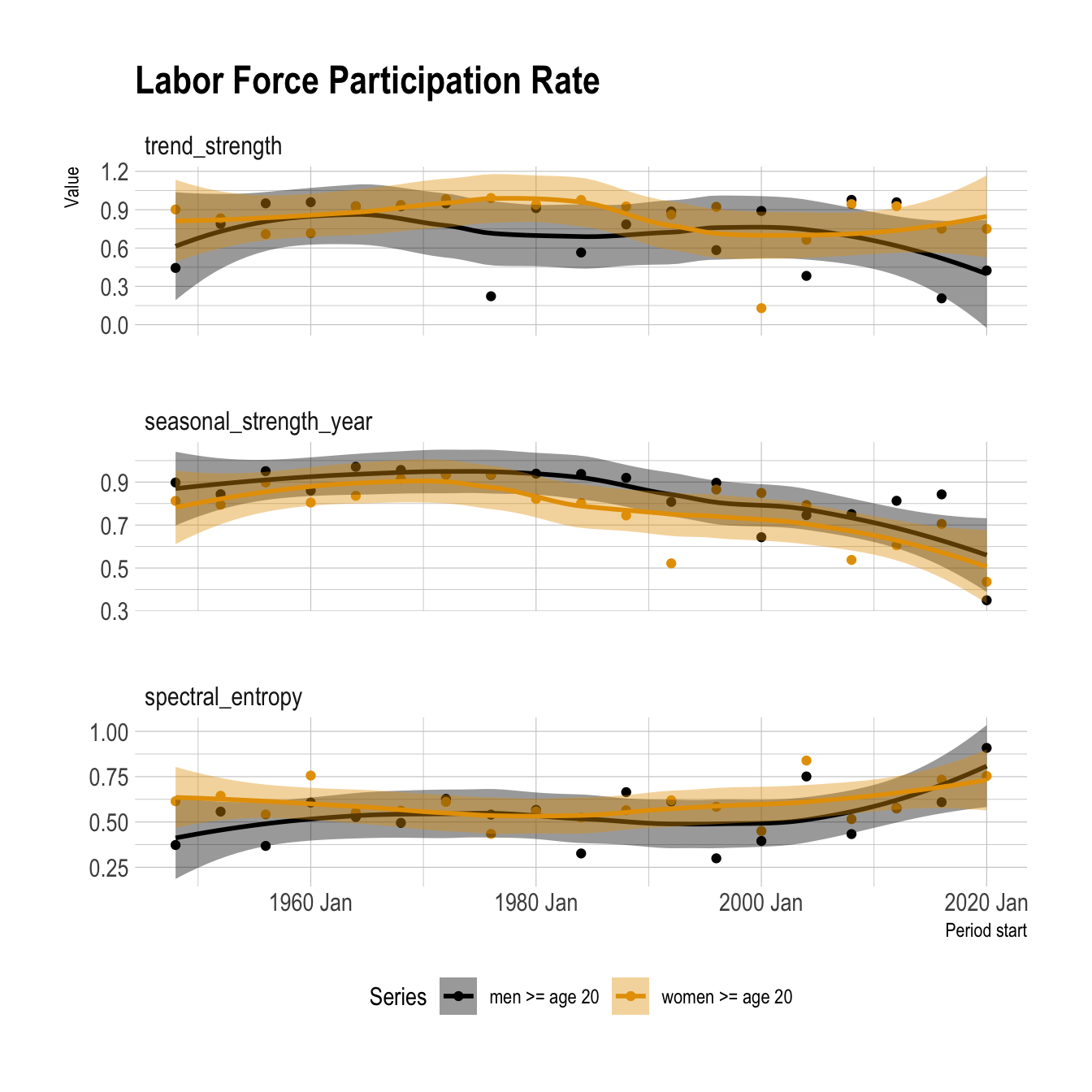
Here I apply STL decomposition to the tiled series to investigate the changes in seasonality over time.
stl_components <- fred_tile |>
  model(stl = STL(participation_rate ~ trend() + season())) |>
  left_join(period_start, by = c("series", ".id")) |>
  components()

stl_components
# A dable: 1,824 x 9 [1M]
# Key: .id, series, .model [38]
# : participation_rate = trend + season_year + remainder
.id series .model date participation_rate trend season_year remainder
<int> <chr> <chr> <mth> <dbl> <dbl> <dbl> <dbl>
1 1 men >= … stl 1948 Jan 87.9 88.5 -0.677 0.109
2 1 men >= … stl 1948 Feb 88.1 88.5 -0.579 0.192
3 1 men >= … stl 1948 Mar 87.8 88.5 -0.368 -0.338
4 1 men >= … stl 1948 Apr 88.1 88.5 -0.275 -0.149
5 1 men >= … stl 1948 May 88.1 88.5 -0.146 -0.293
6 1 men >= … stl 1948 Jun 88.9 88.6 0.326 0.0210
7 1 men >= … stl 1948 Jul 89.3 88.6 0.551 0.182
8 1 men >= … stl 1948 Aug 89.5 88.6 0.694 0.227
9 1 men >= … stl 1948 Sep 89.1 88.6 0.417 0.0908
10 1 men >= … stl 1948 Oct 88.9 88.6 0.150 0.145
# ℹ 1,814 more rows
# ℹ 1 more variable: season_adjust <dbl>stl_components |>
mutate(year = year(date),
month = month(date, label = TRUE) |> fct_rev()) |>
ggplot(aes(year, month, fill = season_year)) +
geom_tile() +
facet_wrap(vars(series), ncol = 1) +
scale_x_continuous(n.breaks = 8, expand = c(0, 0)) +
scale_y_discrete(expand = c(0, 0)) +
scale_fill_viridis_c(name = "Seasonal strength", option = "C") +
labs(title = "Labor Force Participation Rate",
x = "Period start",
y = "Month") +
theme(legend.position = "bottom",
panel.grid.major = element_blank(),
panel.grid.minor = element_blank())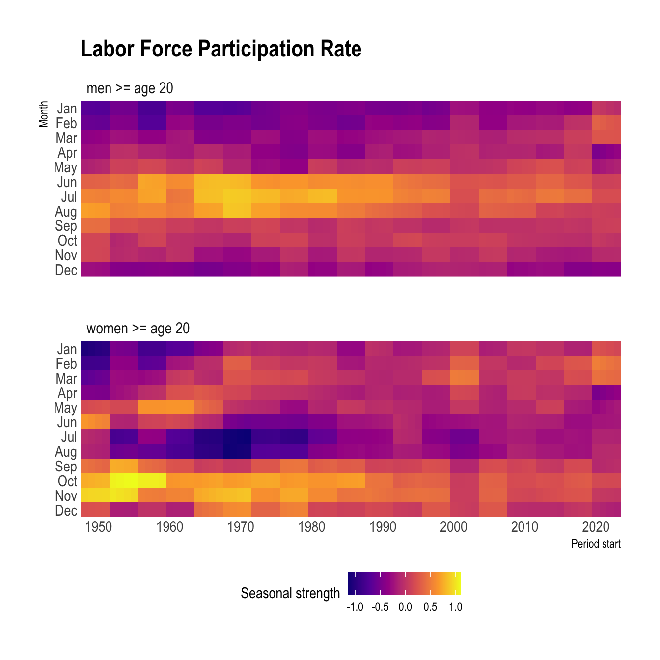
The seasonality among men appears to have started diffusely in the late summer, strengthened in the same season in the late 1960s, and then diffused again over time.
Among women, the seasonality was very strong in the fall in the 1950s. Then it diverged into two groups (spring and fall) bisected by a seasonal trough in the summer. The series for men and women converged on opposite peaks/troughs in the late 1960s, which makes me think the two groups were responding to the same (or multiple correlated) socioeconomic events.
The same analysis done with a time series linear model creates basically the same output.
seasonal_model <- fred_tile |>
  model(ts_lm_seasonal = TSLM(participation_rate ~ trend() + season())) |>
  left_join(period_start, by = c("series", ".id"))

seasonal_model |>
  mutate(coeffs = map(ts_lm_seasonal, tidy)) |>
  unnest(coeffs) |>
  filter(str_detect(term, "season")) |>
  mutate(term = fct_inorder(term) |> fct_rev()) |>
  ggplot(aes(x = period_starting, y = term, fill = estimate)) +
  geom_tile() +
  facet_wrap(vars(series), ncol = 1) +
  scale_x_yearmonth(expand = c(0, 0)) +
  scale_y_discrete(expand = c(0, 0)) +
  scale_fill_viridis_c(name = "Coefficient", option = "C") +
  labs(title = "Labor Force Participation Rate",
       subtitle = "January is hidden reference month",
       x = "Period start",
       y = "Model term") +
  theme(legend.position = "bottom",
        panel.grid.major = element_blank(),
        panel.grid.minor = element_blank())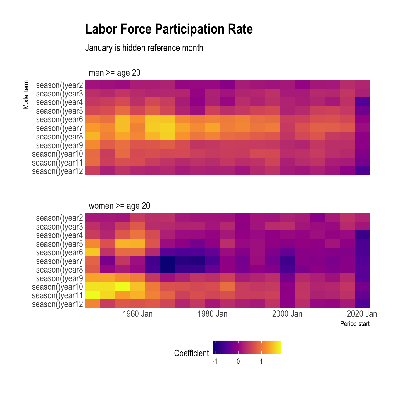
Here I apply Principal Component Analysis (PCA) to the features calculated on the tiled time series. The most recent period for each series, which contains the COVID-19 pandemic, is an outlier along the second component.
pcs <- fred_tile_features |>
  select(-c(series, .id, period_starting, zero_run_mean, bp_pvalue, lb_pvalue, zero_end_prop, zero_start_prop, zero_run_mean)) |>
  prcomp(scale = TRUE) |>
  augment(fred_tile_features)

pcs |>
  mutate(period = str_c("Period starting", period_starting, sep = " ")) |>
  mutate(graph_label = case_when(.fittedPC2 < -4 ~ period,
                                 .default = NA_character_)) |>
  ggplot(aes(x = .fittedPC1, y = .fittedPC2, color = series, fill = series)) +
  geom_point() +
  geom_label_repel(aes(label = graph_label), size = 3, color = "white") +
  scale_color_manual(values = series_pal) +
  scale_fill_manual(values = series_pal) +
  labs(title = "Outlier analysis with PCA",
       subtitle = "4-year time periods",
       color = "Series") +
  theme(aspect.ratio = 1,
        legend.position = "bottom")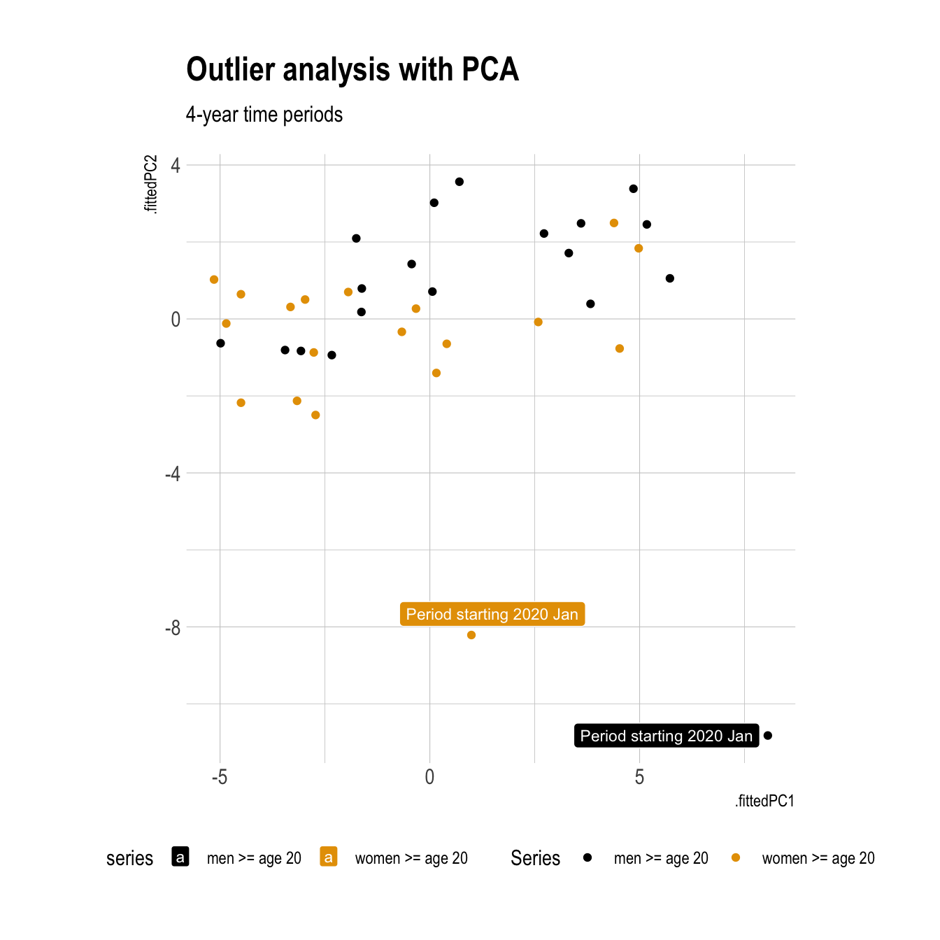
This shows the first two components over time for each group.
pcs |>
  select(.id, period_starting, series, .fittedPC1, .fittedPC2) |>
  pivot_longer(cols = contains("PC")) |>
  ggplot(aes(period_starting, value, color = series)) +
  geom_line(lwd = 1.5) +
  scale_color_manual(values = series_pal) +
  facet_wrap(vars(name), ncol = 1) +
  labs(title = "PCA components over time",
       x = "Period start",
       color = "Series",
       fill = "Series") +
  theme(legend.position = "bottom")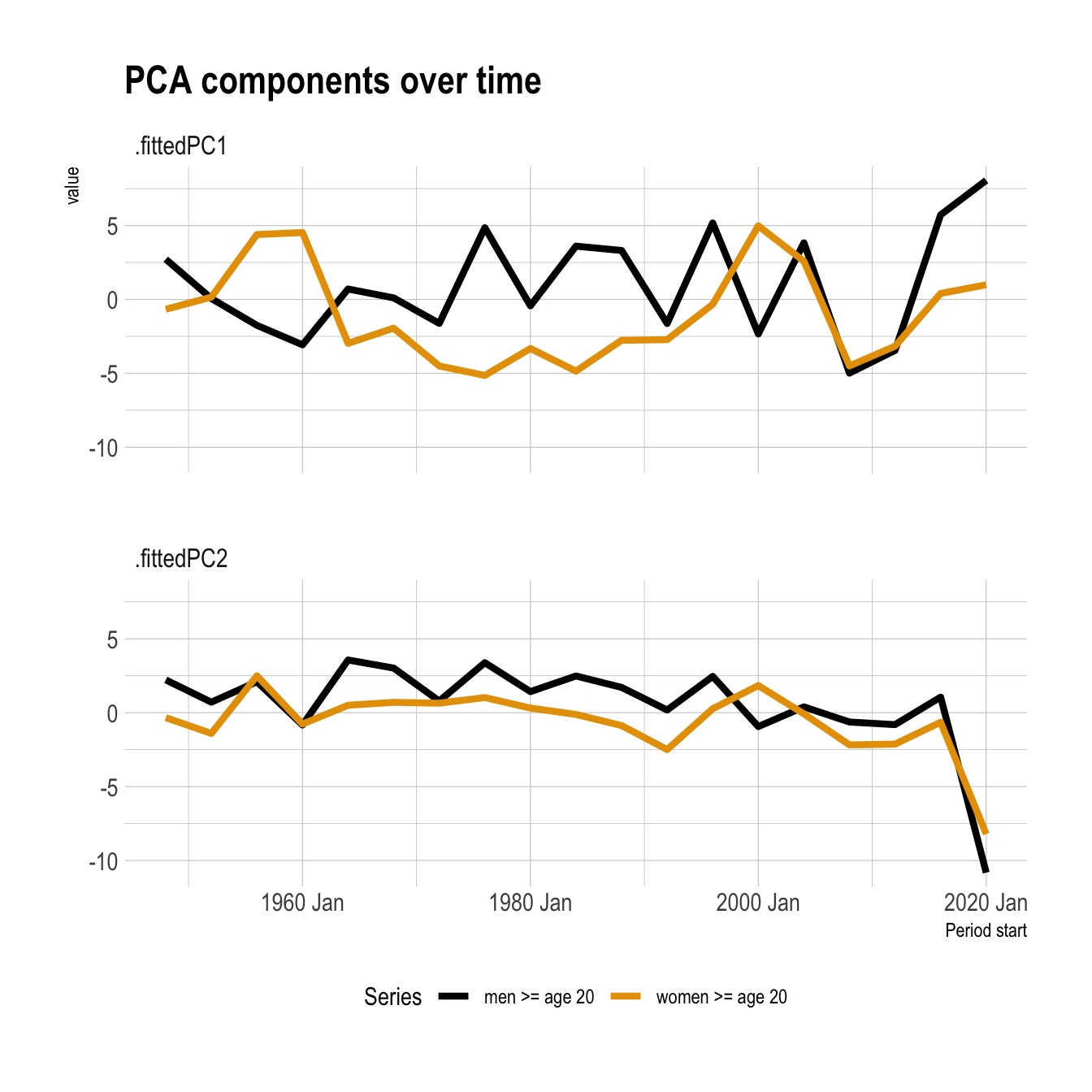
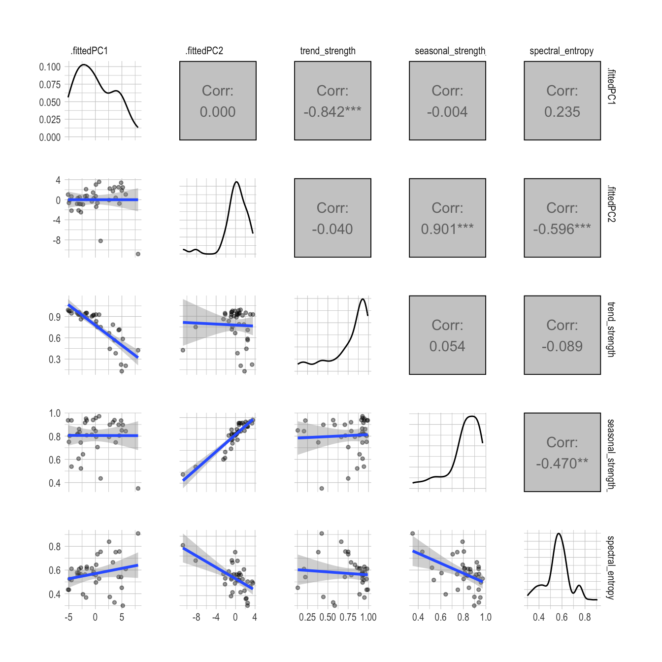
The second component is positively correlated with the seasonality of the series (seasonal_strength_year) and negatively correlated with the amount of noise in the series (spectral_entropy). This reflects the significant decrease in seasonality during this time period.
#https://stackoverflow.com/questions/44984822/how-to-create-lower-density-plot-using-your-own-density-function-in-ggally
my_fn <- function(data, mapping, ...){

  p <- ggplot(data = data, mapping = mapping) +
    geom_point(alpha = .4, size = 1) +
    geom_smooth(method = "lm")

  p

}

pcs |>
  select(.fittedPC1, .fittedPC2, trend_strength, seasonal_strength_year, spectral_entropy) |>
  ggpairs(lower = list(continuous = my_fn)) +
  theme(strip.text = element_text(size = 8),
  axis.text.x = element_text(size = 8),
  axis.text.y = element_text(size = 8))